

The story
The Challenge
Frutsu was a new product entering the crowded healthy snack market, and it needed to look credible from launch.
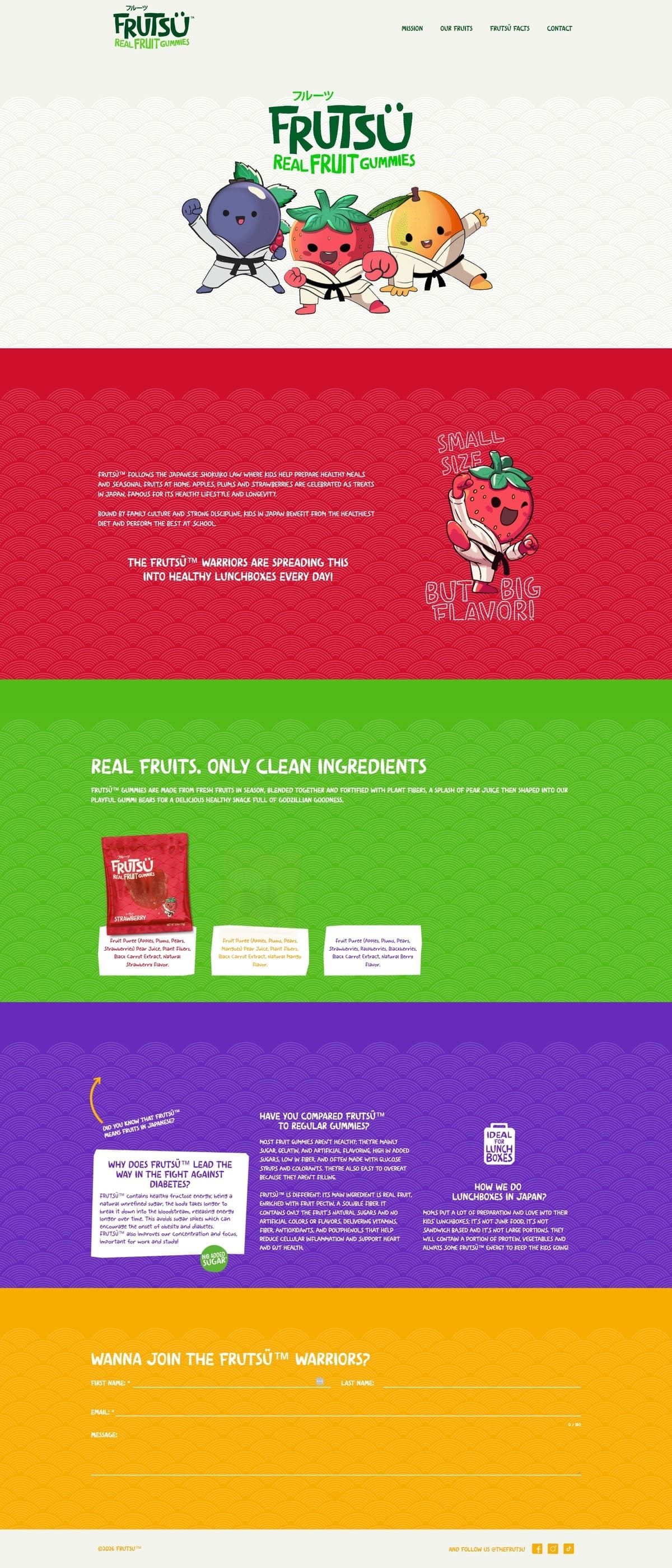
- The brand story draws on Japanese wellness philosophy, the Shokuiko Law, family culture, real nutrition and academic performance, and the site had to carry that in its design and imagery as well as its copy
- Most healthy snack browsing happens on Instagram and TikTok, so the site had to work on mobile first
- Ben needed a site that could cope with viral growth, influencer campaigns and international expansion from day one
Our Approach
Kickass Online worked with Ben in a series of sessions to understand Frutsu’s vision, values and the Shokuiko philosophy behind the brand.
- Collaborative brand translation: Kickass Online built the site around Ben’s own design, using bright colours, clean typography and Japanese-influenced visual elements.
- Performance-first architecture: Kickass Online built the backend with lazy-loading, asset optimisation and caching, so pages load fast despite the rich product animations.
- Educational storytelling: Interactive, visual sections explain the Shokuiko Law, the real fruit versus sugar comparison and the benefits of fibre.
- Conversion-focused pathway: Kickass Online built the customer journey around joining the “Warrior” movement, with messaging and visual cues that lead a visitor from first look to sign-up.
The Solution
Kickass Online delivered a fast website that puts Frutsu’s Japanese wellness heritage and real-fruit difference across through clean design, bright imagery and plain copy. Interactive product pages let visitors compare Frutsu against traditional gummies, and each section repeats one message: healthy energy for focus and performance, as in Japanese schools.
The Results
Frutsu launched looking like an established global brand from day one, with fast load times despite the product photography and animation.