

Click a page below to preview it above Tap a page below to preview it above
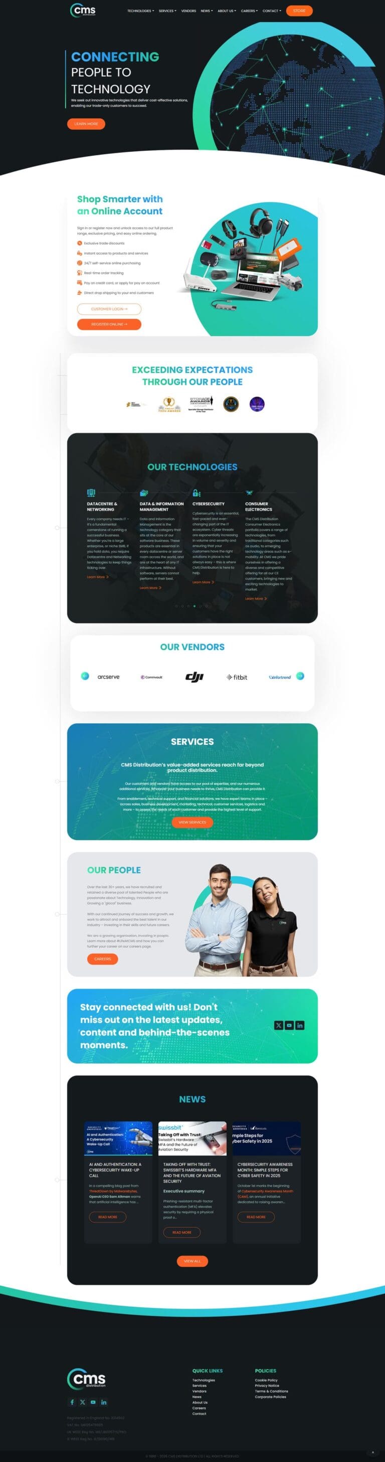
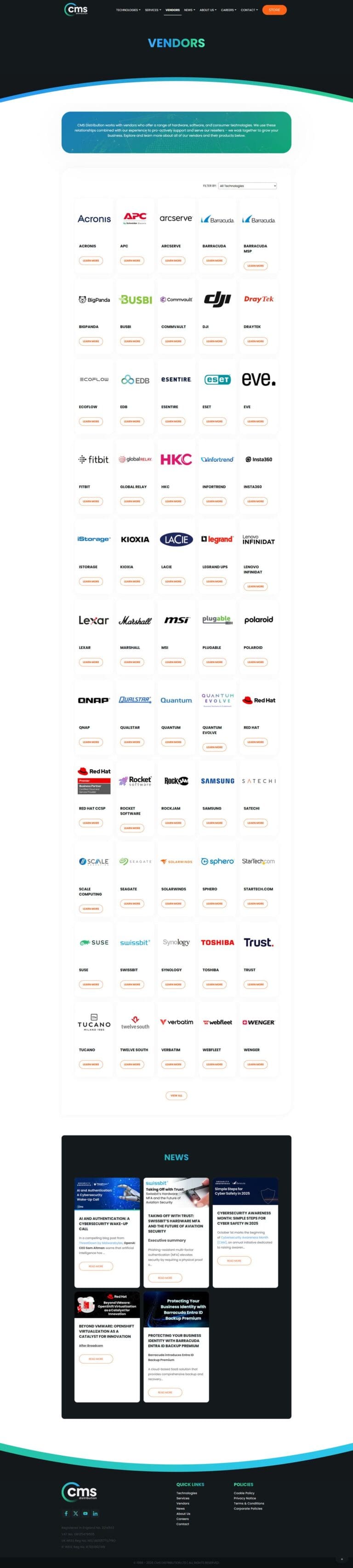
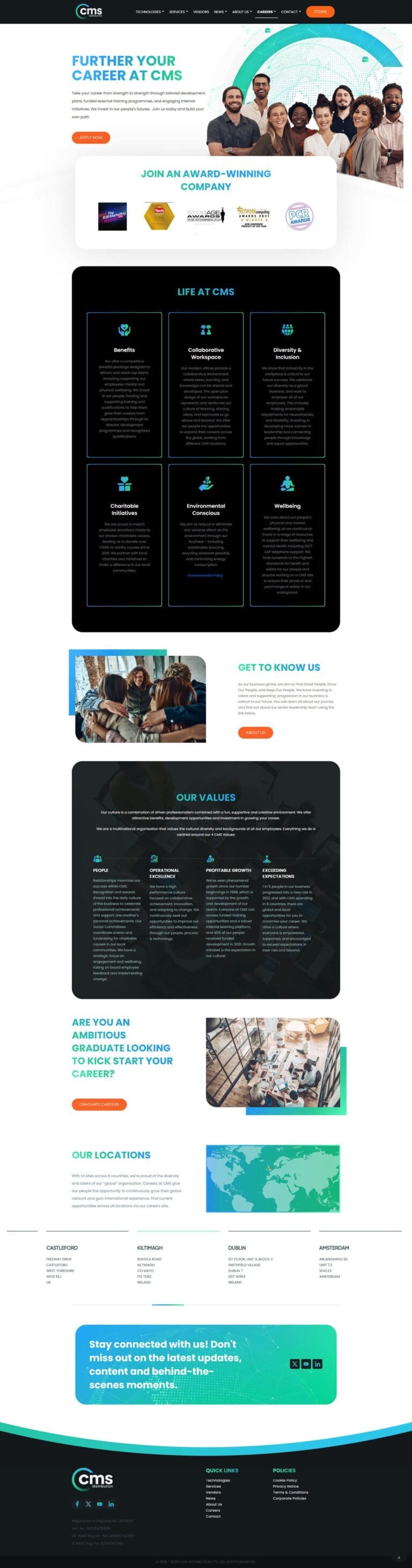
CMS Distribution, a leading distributor of innovative technologies, approached Kickass Online with a clear objective: to redesign its brand and logo. The company's existing visual identity was outdated and lacked cohesive brand guidelines, hindering its ability to communicate its message and values effectively to its target audience.
Our team at Kickass Online embarked on a comprehensive rebranding process, starting with an in-depth analysis of CMS Distribution's brand identity, target audience, and competitive landscape. Through close collaboration with the CMS Distribution team, we developed several concept designs, iterating and refining until we arrived at the perfect solution.
The final logo design features a modern, dynamic aesthetic that captures CMS Distribution's commitment to innovation and growth. We introduced a gradient semi-circle element reminiscent of a loading bar to symbolize the company's constant strive towards perfection and progress. This visual element also serves as a subtle nod to CMS Distribution's role in delivering cutting-edge technologies to its customers.
We updated the colour palette to include vibrant, energetic hues to enhance the brand's visual impact further. The primary colours, Shamrock Green and Dodger Blue, pay homage to CMS Distribution's Irish roots while creating a fresh, contemporary look. We also introduced Active Orange as the brand's call-to-action colour, ensuring that essential elements stand out and drive engagement. The palette is rounded out with Woodsmoke Black and Gallery Grey, providing versatility and balance.
The revitalized brand identity has been a game-changer for CMS Distribution. The new logo and colour palette have injected new life into the company's visual communication, making their brand more memorable and recognizable. The consistent application of the brand guidelines across all touchpoints has helped CMS Distribution establish a robust and cohesive brand presence, both online and offline.
Since the rebranding, CMS Distribution has reported increased brand recognition, customer engagement, and overall positive feedback from its target audience. The new visual identity has also boosted employee morale and pride in the company, as they now have a brand that truly reflects their values and aspirations.
"I am so happy with the work Kickass Online did for us. They really understood what we needed and helped us create a new brand and website that looks amazing."
CHIEF PEOPLE OFFICER, CMS DISTRIBUTION