
How to Design a Custom Website for Tech
Creating a custom website for a tech company in 2025 demands more than just aesthetic appeal; it requires a thoughtful blend of cutting-edge technology, user-centric design, and performance optimisation. As the digital landscape evolves rapidly, tech companies must ensure their websites not only look modern but also deliver seamless experiences across devices and meet the expectations of a savvy audience.
Start with a Mobile-First and Responsive Approach
In today’s world, over 60% of web traffic comes from mobile devices. This makes mobile-first design an absolute necessity rather than an option. Designing with mobile users in mind from the outset ensures that the website is intuitive, fast, and easy to navigate on smaller screens.
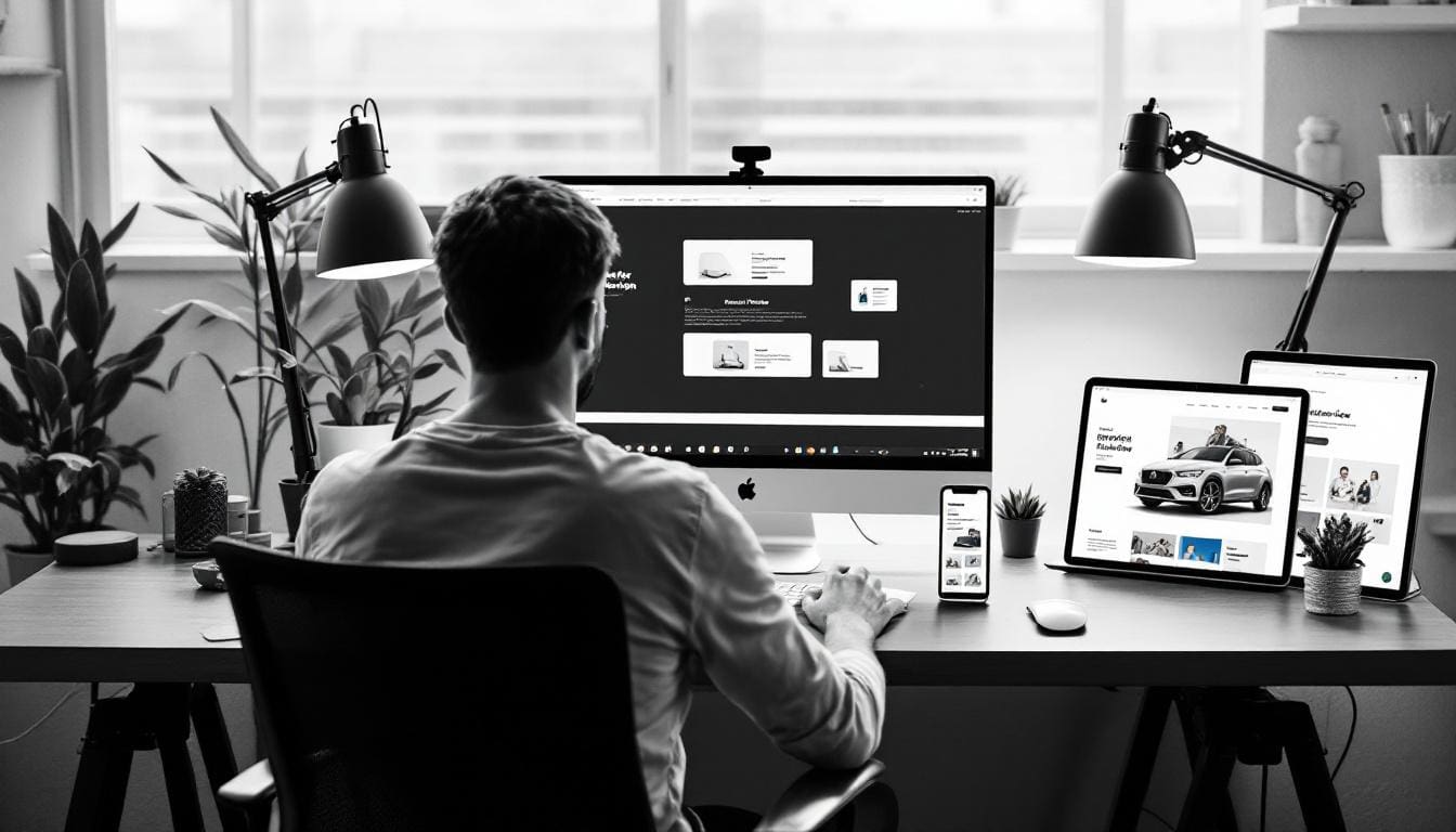
A mobile-first strategy involves prioritising touch-friendly interfaces, simplifying navigation menus, and optimising images and content to load quickly. Responsive design then adapts this layout fluidly to larger screens such as tablets and desktops, maintaining consistency and usability. This approach not only improves user retention but also enhances brand credibility, as users expect flawless performance regardless of the device they use.
Why Mobile Optimisation Matters for Tech Companies
Tech-savvy users tend to access websites on the go, often relying on smartphones or tablets. A site that loads slowly or feels clunky on mobile can quickly frustrate visitors, leading to higher bounce rates. Moreover, search engines like Google prioritise mobile-friendly websites in their rankings, making mobile optimisation a key factor for visibility.
Furthermore, the importance of mobile optimisation extends beyond just aesthetics and functionality; it also plays a crucial role in user engagement and conversion rates. For instance, studies have shown that users are more likely to complete a purchase or sign up for a service when the mobile experience is seamless and enjoyable. This means that tech companies must invest in understanding their audience's mobile behaviour, ensuring that every touchpoint is designed to facilitate a smooth user journey. With features like one-click purchasing and easy access to customer support, businesses can significantly enhance user satisfaction and loyalty.
Additionally, as mobile technology continues to evolve, incorporating features such as voice search and augmented reality can further enrich the user experience. These innovations not only cater to the growing expectations of consumers but also set brands apart in a competitive landscape. By embracing a mobile-first approach, tech companies can stay ahead of the curve, adapting to trends and harnessing the power of mobile technology to drive growth and engagement.
Incorporate Dark Mode for Modern Appeal and Comfort
Dark mode has become more than just a trend; it’s now a standard feature expected by many users. Offering a dark mode option reduces eye strain, especially in low-light environments, and can extend battery life on mobile devices with OLED screens. This functionality is particularly beneficial for those who spend long hours on their devices, whether for work or leisure, as it allows for a more comfortable viewing experience without the harsh glare of bright screens.
From a design perspective, dark mode lends a sleek and contemporary look that resonates well with tech audiences. It also allows brands to showcase their creativity by experimenting with colour contrasts and highlights that stand out against dark backgrounds. This aesthetic not only enhances visual appeal but also creates a more immersive atmosphere, drawing users into the content in a way that bright modes often cannot achieve. As such, many brands are now rethinking their design strategies to incorporate this feature, ensuring they stay relevant in a competitive market.
Implementing Dark Mode Thoughtfully
When integrating dark mode, ensure that all elements—text, icons, buttons—remain clear and accessible. Avoid harsh contrasts that can cause discomfort, and test across different devices to maintain consistency. Providing users with the option to toggle between light and dark modes empowers them to personalise their experience. Furthermore, consider the psychological impact of colour choices in dark mode; subtle hues can evoke different emotions and reactions, which can enhance user engagement. For instance, a deep blue might convey calmness, while a vibrant green can inspire creativity, making it essential to choose colours that align with your brand's identity.
Additionally, it is crucial to gather user feedback during the implementation phase. Engaging with your audience can provide insights into their preferences and experiences, allowing for adjustments that cater to their needs. Incorporating user suggestions not only improves the functionality of dark mode but also fosters a sense of community and loyalty among users, as they feel their opinions are valued and considered in the development process. This collaborative approach can ultimately lead to a more successful and widely embraced feature, enhancing the overall user experience.
Leverage AI-Powered Personalisation for Enhanced Engagement
Artificial intelligence is revolutionising how websites interact with visitors. By analysing user behaviour in real-time, AI can deliver personalised content, product recommendations, and customised navigation paths. This level of personalisation increases user engagement and satisfaction, making visitors feel understood and valued.
For tech companies, integrating AI-driven tools can automate customer support through chatbots, tailor marketing messages, and streamline user journeys. This not only boosts conversion rates but also frees up resources to focus on innovation and growth.
Examples of AI in Action on Tech Websites
Imagine a software company’s site that suggests tutorials based on a visitor’s previous interactions or an e-commerce platform offering product bundles tailored to browsing history. These subtle yet powerful personal touches can significantly improve the overall user experience.
Enhance User Experience with AR and VR Elements
Augmented Reality (AR) and Virtual Reality (VR) are transforming how users engage with digital content. Incorporating these technologies into a website can create immersive experiences that set a brand apart from competitors.
For instance, a tech company specialising in hardware could offer virtual product demonstrations, allowing users to explore features interactively. Similarly, VR-enabled virtual tours can showcase office spaces or event setups, adding a dynamic dimension to the website.
Balancing Innovation with Usability
While AR and VR can captivate users, it’s important to implement these features without compromising site performance or accessibility. Providing clear instructions and fallback options for devices that don’t support AR/VR ensures all visitors can benefit from the website’s offerings.
Optimise for Voice Search to Stay Ahead
Voice-activated devices are becoming increasingly popular, changing how people search for information online. Optimising a website for voice search involves adapting content to answer natural, conversational queries.
This means using clear, concise language and structuring content in a way that directly addresses common questions. For tech companies, this could translate into FAQs, how-to guides, and product descriptions that align with how users speak rather than type.
Benefits of Voice Search Optimisation
Voice search optimisation improves accessibility and can boost search engine rankings by catering to emerging user behaviours. It also enhances the overall user experience, making it easier for visitors to find relevant information quickly.
Prioritise Sustainable Web Design Practices
Environmental responsibility is increasingly important to consumers and businesses alike. Sustainable web design focuses on reducing a website’s energy consumption and carbon footprint through efficient coding, optimised images, and green hosting solutions.
Lightweight websites not only benefit the environment but also improve load times and performance. For tech companies, aligning with eco-conscious values can strengthen brand reputation and appeal to a growing segment of environmentally aware customers.
How to Make Your Website More Sustainable
Use compressed images and minimise the use of heavy scripts. Choose hosting providers that use renewable energy and implement caching strategies to reduce server load. These steps contribute to a faster, greener website that meets modern expectations.
Ensure Ultra-Fast Load Times for Better User Retention
Speed is critical in web design. Studies show that if a website takes more than three seconds to load, the likelihood of users leaving increases by 32%. For tech companies, where users expect efficiency, slow load times can be particularly damaging.
Techniques such as Accelerated Mobile Pages (AMP), Progressive Web Apps (PWAs), and lazy loading images can dramatically improve performance. These technologies help deliver content quickly and smoothly, even on slower connections.
Technical Tips to Boost Website Speed
Optimise code by removing unnecessary elements, leverage browser caching, and use Content Delivery Networks (CDNs) to serve content closer to the user’s location. Regularly testing site speed and addressing bottlenecks ensures a consistently fast experience.
Use Bold and Experimental Typography to Stand Out
Typography plays a crucial role in defining a website’s personality. Moving away from traditional fonts to bold, oversized, and experimental typefaces can capture attention and reinforce brand identity.
For tech companies, this approach can communicate innovation and confidence. It’s important, however, to maintain readability and balance creative fonts with clean layouts to avoid overwhelming users.
Tips for Effective Typography
Pair bold headings with simpler body text to create contrast. Use typography to guide users through the content hierarchy and highlight key messages. Testing across devices ensures that fonts render well everywhere.
Integrate Micro-Interactions for a Polished User Experience
Micro-interactions are subtle animations or feedback cues that respond to user actions, such as button clicks, form submissions, or hover effects. These small details make a website feel more interactive and refined.
Incorporating micro-interactions can improve usability by providing immediate feedback, reducing uncertainty, and delighting users with smooth transitions.
Examples of Micro-Interactions
Animated loading indicators, button colour changes on hover, or confirmation messages after form submissions are simple yet effective micro-interactions. They enhance engagement without distracting from the main content.
Design with Accessibility as a Priority
Creating an accessible website is both an ethical responsibility and a business advantage. Ensuring that people of all abilities can use the site broadens the audience and complies with legal standards such as the Web Content Accessibility Guidelines (WCAG) 2.2.
Key accessibility features include screen reader compatibility, keyboard navigation, sufficient colour contrast, and clear, descriptive alt text for images.
Making Accessibility Part of the Design Process
Involve accessibility testing early and throughout development. Use tools to check compliance and gather feedback from users with disabilities. An accessible website demonstrates inclusivity and enhances usability for everyone.
Conclusion: Building a Future-Proof Tech Website
Designing a custom website for a tech company in 2025 involves a strategic blend of mobile-first design, modern aesthetics like dark mode, and advanced technologies such as AI personalisation and AR/VR elements. Prioritising fast load times, sustainable practices, and accessibility ensures the site meets both user expectations and ethical standards.

Bold typography and micro-interactions add personality and polish, while voice search optimisation keeps the website aligned with emerging user behaviours. By integrating these elements thoughtfully, tech companies can create websites that are not only visually appealing but also highly functional, engaging, and ready to meet the challenges of the digital future.
Ready to elevate your tech company's online presence with a state-of-the-art website that embodies all the principles we've discussed? Kickass Online specializes in bespoke web development, from WordPress to custom Angular, MERN, or Laravel projects. We enhance your digital strategy with website maintenance, SEO, PPC, and AI-driven automations to grow your business. Don't miss the opportunity to stand out in the digital future. Book a discovery call with us today and let's create a website that's as kickass as your tech!