
Nearly half of british small businesses report that a poorly planned website keeps customers away. The right online presence has become a direct line to building trust and driving sales in an increasingly digital world. With so much riding on your website’s design and function, learning how to set clear goals, understand your audience, and create a seamless user experience can help your brand stand out and attract qualified leads.
Table of Contents
- Step 1: Define Your Website Objectives And Audience
- Step 2: Plan Your Site Structure And Content
- Step 3: Choose Your Design And Development Platform
- Step 4: Build And Customise Your Website Layout
- Step 5: Optimise For Seo And Mobile Devices
- Step 6: Test, Launch And Review Your Website
Quick Summary
| Key Takeaway | Explanation |
|---|---|
| 1. Clearly define objectives and audience | Establishing clear goals and understanding your target audience is crucial for effective website design. |
| 2. Plan intuitive site structure | A well-organised structure enhances navigation and user experience, helping visitors find information efficiently. |
| 3. Choose the right platform | Select a website platform that aligns with your business needs and technical capabilities for future growth. |
| 4. Optimise for SEO and mobile use | Implementing effective SEO strategies and prioritising mobile responsiveness significantly boost visibility and engagement. |
| 5. Test thoroughly before launch | Comprehensive testing across devices ensures functionality and user satisfaction, paving the way for a successful website launch. |
Step 1: Define your website objectives and audience
Successfully designing a business website begins with crystal clear objectives and a precise understanding of your target audience. Your website will serve as a digital representation of your brand, so establishing its core purpose and intended users is paramount.
Starting with website goals requires deep strategic thinking. Columbia University recommends defining an editorial mission that aligns with your organisational objectives. For most businesses, website objectives typically fall into several key categories: generating leads, selling products directly, providing information, building brand credibility, or facilitating customer service interactions.
To define your audience effectively, conduct thorough research into your potential customers demographic characteristics, online behaviours, and specific needs. Create detailed audience personas that capture age ranges, professional backgrounds, pain points, and digital preferences. This understanding will directly inform your website design decisions such as layout, colour schemes, messaging tone, and functionality. Are your customers tech savvy professionals seeking efficient solutions? Or perhaps local consumers looking for personalised services?
Precisely mapping your website objectives and audience ensures your digital presence becomes a powerful strategic asset rather than merely an online placeholder. Your website should speak directly to your ideal customers, addressing their specific challenges and presenting your business as the optimal solution.
Here is a summary of common business website objectives and their strategic impact:
| Objective | Key Benefit | Typical Audience |
|---|---|---|
| Generate leads | Increases potential client base | B2B professionals, SMEs |
| Sell products online | Boosts direct revenue | Consumers, retail customers |
| Provide information | Establishes authority | Researchers, information seekers |
| Build brand credibility | Enhances trust and reputation | General public, media |
| Facilitate customer service | Improves client retention | Existing customers |
Professional insight: Always validate your initial audience assumptions through direct market research, customer interviews, and analytics data to refine your understanding continually.
Advanced tip: Create multiple audience personas representing different segments to ensure your website design accommodates diverse user needs and expectations.
Step 2: Plan your site structure and content
Developing a strategic website structure serves as the architectural blueprint for your digital presence. This critical planning stage determines how effectively your audience will navigate and interact with your online platform.

Case Western Reserve University emphasises the importance of creating an intuitive information architecture that connects your content logically and purposefully. Your site structure should reflect a clear hierarchy that guides visitors seamlessly from general information to specific details. Begin by mapping out primary navigation categories that represent your core business offerings such as services, about us, contact, portfolio or case studies.
When planning content, consider a user journey that anticipates visitor needs and questions. Structure your pages to provide progressive levels of detail starting with concise overviews that invite deeper exploration. Each section should communicate your value proposition clearly while maintaining a consistent brand voice. Think strategically about how different content types support your business goals: blog posts demonstrate expertise, service pages explain solutions, testimonials build trust, and clear calls to action encourage engagement.
Your website architecture must balance aesthetic appeal with functional clarity. Aim for a design that allows visitors to find information within three clicks from the homepage. This means creating intuitive menus, logical content groupings, and clear pathways that reduce user frustration and support smooth navigation.
Professional insight: Regularly review your site structure using web analytics to understand how users actually interact with your content and be prepared to adapt your architecture accordingly.
Advanced tip: Create a visual sitemap before building your website to ensure your content structure makes logical sense and meets both user needs and business objectives.
Step 3: Choose your design and development platform
Selecting the right website design and development platform represents a pivotal decision that will shape your digital strategy and online performance. Your chosen platform must align seamlessly with your business goals, technical capabilities, and long term growth objectives.
Website development platforms range from user friendly website builders to more complex content management systems. For small businesses seeking simplicity, drag and drop platforms like Wix or Squarespace offer quick setup with minimal technical knowledge. These solutions provide pre designed templates and integrated hosting that can get your website live rapidly. Alternatively, WordPress remains a powerful option offering greater flexibility and customisation potential for businesses requiring more sophisticated functionality.
Consider critical factors when evaluating platforms: scalability, ease of use, design flexibility, integration capabilities, and ongoing maintenance requirements. Technical features such as mobile responsiveness, SEO tools, security protocols, and e commerce functionality should influence your selection. Assess your internal technical skills realistically some platforms demand more advanced web development expertise than others. Smaller businesses might prioritise intuitive interfaces, while larger organisations may require robust custom development options.
Your platform choice impacts not just initial website creation but future growth potential. Select a solution that can evolve alongside your business, supporting additional features and increasing complexity as your digital presence expands.
The table below compares popular website development platforms for businesses:
| Platform | Technical Skill Needed | Design Flexibility | Suitable Business Size |
|---|---|---|---|
| Wix | Low | Limited but user-friendly | Small businesses, startups |
| Squarespace | Low | Visually strong templates | Freelancers, small firms |
| WordPress | Moderate to high | Highly customisable | All sizes, growing companies |
| Custom CMS | High | Fully customisable | Large organisations |
Professional insight: Always test platform features through free trials or demonstration versions before making a final commitment.
Advanced tip: Prioritise platforms offering comprehensive support documentation and active user communities to facilitate smoother technical problem solving.
Step 4: Build and customise your website layout
Creating an engaging website layout transforms your digital strategy from conceptual planning into visual reality. This critical stage determines how effectively your audience will interact with and perceive your brand online.
The University of Maryland’s Website Manual emphasises the importance of aligning layout design with audience needs and organisational goals. Begin by establishing a clear visual hierarchy that guides visitors intuitively through your content. Your layout should create a natural flow that draws attention to key messages and calls to action. Consider implementing a grid based design that provides structure while maintaining visual flexibility.
Prioritise responsive design principles that ensure your website looks exceptional across different devices and screen sizes. This means creating layouts that adapt seamlessly from desktop computers to mobile smartphones. Pay careful attention to white space, typography, and colour schemes that reflect your brand identity while maintaining readability. Strategic placement of visual elements like images, icons, and graphics can break up text and maintain user engagement.
When customising your layout, focus on creating intuitive navigation pathways that allow visitors to find information quickly and effortlessly. Use consistent design elements across pages to provide a cohesive user experience. Consider how different sections of your website will interconnect and ensure that each page contributes to a unified narrative about your business.
Professional insight: Conduct user testing with multiple device types to validate your layout’s effectiveness and identify potential navigation challenges.
Advanced tip: Create multiple layout variations and use heat mapping tools to understand how users interact with different design approaches.
Step 5: Optimise for SEO and mobile devices
Transforming your website into a powerful digital marketing tool requires strategic search engine optimisation and robust mobile responsiveness. This crucial stage determines how effectively your online presence will attract and engage potential customers.
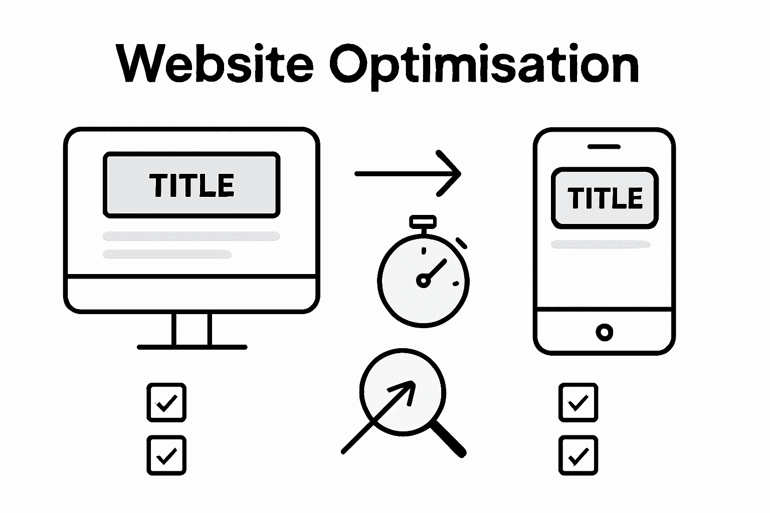
Comprehensive research highlights the critical importance of aligning website objectives with SEO and mobile design strategies to achieve meaningful business outcomes. Start by implementing technical SEO fundamentals such as clean website structure, fast loading speeds, and metadata optimisation. Focus on creating high quality, keyword rich content that addresses your target audience’s specific needs and search intentions. This means developing informative pages that genuinely answer user queries while incorporating strategic keyword placement.
Mobile optimisation goes beyond simply making your website responsive. Ensure your design provides an exceptional user experience across all device types by implementing touch friendly navigation, readable font sizes, and streamlined content layouts. Google prioritises mobile friendly websites in search rankings, making this aspect crucial for visibility. Test your website thoroughly on multiple devices and screen sizes, paying close attention to loading performance, image scaling, and interactive element functionality.
Keyword research remains fundamental to your SEO strategy. Utilise tools that help identify search terms your potential customers are using. Integrate these keywords naturally into your content, headings, and metadata without compromising readability. Remember that search engines increasingly prioritise user experience and content quality over keyword density.
Professional insight: Conduct regular technical SEO audits to identify and resolve potential performance issues that could impact your search engine rankings.
Advanced tip: Implement schema markup to provide search engines with structured data about your business, enhancing your potential for rich search result displays.
Step 6: Test, launch and review your website
The final stage of website development requires meticulous attention to detail and strategic preparation to ensure a seamless digital presence that represents your business effectively. This crucial phase transforms your carefully designed website from a concept into a live, functional platform.
The University of Winnipeg’s lecture notes underscore the importance of comprehensive testing and review processes before website launch. Begin by conducting thorough functionality tests across multiple browsers and devices. Check every interactive element including forms, links, navigation menus, and contact mechanisms. Verify that all pages load quickly, display correctly, and provide a consistent user experience regardless of the device or screen size.
Before going live, perform comprehensive user acceptance testing. Invite a small group of trusted individuals who represent your target audience to navigate the website and provide honest feedback. Pay attention to their user experience observations such as navigation ease, content clarity, and overall visual appeal. Simultaneously, run technical performance tests using tools that analyse website speed, mobile responsiveness, and potential security vulnerabilities.
After launching your website, establish a continuous review and improvement cycle. Implement web analytics to track user behaviour, engagement metrics, and conversion rates. Set up regular monthly or quarterly reviews to assess your website’s performance against initial business objectives. Be prepared to make incremental improvements based on real user data and emerging digital trends.
Professional insight: Create a structured feedback mechanism on your website that allows visitors to share their experience and suggestions for improvement.
Advanced tip: Schedule quarterly technical and content audits to ensure your website remains current, secure, and aligned with your evolving business goals.
Unlock Business Success with Expert Website Design and Support
Building a business website that truly connects with your audience involves more than just good looks. This article highlights crucial challenges such as defining clear objectives, planning an intuitive site structure, choosing the right development platform, and optimising for SEO and mobile devices. Many businesses struggle to translate these concepts into a high-performing website that drives leads, builds credibility and delights users.
At Kickass Online, we understand these pain points and offer personalised, results-driven solutions to overcome them. Our specialist team focuses on building tailored websites that align perfectly with your specific audience personas and business goals. From seamless responsive layouts and keyword-focused content to robust SEO strategies, we ensure your online presence stands out and grows sustainably. Discover how we put proven web design steps into action by exploring our curated collection of successful projects in the Websites | Kickass Online category.
Ready to transform your digital strategy with a website built for business growth? Visit https://kickassonline.com to book your consultation and access practical guides in Tutorials | Kickass Online. Take the decisive step today to create a website that delivers exceptional value and converts visitors into loyal customers.
Frequently Asked Questions
What are the main objectives for designing a business website?
The primary objectives typically include generating leads, selling products, providing information, building brand credibility, and facilitating customer service interactions. To define your objectives clearly, list the top three goals for your website and align them with your overall business strategy.
How can I effectively define my target audience for my website?
Conduct thorough research into demographic characteristics, online behaviours, and specific needs of your potential customers. Create detailed audience personas that include age ranges, professional backgrounds, and pain points to guide your website design.
What should I consider when planning my website structure?
Focus on creating an intuitive information architecture that reflects a clear hierarchy and allows easy navigation. To do this, map out your primary navigation categories and ensure users can find information in three clicks or less from the homepage.
How can I optimise my website for search engines and mobile devices?
Implement technical SEO fundamentals and ensure fast loading speeds while creating high-quality, keyword-rich content. To enhance mobile responsiveness, test your website on various devices and ensure that layouts are touch-friendly and legible across all screen sizes.
What steps should I take before launching my website?
Prior to going live, conduct thorough functionality tests across multiple browsers and devices, checking all interactive elements for performance. Invite a small group of target audience representatives to provide feedback on usability and content clarity, making necessary adjustments based on their observations.