Responsive Design: Boosting Website Performance for SMEs

More than 60 percent of british consumers use smartphones to browse and shop, yet many small businesses still struggle with outdated websites that frustrate mobile users. In today’s competitive market, responsive design does more than just make your site look tidy. It can turn casual visitors into loyal customers by keeping navigation simple and content clear. Discover how tapping into responsive strategies helps british retailers and service providers connect better, win trust, and drive more sales.
Table of Contents
- Defining Responsive Design for Modern Websites
- How Responsive Design Adapts to Devices
- Core Elements of a Responsive Website
- Business Benefits and Real-World Examples
- Common Pitfalls and How to Avoid Them
Key Takeaways
| Point | Details |
|---|---|
| Responsive Design is Essential | Websites must adapt to various devices for optimal user experience in a mobile-first world. |
| Technical Foundations Matter | Employ techniques like CSS media queries and fluid grids to ensure seamless layout adjustments. |
| User Experience is Key | Focus on touch-friendly navigation and responsive typography to enhance usability across devices. |
| Performance Optimization is Crucial | Regularly test and optimise for speed, as slow loading times can negatively impact user engagement and SEO. |
Defining Responsive Design for Modern Websites
Responsive design is a strategic web development approach that transforms how websites adapt across different devices and screen sizes. At its core, responsive web design enables websites to dynamically adjust their layout, images, and navigation to provide optimal viewing experiences whether accessed on a desktop, tablet, or smartphone.
The fundamental principle behind responsive design involves creating flexible layouts that automatically recalibrate based on screen dimensions. Web developers achieve this through advanced techniques like CSS media queries, fluid grid systems, and adaptable image scaling. These techniques ensure that website elements resize, reposition, and reformat seamlessly, eliminating horizontal scrolling and maintaining readability across diverse digital platforms.
Modern responsive websites go beyond simple resizing. They intelligently restructure content, prioritise mobile-friendly navigation, and ensure lightning-fast loading speeds. This approach means a single website can deliver a consistent, high-quality user experience regardless of the device being used. Responsive web design has become critical for businesses seeking to engage users effectively in an increasingly mobile-first digital landscape.
Pro tip: Consider implementing a mobile-first design strategy, where you design for mobile interfaces first and then progressively enhance the layout for larger screens.
How Responsive Design Adapts to Devices
Responsive design operates through sophisticated techniques that enable websites to seamlessly transform across different digital devices. Fluid grid systems are the backbone of this adaptive approach, allowing content to dynamically resize and reposition based on screen dimensions. This means website layouts can intelligently adjust from large desktop monitors to compact smartphone screens without losing visual integrity or user experience.
The core mechanisms driving device adaptation include flexible image scaling, CSS media queries, and breakpoint configurations. Web developers strategically programme these elements to detect screen width, orientation, and resolution, triggering precise layout modifications. For instance, navigation menus might collapse into hamburger icons on mobile devices, while sidebars could reflow or disappear entirely depending on available screen real estate. Responsive design techniques ensure that content remains readable, accessible, and visually appealing across smartphones, tablets, laptops, and desktop computers.
Beyond visual adaptation, responsive design considers user interaction nuances across different devices. Touch interfaces require larger buttons and more generous spacing compared to mouse-driven desktop environments. Intelligent responsive frameworks anticipate these differences, automatically adjusting interactive elements to enhance usability. This holistic approach means users experience consistent functionality and design language regardless of their chosen device, creating a unified digital experience that feels intentional and professional.
Here’s a summary of the key techniques that enable responsive design and their benefits for website users:
| Technique | How it Works | User Benefit |
|---|---|---|
| CSS Media Queries | Detect device characteristics | Consistent layout across devices |
| Fluid Grid Systems | Use relative sizing units | Content scales smoothly |
| Flexible Image Scaling | Images resize for screen size | Faster loading, reduced distortion |
| Breakpoint Configuration | Set layout change points | Improved readability and usability |
Pro tip: Test your responsive design across multiple devices and screen sizes using browser developer tools to ensure seamless adaptation and user experience.
Core Elements of a Responsive Website
Responsive websites rely on a sophisticated framework of interconnected design principles that enable seamless adaptation across devices. Flexible grid systems form the foundational structure, utilising relative units like percentages instead of fixed pixel measurements. This approach allows content to dynamically resize and reposition, ensuring that websites maintain visual integrity whether viewed on a smartphone, tablet, or desktop computer.
Critical technical components include CSS media queries, which act as intelligent triggers for layout transformations. These queries detect specific device characteristics such as screen width, orientation, and resolution, enabling targeted styling adjustments. Responsive images represent another crucial element, automatically scaling and reformatting to prevent distortion or unnecessary bandwidth consumption. Responsive design techniques also prioritise performance optimisation, compressing assets and implementing semantic HTML to support diverse user interactions and accessibility requirements.

Beyond technical implementation, responsive design demands a holistic approach to user experience. Navigation elements must be touch-friendly, with appropriately sized buttons and intuitive interaction models. Typography needs careful consideration, with font sizes and line heights adapting to different screen dimensions to maintain readability. Intelligent responsive frameworks anticipate these nuanced requirements, creating digital experiences that feel intentional and professionally crafted across every potential device and screen size.
Pro tip: Implement a mobile-first design strategy, developing your website’s core experience for smaller screens before progressively enhancing layout for larger displays.
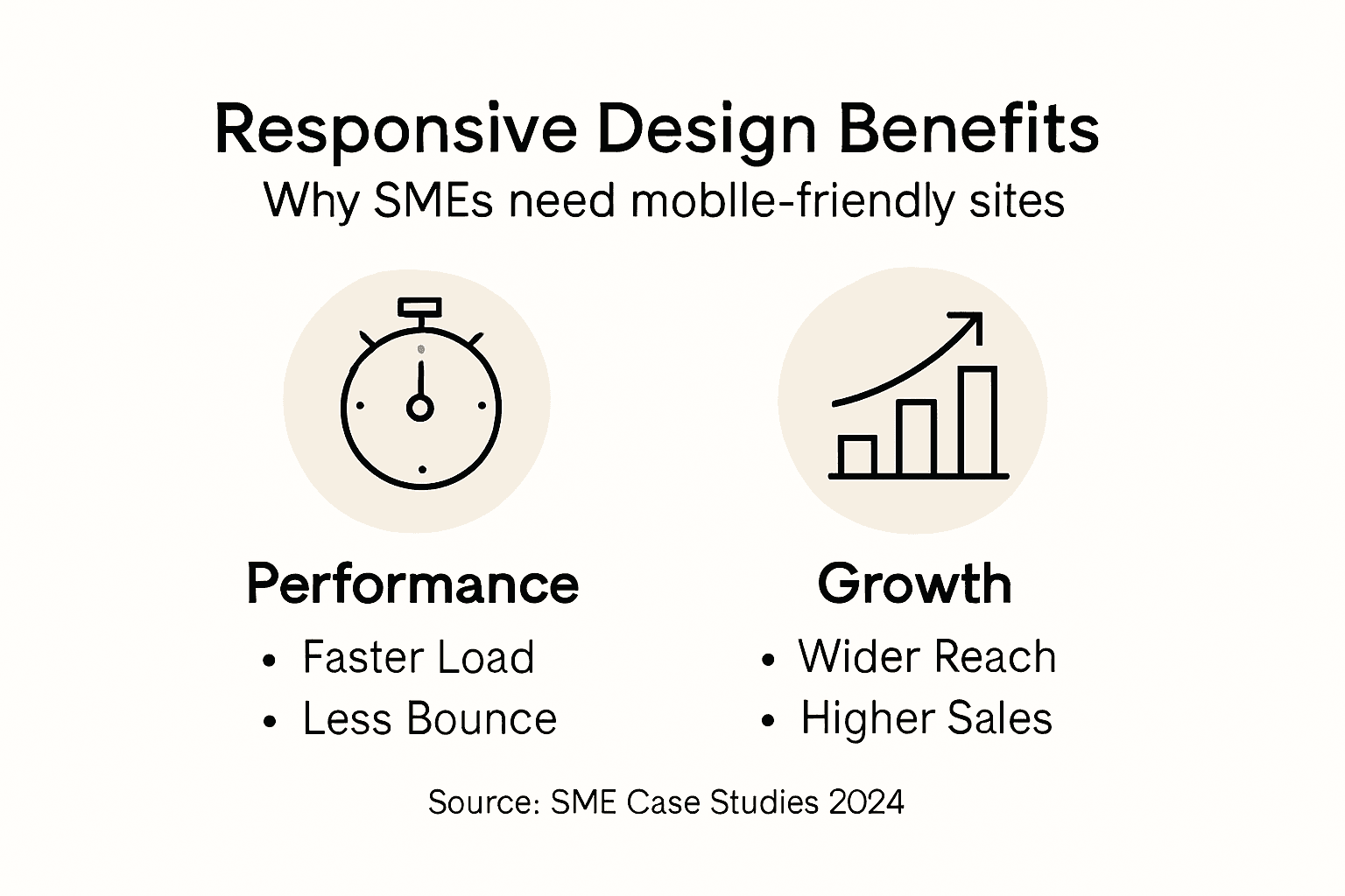
Business Benefits and Real-World Examples
Responsive web design delivers substantial strategic advantages for small and medium enterprises seeking to establish a robust digital presence. Business performance metrics demonstrate significant improvements in user engagement, with companies experiencing reduced bounce rates and enhanced conversion potential across multiple device platforms. Small businesses can particularly benefit from a unified website approach that eliminates the need for separate mobile and desktop versions, streamlining maintenance and development costs.
The technical and commercial implications of responsive design extend far beyond simple visual adaptation. Responsive design strategies provide critical SEO advantages, particularly with Google’s mobile-first indexing approach. This means websites optimised for multiple devices are more likely to achieve higher search rankings, driving increased organic traffic and potential customer interactions. Additionally, responsive design supports improved user experience through faster loading times, intuitive navigation, and consistent branding across smartphones, tablets, and desktop computers.
Real-world case studies illuminate the transformative potential of responsive web design for businesses. Retail companies have reported significant increases in mobile purchasing after implementing responsive interfaces, with some experiencing up to 30% growth in mobile transaction volumes. Service-based businesses have similarly witnessed improved customer engagement, as responsive websites enable seamless information access and interaction regardless of the device being used. These tangible outcomes demonstrate that responsive design is not merely a technical enhancement but a strategic business investment with measurable financial implications.
Pro tip: Conduct regular cross-device user testing to identify and address potential responsive design limitations in your website’s performance.
Common Pitfalls and How to Avoid Them
Responsive web design presents numerous challenges that can undermine a website’s effectiveness if not carefully addressed. Responsive design challenges frequently emerge from inadequate testing and poor implementation strategies. Small businesses often struggle with creating consistent layouts across different devices, leading to user frustration and potential loss of customer engagement. Common mistakes include using fixed-width layouts, neglecting touch interface considerations, and failing to prioritise content hierarchy across various screen sizes.
Performance optimization represents another critical area where responsive design can fall short. Website performance strategies highlight the importance of image compression, efficient code structure, and strategic breakpoint configuration. Many developers inadvertently create bloated websites by not optimising images for different devices or implementing unnecessarily complex navigation structures. This can result in slower loading times, particularly on mobile networks, which directly impacts user experience and search engine rankings.
Accessibility and user interaction present additional layers of complexity in responsive design. Designers must carefully consider touch target sizes, ensuring buttons and interactive elements are large enough for comfortable mobile interaction while maintaining an aesthetically pleasing desktop experience. This requires a delicate balance between visual design, functional usability, and performance optimization. Successful responsive design demands a holistic approach that considers user experience across all potential device types, from small smartphone screens to large desktop monitors.
The table below contrasts some common responsive design mistakes with recommended solutions:
| Pitfall | Impact on Users | Effective Solution |
|---|---|---|
| Fixed-width layouts | Poor viewing on mobiles | Use fluid, percentage-based grids |
| Overlooking touch interfaces | Difficult navigation | Design for larger touch targets |
| Neglecting content hierarchy | Hard-to-scan pages | Prioritise top content for devices |
| Unoptimised images | Slow loading times | Compress and scale assets |
Pro tip: Implement comprehensive cross-device testing using real devices and browser developer tools to identify and resolve responsive design inconsistencies before launching your website.
Elevate Your SME’s Online Presence with Expert Responsive Design
Struggling with inconsistent layouts or slow loading times on your business website Adapt our proven responsive design strategies to deliver a seamless user experience across all devices. At Kickass Online, we understand the challenges SMEs face with fixed-width layouts, unoptimised content, and limited mobile functionality. Our team specialises in creating flexible grid systems and employing CSS media queries to ensure your website not only looks superb but also performs excellently on smartphones, tablets, and desktops alike. Achieve higher search rankings, reduce bounce rates, and convert visitors into loyal customers through a bespoke, mobile-first approach.

Ready to transform your website into a powerful growth engine Don’t let common responsive design pitfalls hold your business back. Book a personalised consultation with Kickass Online today and gain access to targeted web development, SEO optimisation, and ongoing maintenance tailored exclusively for SMEs. Discover how our client-focused process fuels business performance by visiting our website. Learn more about our commitment to delivering high-converting websites and exceptional digital results at Kickass Online. Take the first step towards elevating your online presence by connecting with expert digital strategists who listen, understand, and execute just for you.
Frequently Asked Questions
What is responsive design?
Responsive design is a web development approach that enables websites to adapt their layout, images, and navigation seamlessly across different devices and screen sizes, ensuring an optimal viewing experience on desktops, tablets, and smartphones.
How does responsive design improve website performance for SMEs?
Responsive design improves website performance by eliminating the need for separate mobile and desktop versions, streamlining maintenance, enhancing SEO rankings through mobile optimisation, and providing a consistent user experience that can reduce bounce rates and increase conversions.
What are the key techniques used in responsive design?
Key techniques include CSS media queries for detecting device characteristics, fluid grid systems for flexible layouts, and responsive image scaling to ensure images load correctly across various screen sizes, all contributing to a better user experience.
What common mistakes should be avoided in responsive design?
Common mistakes include using fixed-width layouts, neglecting touch interface considerations, and failing to prioritise content hierarchy across different devices, which can lead to poor user experience and website performance.
Recommended


Book A Discovery Call
Stay Connected

