What Is Mobile Optimisation and Why It Matters

More than 80 percent of British shoppers use their phones to research or buy products, and small retailers in Milton Keynes risk losing sales with outdated sites. A seamless mobile experience now sets local businesses apart, keeping customers engaged and coming back. This article highlights the practical methods and solutions that help retail owners create fast, responsive websites that boost user satisfaction and drive real growth.
Table of Contents
- Defining Mobile Optimisation For Modern Websites
- Key Features And Methods Explained
- Types Of Mobile Optimisation Solutions
- Business Benefits For SME Retailers
- Common Pitfalls And How To Avoid Them
Key Takeaways
| Point | Details |
|---|---|
| Emphasise Responsive Design | Focus on creating flexible layouts that adjust dynamically across various devices. |
| Regular Performance Testing | Conduct routine assessments of your website’s mobile responsiveness and speeds. |
| Avoid Common Pitfalls | Mitigate excessive load times and security vulnerabilities through best practices. |
| Leverage Mobile Technologies | Utilise advanced methodologies like server-side caching and progressive web apps for enhanced user experiences. |
Defining Mobile Optimisation for Modern Websites
Mobile optimisation represents a strategic approach to website design that ensures seamless functionality and visual appeal across multiple digital devices. At its core, mobile optimisation creates web experiences that adapt dynamically to different screen sizes and resolutions, prioritising user experience on smartphones, tablets, and desktop computers.
The fundamental principle behind mobile optimisation is the responsive design methodology, which involves creating flexible webpage layouts that automatically adjust their configuration based on device characteristics. This approach goes beyond simply shrinking website elements to fit smaller screens. Instead, it involves intelligent redesign that considers factors like touch interactions, screen resolution, and mobile browsing behaviours. Mobile first design prioritises creating experiences optimised for mobile screen sizes before adapting to larger displays, representing a significant shift from traditional desktop-centric web development strategies.
Modern mobile optimisation techniques incorporate several key technical elements. These include fluid grid systems that proportionally scale webpage components, responsive image techniques that serve appropriately sized graphics, and CSS media queries that enable precise layout modifications. By implementing these strategies, businesses can create websites that provide consistent, high-quality user experiences regardless of the device being used.
Pro tip: Regularly test your website across multiple devices and screen sizes to ensure consistent performance and identify potential optimisation opportunities.
Key Features and Methods Explained
Mobile optimisation encompasses a comprehensive set of technical strategies designed to enhance website performance across diverse digital platforms. Performance optimization techniques focus on improving non-functional characteristics such as energy efficiency and memory consumption, ensuring websites deliver exceptional user experiences regardless of device specifications.
Key mobile optimisation methods involve several critical technical approaches. These include responsive design techniques that dynamically adjust layout structures, adaptive image scaling to reduce loading times, and performance-focused coding practices that minimise resource consumption. Developers utilise sophisticated CSS media queries, fluid grid systems, and intelligent scaling algorithms to create websites that seamlessly transition between different screen sizes and device capabilities.

Mobile development best practices emphasise creating user-centred designs that prioritise accessibility, performance, and continuous improvement. This involves implementing advanced techniques like lazy loading for images, minimising HTTP requests, compressing website assets, and developing streamlined code that reduces unnecessary computational overhead. By integrating these methods, businesses can create mobile-optimised websites that deliver fast, responsive, and engaging user experiences across smartphones, tablets, and desktop computers.
Pro tip: Implement automated performance testing tools to regularly assess and optimise your website’s mobile responsiveness and loading speeds.
Types of Mobile Optimisation Solutions
Mobile optimisation solutions encompass a diverse range of technical approaches designed to address the unique challenges of delivering exceptional digital experiences across different mobile devices. These solutions can be broadly categorised into three primary strategies: server-side optimisations, client-side enhancements, and hybrid methodologies that combine multiple techniques to improve overall website performance and user experience.
The first category, server-side optimisations, involves backend strategies that prepare and deliver content more efficiently to mobile devices. This includes techniques like image compression, minifying CSS and JavaScript files, implementing efficient caching mechanisms, and utilising content delivery networks (CDNs) to reduce latency. Mobile development solutions also encompass critical choices between native and cross-platform application development approaches, each offering distinct advantages for businesses seeking to create robust mobile experiences.
Client-side optimisation techniques focus on improving the front-end performance and user interaction of mobile websites. These methods include implementing responsive design principles, using adaptive images that scale appropriately, leveraging browser caching, minimising HTTP requests, and developing lightweight, efficient JavaScript that reduces computational overhead. Advanced techniques also involve implementing progressive web app technologies, which enable websites to function more like native mobile applications, providing seamless offline capabilities and enhanced user engagement.
The following table compares the main mobile optimisation solution types and their effects.
| Solution Type | Key Focus Areas | Main Technologies | Typical Business Benefit |
|---|---|---|---|
| Server-side | Content delivery, speed | Caching, CDNs, compression | Faster loading, improved reliability |
| Client-side | User interface, interactivity | Responsive CSS, adaptive images | Engaging browsing, higher retention |
| Hybrid | Combined optimisation | PWAs, smart asset allocation | Best of speed and interactivity |
Pro tip: Conduct regular mobile performance audits using tools like Google PageSpeed Insights to identify and address specific optimisation opportunities for your website.
Business Benefits for SME Retailers
Digitalisation offers transformative opportunities for small and medium-sized retail enterprises, particularly through strategic mobile optimisation. By embracing mobile-friendly digital strategies, SME retailers can dramatically enhance their competitive positioning, reach broader customer segments, and create more engaging shopping experiences that drive substantial business growth.
Mobile optimisation provides multiple strategic advantages for SME retailers. These include significantly improved customer engagement through responsive website designs, enhanced online visibility, and the ability to provide personalised shopping experiences across multiple digital platforms. Digital transformation enables retailers to leverage mobile technologies for overcoming traditional resource constraints, allowing smaller businesses to compete effectively with larger enterprise competitors by delivering sophisticated, user-friendly digital experiences that meet contemporary consumer expectations.
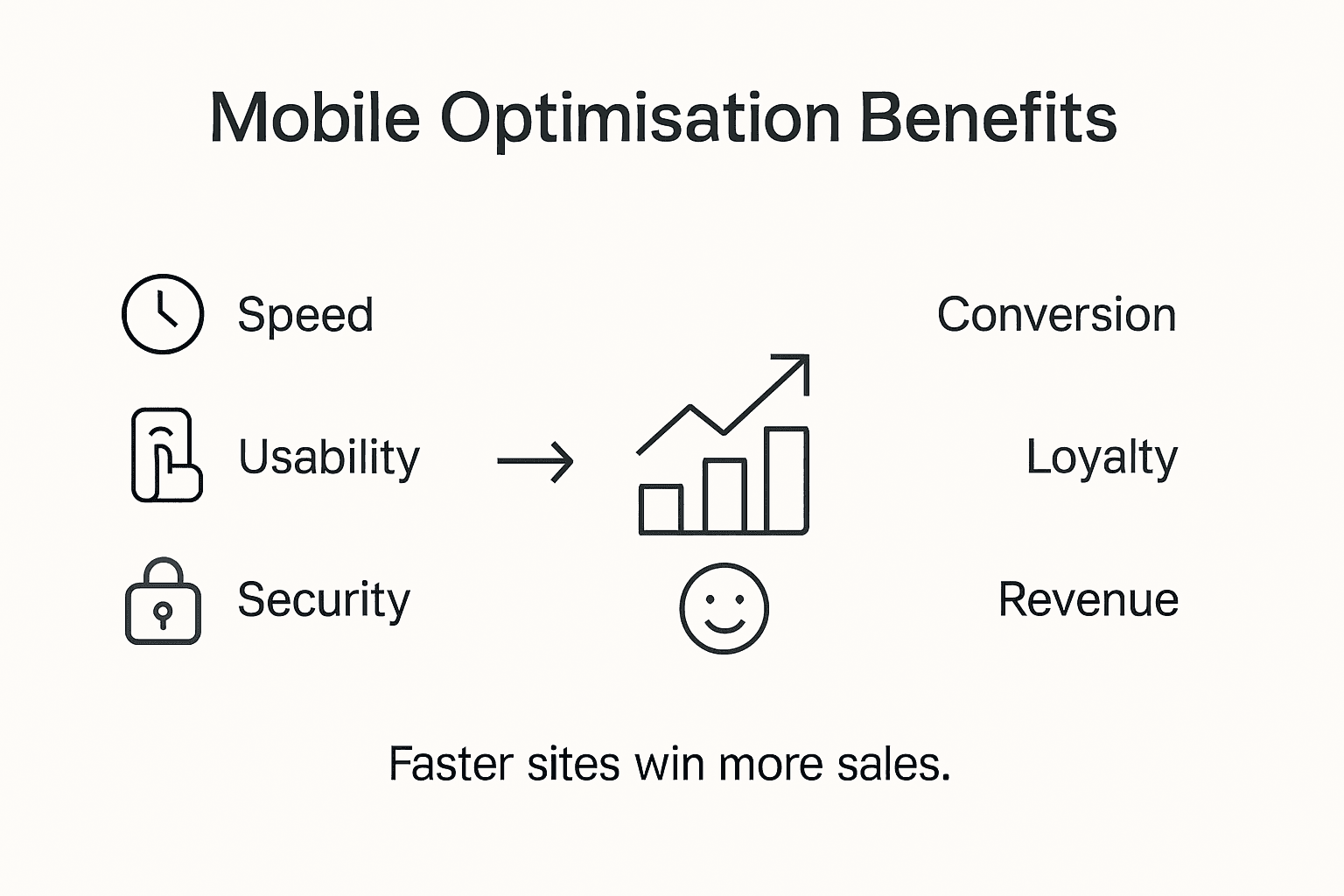
The financial implications of mobile optimisation are particularly compelling for SME retailers. Advanced mobile strategies can reduce customer acquisition costs, increase conversion rates, and provide granular insights into consumer behaviour through sophisticated analytics. By implementing responsive design, implementing fast-loading mobile interfaces, and creating seamless cross-device shopping experiences, retailers can directly improve their bottom line while building stronger, more meaningful connections with their digital customer base.
Here is a summary of major business benefits SME retailers gain from mobile optimisation:
| Benefit | Description | Example Impact |
|---|---|---|
| Enhanced engagement | Captures users with responsive layouts | More time spent on site |
| Broader market reach | Attracts mobile-first consumers | Expanded local and global reach |
| Increased conversion rates | Reduces friction in the shopping process | Higher online sales |
| Lower acquisition costs | Better site performance reduces ad spend | Cost-effective marketing |
Pro tip: Invest in mobile-responsive design that prioritises user experience, focusing on fast load times, intuitive navigation, and clear product presentation to maximise your digital retail performance.
Common Pitfalls and How to Avoid Them
Mobile optimisation presents numerous potential challenges that can significantly undermine website performance, requiring strategic approaches to overcome common technical and design limitations. Small and medium enterprises must navigate a complex landscape of technical constraints, user experience considerations, and performance expectations to create truly effective mobile experiences.
Performance and usability represent critical areas where mobile optimisation efforts frequently falter. Common pitfalls include excessive page load times, non-responsive design elements, complex navigation structures, and inconsistent rendering across different device types. Businesses must prioritise streamlined design principles, implement efficient coding practices, and continuously test their mobile interfaces to ensure smooth, intuitive user interactions that maintain engagement and prevent potential customer abandonment.
Mobile security vulnerabilities pose another significant risk that businesses cannot afford to overlook, with potential consequences ranging from data breaches to compromised user trust. Implementing robust security protocols, utilising encryption technologies, conducting regular security audits, and adhering to comprehensive mobile application security standards are essential strategies for protecting both user data and business reputation. Advanced mobile optimisation requires a holistic approach that balances technical performance, user experience, and stringent security measures.
Pro tip: Implement comprehensive cross-device testing protocols using multiple real-world devices and emulators to identify and resolve potential mobile optimisation challenges before launching your website.
Unlock the Power of Mobile Optimisation for Your Business
Are you struggling with slow loading times or clunky website navigation on mobile devices Mobile optimisation is essential for delivering fast, responsive, and engaging user experiences that keep your customers coming back. This article highlights critical concepts like responsive design, adaptive image scaling, and the importance of seamless cross-device functionality — all key to staying competitive in today’s digital marketplace. If these challenges sound familiar, then a tailored mobile-friendly website could be the game changer you need to boost conversions and grow your online presence.

At Kickass Online, we specialise in creating high-converting, mobile-optimised websites that prioritise user experience and performance. Discover our expert solutions in Websites | Kickass Online designed specifically for small and medium-sized businesses seeking to enhance their digital footprint. Don’t wait until poor mobile performance drives potential customers away Act now by visiting https://kickassonline.com to book a consultation and start transforming your website into a mobile powerhouse. For ongoing insights and tips on maintaining a competitive edge, explore our Tips and Tricks | Kickass Online section and stay ahead in the fast-paced online market.
Frequently Asked Questions
What is mobile optimisation?
Mobile optimisation is a strategic approach to web design that ensures websites function effectively and look appealing across various devices, particularly smartphones and tablets. It focuses on creating responsive designs that dynamically adjust to different screen sizes and resolutions.
Why is mobile optimisation important for businesses?
Mobile optimisation is crucial for businesses as it enhances user experience, leading to increased engagement and conversion rates. A well-optimised mobile site can attract a broader audience, improve online visibility, and ultimately drive sales and customer loyalty.
What techniques are used in mobile optimisation?
Common techniques in mobile optimisation include responsive design methodologies, fluid grid systems, adaptive image scaling, CSS media queries, and performance-focused coding practices. These strategies work together to ensure fast loading times and a seamless user experience across devices.
How can I ensure my website is mobile-optimised?
To ensure your website is mobile-optimised, regularly test it across multiple devices and screen sizes, implement automated performance testing tools, and utilise best practices such as lazy loading and efficient coding. Monitoring user interactions and making iterative improvements based on feedback can also enhance mobile performance.
Recommended
- Why a Mobile-Friendly Website Is the Key to Business Growth | Kickass Online
- 10 Practical Ways to Step Up Your Mobile App Conversion Rate | Kickass Online
- The Dos and Dont’s of Improving Mobile App Conversion Rates | Kickass Online
- How to Create a Mobile Marketing Plan that Delivers Results | Kickass Online


Book A Discovery Call
Stay Connected

