Frustrated when a customer clicks away because your website feels awkward on a smartphone? For businesses in Milton Keynes, mobile responsiveness is more than a technical feature—it shapes your reputation and customer loyalty with every visit. Embracing responsive web design means your site adjusts smoothly to any device, helping you stay ahead in search rankings while keeping potential clients engaged from the very first glance.
Table of Contents
- Mobile Responsiveness: Definition And Misconceptions
- Common Approaches To Mobile Optimisation
- Key Features Of Responsive Web Design
- SEO And Business Benefits For SMES
- Pitfalls And Costly Mistakes To Avoid
Key Takeaways
| Point | Details |
|---|---|
| Understanding Mobile Responsiveness | Mobile responsiveness is essential for optimising user experience across devices, adapting layouts and content dynamically. |
| Common Misconceptions | Mobile compatibility differs from true responsiveness; merely making a site mobile-friendly is insufficient for an optimal experience. |
| Optimisation Strategies | Use responsive, adaptive, or mobile-first design approaches to cater effectively to various screen sizes and device types. |
| Business Benefits | Mobile responsiveness can significantly enhance search engine rankings, lower bounce rates, and improve customer satisfaction for SMEs. |
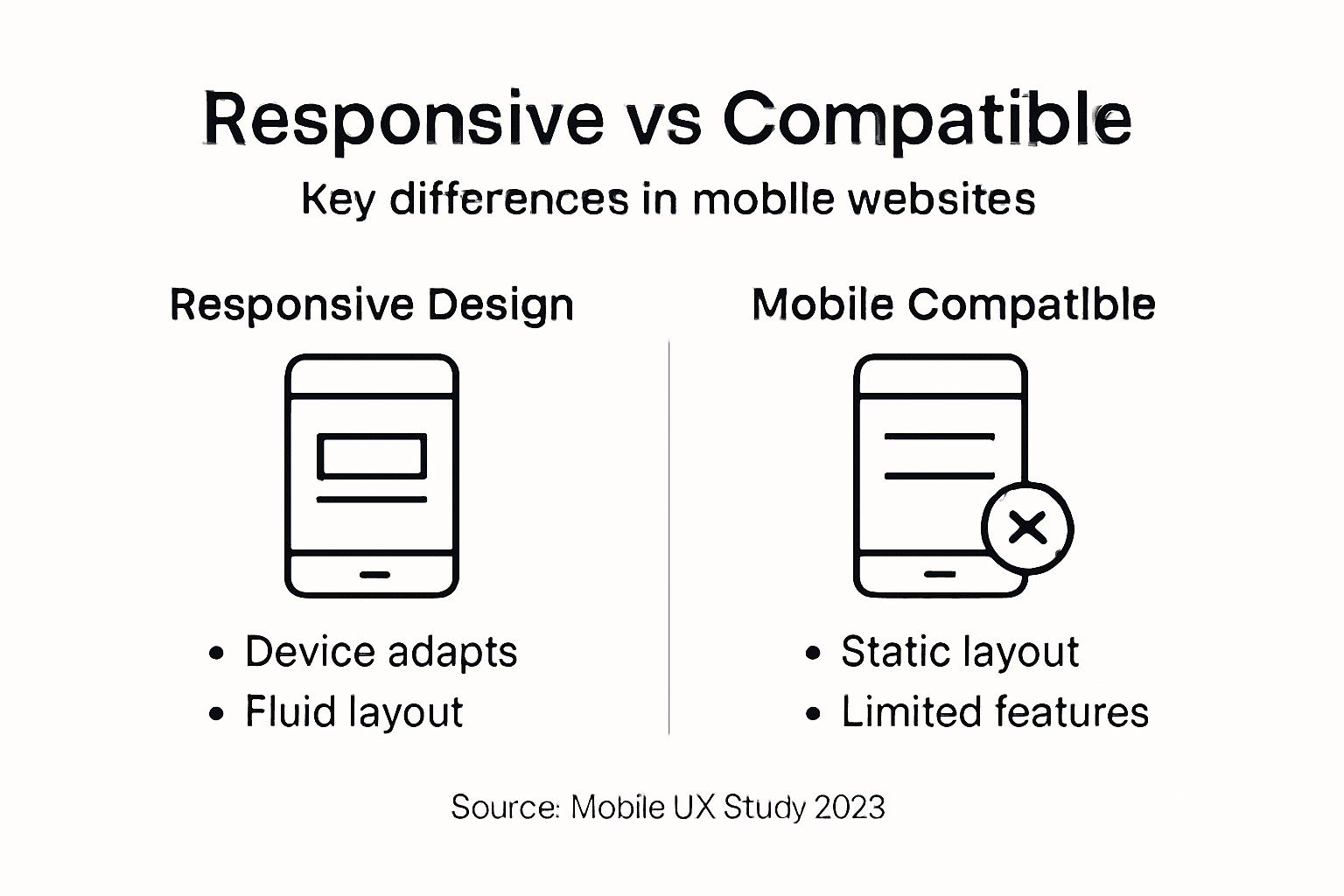
Mobile responsiveness: Definition and misconceptions
Mobile responsiveness represents a critical web design approach that ensures websites adapt seamlessly across different screen sizes and devices. Unlike traditional static web designs, responsive design dynamically adjusts layouts, images, and text to provide optimal viewing experiences.
At its core, mobile responsiveness involves creating flexible web interfaces that automatically reconfigure based on the user’s device. This means a website will look equally compelling whether accessed on a desktop computer, tablet, smartphone, or smartwatch. The key objective is maintaining readability, navigation ease, and visual appeal across diverse screen dimensions.
Several common misconceptions persist about mobile responsiveness:
- Mobile compatibility is not the same as mobile responsiveness
- Simply making a website “mobile-friendly” does not guarantee seamless user experience
- Responsive design involves more than just shrinking content proportionally
- Not all mobile-optimised websites provide genuine responsive experiences
Mobile responsiveness ensures websites work flawlessly across devices without requiring manual zooming or horizontal scrolling.
Understanding the nuanced differences between mobile compatibility and true responsiveness is crucial. While compatibility might allow basic functionality, responsive design focuses on creating intuitive, dynamically adjusting interfaces that feel native to each device’s unique characteristics.
Pro tip: Test your website’s responsiveness using multiple devices and screen sizes to identify potential layout or usability issues.
Common approaches to mobile optimisation
Mobile optimisation encompasses several strategic approaches designed to enhance website performance across diverse digital devices. Responsive web design techniques have emerged as critical solutions for addressing the complex challenges of modern digital interfaces.
Three primary approaches dominate mobile optimisation strategies:
- Responsive web design: Uses flexible grid layouts and media queries to dynamically adjust content across different screen sizes
- Adaptive design: Delivers specific fixed layouts based on detected device characteristics
- Mobile-first design: Prioritises designing for mobile devices initially, then progressively enhancing for larger screens
Mobile optimisation is about creating seamless user experiences that function flawlessly across every device type.
Each approach offers unique advantages in tackling device fragmentation. Responsive design provides the most fluid experience, allowing content to reshape automatically. Adaptive design offers more controlled, tailored experiences for specific device types. Mobile-first design ensures fundamental usability starts with the smallest screen, guaranteeing core functionality remains consistent.
Here’s a comparison of common mobile optimisation approaches:
| Approach | Main Technique | Strengths | Drawbacks |
|---|---|---|---|
| Responsive Design | Flexible grids, media queries | Automatic adaptation | May require more initial effort |
| Adaptive Design | Pre-set layouts for device types | Targeted device experiences | Less flexible across devices |
| Mobile-First Design | Design starts with smallest screens | Guarantees core usability | Desktop enhancements needed |
Pro tip: Implement comprehensive testing across multiple devices and screen resolutions to validate your mobile optimisation strategy.
Key features of responsive web design
Responsive web design techniques represent a sophisticated approach to creating flexible, adaptable digital interfaces that seamlessly adjust across multiple devices and screen sizes. The core philosophy centres on building websites that provide optimal viewing experiences regardless of the user’s device.
Key features of responsive web design include:
- Flexible grid layouts: Dynamically adjusting content containers that proportionally resize
- Media queries: Conditional CSS rules that apply different styling based on device characteristics
- Fluid image scaling: Ensuring visual elements resize without losing quality or breaking design integrity
- Touch-friendly interactions: Designing interface elements suitable for touchscreen navigation
- Viewport configuration: Precise settings that control how content renders across different screens
Responsive design transforms websites from rigid, fixed layouts to dynamic, intelligent interfaces that adapt in real-time.
The technical implementation of responsive web design goes beyond simple resizing. It involves creating intelligent, context-aware interfaces that understand and respond to the specific characteristics of each device. This means considering factors like screen resolution, orientation, input method, and processing capabilities when rendering content.

Modern responsive design prioritises performance and user experience, ensuring that websites load quickly, look appealing, and remain highly functional across smartphones, tablets, laptops, and desktop computers.
To clarify the business impact of responsive web design features:
| Feature | What It Does | Business Impact |
|---|---|---|
| Flexible grid layouts | Adjust to various screen sizes | Consistent branding |
| Fluid image scaling | Maintain quality on all devices | Professional appearance |
| Touch-friendly design | Easy navigation via touchscreens | Greater user satisfaction |
| Viewport configuration | Controls content display | Reduced site abandonment |
Pro tip: Regularly test your responsive design using multiple devices and browser developer tools to identify and resolve potential layout inconsistencies.
SEO and business benefits for SMEs
Mobile responsiveness offers critical SEO advantages that can transform how small and medium-sized enterprises compete in the digital marketplace. By prioritising mobile-friendly design, SMEs can significantly enhance their online visibility and customer engagement strategies.
Key business benefits include:
- Improved search engine rankings: Google prioritises mobile-friendly websites in search results
- Reduced bounce rates: Enhanced user experience keeps visitors on the site longer
- Increased conversion potential: Smooth mobile interfaces encourage customer interactions
- Competitive differentiation: Mobile-optimised websites stand out from less adaptive competitors
- Enhanced brand perception: Professional, responsive design builds customer trust
Mobile responsiveness is no longer optional – it’s a fundamental requirement for digital business success.
For SMEs, mobile responsiveness represents more than just technical adaptation. It’s a strategic approach to meeting modern consumer expectations, with direct implications for business growth. Websites that load quickly, display correctly, and provide intuitive navigation across devices create positive user experiences that translate into tangible business outcomes.
Modern consumers expect seamless digital interactions, and businesses that fail to provide mobile-friendly experiences risk losing potential customers to more technologically adept competitors.
Pro tip: Invest in regular mobile usability testing to continuously refine your website’s responsiveness and user experience.
Pitfalls and costly mistakes to avoid
Common mobile compatibility errors can significantly undermine a website’s performance and user experience. Understanding these potential pitfalls is crucial for businesses seeking to create truly responsive digital platforms that engage and retain customers.
Critical mistakes to avoid include:
- Misinterpreting mobile compatibility: Simply making a site accessible on mobile is not the same as true responsiveness
- Ignoring touch interactions: Failing to design for touchscreen navigation and gestures
- Overlooking performance metrics: Not optimising page load times for mobile networks
- Using fixed-width layouts: Designing rigid structures that don’t adapt to different screen sizes
- Neglecting content hierarchy: Presenting information without mobile-specific prioritisation
Mobile responsiveness requires a holistic approach, not just surface-level technical adjustments.
Technical limitations can dramatically impact user experience. Websites with outdated codebases often struggle to support modern responsive techniques, resulting in poor navigation, excessive zooming, and horizontal scrolling. These issues not only frustrate users but can also lead to significant ranking penalties from search engines.
Effective mobile design demands continuous testing and adaptation. Developers must rigorously validate that all content displays correctly and functions intuitively across diverse mobile devices and screen configurations.
Pro tip: Conduct monthly mobile usability audits to identify and resolve potential responsive design weaknesses before they impact user experience.
Elevate Your Website’s Mobile Responsiveness for Greater SEO Impact and User Engagement
Ensuring your website is truly mobile responsive goes beyond simple compatibility. Many businesses struggle with fixed layouts, poor touch interactions, and slow load times that frustrate users and harm SEO rankings. If you want to provide a seamless browsing experience across all devices while boosting your search engine visibility, you need more than just a mobile-friendly label. Understanding and implementing flexible grid layouts, fluid images, and viewport configuration are key to standing out in today’s competitive online environment.

At Kickass Online, we specialise in crafting customised, responsive web designs that meet Google’s SEO standards and engage your visitors effortlessly. Our dedicated team works closely with you to ensure your website performs brilliantly on smartphones and desktops alike. Don’t let outdated or rigid designs limit your growth. Take the next step now by exploring our expert services and booking a consultation. Let us help you transform your digital presence with a website designed to convert and rank higher immediately.
Frequently Asked Questions
What is mobile responsiveness?
Mobile responsiveness is a web design approach that ensures websites adapt seamlessly across different screen sizes and devices, providing optimal viewing experiences without requiring manual zooming or horizontal scrolling.
How does mobile responsiveness impact SEO?
Mobile responsiveness enhances SEO by improving search engine rankings, as Google prioritises mobile-friendly websites in search results. A responsive design also contributes to reduced bounce rates and increased user engagement.
What are the common approaches to mobile optimisation?
The primary approaches to mobile optimisation include responsive web design, adaptive design, and mobile-first design, each offering unique advantages in creating user-friendly experiences across various devices.
What are the key features of responsive web design?
Key features include flexible grid layouts, media queries, fluid image scaling, touch-friendly interactions, and viewport configuration, all of which help create adaptable digital interfaces that function well across multiple devices.