
Struggling to turn Milton Keynes website visitors into loyal customers can feel frustrating when you are not sure where they drop off or why. Understanding the full path each person takes on your site reveals not just what works but where they’re losing interest. By focusing on mapping your user journey and spotting emotional highs and lows, you uncover hidden problems in your website experience and form a clear action plan for improvements that drive real results.
Table of Contents
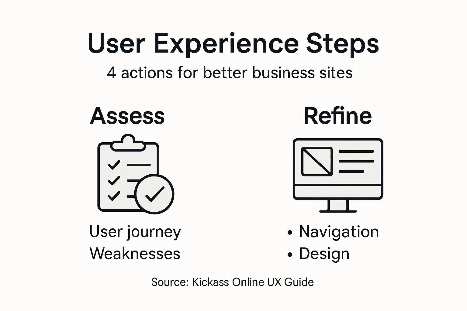
- Step 1: Assess Current User Journey and Identify Weaknesses
- Step 2: Refine Website Structure and Simplify Navigation
- Step 3: Optimise Visual Design and Enhance Readability
- Step 4: Test User Interactions and Implement Feedback
Quick Summary
| Key Message | Explanation |
|---|---|
| 1. Understand User Journey | Map every touchpoint to identify weaknesses in customer interaction and ensure data-driven insights for improvements. |
| 2. Simplify Navigation Structure | Organise categories based on customer needs rather than internal departments to enhance user experience and satisfaction. |
| 3. Prioritise Readability and Design | Use clear typography, visual hierarchy, and strategic colour usage to improve content engagement and retention. |
| 4. Conduct Real User Testing | Involve actual customers in testing to gain insights into usability issues and allow iterative improvements based on feedback. |
Step 1: Assess Current User Journey and Identify Weaknesses
Your first task is understanding exactly how customers interact with your website from start to finish. This isn’t about guessing or relying on hunches. You need concrete data that shows where visitors succeed and where they abandon you.
Start by mapping out every touchpoint in your customer’s experience. Think about the moments when someone arrives at your site, browses your products or services, and attempts to convert. User journey maps visualise a customer’s experience with your brand, revealing the steps they take and where friction occurs.
Here’s what to track across your journey:
- Entry points (Google search, social media, direct link, paid ads)
- Pages visited in order
- Time spent on each page
- Forms or buttons they interact with
- Points where they leave your site
Gather real data from your analytics. Google Analytics shows visitor behaviour patterns, but dig deeper. Look at session recordings using tools like Hotjar or Smartlook to watch actual users navigating your site. You’ll spot confusion that numbers alone never reveal.
Pay close attention to emotional shifts. Where do visitors feel confident? Where do they hesitate? Identifying weaknesses in the user journey happens by tracking real-time customer interactions across your touchpoints.
Real-time data reveals not just what visitors do, but where they struggle most. These struggle points are your biggest opportunities.
Once you’ve mapped the journey, mark the pain points. These are moments where visitors face obstacles, confusion, or friction. Common weakness areas include:
- Slow page load times
- Unclear navigation menus
- Forms asking for too much information
- Missing information about products or services
- Confusing checkout processes
- Unresponsive design on mobile devices
Document these findings clearly. Create a simple spreadsheet listing each weakness, where it occurs in the journey, and how many users it affects. This becomes your action list for improvements.
To clarify the impact of key website weaknesses, here is a business-focused summary table:
| Weakness Area | Business Impact | Improvement Priority |
|---|---|---|
| Slow loading pages | Lower conversion rate | High |
| Cluttered navigation | Increased user frustration | High |
| Excessive form fields | Higher abandonment rate | Medium |
| Missing details | Fewer purchases | Medium |
| Mobile issues | Lost mobile customers | High |
| Confusing checkout | Increased cart abandonment | High |
Pro tip: Watch 10 to 15 unmoderated user session recordings before making changes. Real user behaviour often contradicts what you think visitors want to do.
Step 2: Refine Website Structure and Simplify Navigation
Now you understand where users struggle. Next, fix the structure that’s causing confusion. Your website’s backbone—how content is organised and how visitors move through it—directly affects whether they find what they need or leave frustrated.

Start by auditing your current navigation. Does it reflect how your customers actually think about your business? Most businesses organise navigation around their internal departments, but customers care about what problems you solve. A Milton Keynes accountancy firm shouldn’t have “Taxation” and “Audit Services” listed separately if customers search for “tax planning” and “financial reviews.”
Restructure your main categories around customer needs, not internal structure. Group related content logically so visitors can anticipate where information lives. Global navigation design acts as a map, showing users main content categories and helping them move between sections intuitively.
Here’s what to refine:
- Limit top-level navigation to 5-7 main categories maximum
- Use clear, descriptive labels (“Services” instead of “Solutions”)
- Ensure navigation appears consistently on every page
- Add breadcrumbs on deeper pages to show where users are
- Include a search function for users who prefer searching
- Make mobile navigation touch-friendly and accessible
Clean up your URL structure too. Avoid deep, complex paths like “yoursite.com/services/business/consulting/tax-planning.” Instead, use straightforward URLs like “yoursite.com/tax-planning-services.” Shorter paths help both users and search engines.
Properly marking up page structure with clear headings and sections makes your site easier to navigate for everyone, especially visitors using screen readers or mobile devices.
Simple navigation means fewer clicks to reach information. Every extra click increases the chance a visitor leaves.
Test your revised navigation with actual users. Watch them attempt common tasks without guidance. Do they find what they need? Do they get lost? Their behaviour reveals blind spots your team might miss.
Pro tip: Use a three-click rule: visitors should reach any page on your site within three clicks from the homepage. If not, your structure needs further simplification.
For better understanding of successful navigation features, here is a concise comparison table:
| Navigation Feature | User Benefit | Business Benefit |
|---|---|---|
| Breadcrumbs | Clear user orientation | Lower bounce rates |
| Three-click rule | Fast information access | Higher satisfaction |
| Descriptive labels | Easy decision-making | Increased trust |
| Mobile accessibility | Smooth on all devices | Wider customer reach |
Step 3: Optimise Visual Design and Enhance Readability
Your website’s visual presentation directly impacts whether visitors read your content or bounce away. People don’t read websites—they scan them. Your design must guide their eyes to what matters most and make text easy to process quickly.
Start with typography, the foundation of readability. Choose fonts that are clean and legible on all devices. Sans-serif fonts like Arial, Helvetica, or Open Sans work well for body text on screens. Your font size should be at least 16 pixels for body text. Smaller text forces visitors to squint, creating friction that sends them elsewhere.
Optimising font choice, size, spacing, and contrast significantly improves reading speed and comprehension across your website. Line spacing matters too. Too tight, and text feels cramped. Too loose, and it feels disconnected. Aim for a line height of 1.5 to 1.6 times your font size.
Next, organise your content visually. Use clear hierarchy with distinct heading levels so visitors understand what’s important. Using headings, bold text, and lists helps readers quickly locate information they need.
Implement these visual strategies:
- Break text into short paragraphs of 3-4 sentences maximum
- Use bullet points and numbered lists for multiple items
- Add whitespace between sections for visual breathing room
- Ensure sufficient contrast between text and background colours
- Use colour strategically to highlight calls to action
- Keep images relevant and optimise them for fast loading
Maintain colour consistency across your site. Limit your palette to 3-4 primary colours plus neutral tones. Your Milton Keynes business needs coherent branding, not a rainbow of inconsistent hues.
Readability isn’t about being beautiful. It’s about making your message impossible to ignore.
Test your design on actual devices. How does it look on mobile? Tablet? Desktop? Visitors use multiple devices, and your design must adapt seamlessly. Poor mobile readability alone will tank your user experience.
Pro tip: Use the F-pattern layout on key pages: visitors scan left to right, then down the left side. Place your most important information along this natural reading path.
Step 4: Test User Interactions and Implement Feedback
You’ve restructured your site and polished the design. Now comes the reality check. Real users will interact with your website in ways you never anticipated, revealing issues your team can’t see from the inside.
Start testing with real people. Don’t use colleagues, friends, or family. Find actual customers or prospects who match your target audience. A Milton Keynes retailer needs feedback from local shoppers, not your brother who never visits your shop.
Run structured testing sessions with 5-8 participants per round. Give them specific tasks without guidance. “Find our most popular product” or “Complete a booking” forces them to navigate your site naturally. Watch what they do, not what they say they do. Their actions reveal truth that surveys never will.
Using structured feedback methods like “I Like, I Wish, What If” encourages honest critique from testers. This simple framework helps users articulate their reactions clearly and gives you actionable insights.
Capture feedback systematically:
- Record sessions or take detailed notes
- Note where users hesitate or get confused
- Track which pages they visit and which they skip
- Listen for complaints or frustrated comments
- Identify tasks that users complete successfully
- Time how long common actions take
Analyse patterns across your test sessions. One user struggling with checkout might be a fluke. Three users all struggling? That’s a priority fix. Group similar feedback together and rank issues by impact and frequency.
Integrating user feedback into design iterations is fundamental to human-centred design. Don’t make sweeping changes based on a single comment. Prioritise feedback that multiple users mentioned.
Testing reveals blind spots your team creates through familiarity. What seems obvious to you may confuse visitors completely.
Make changes iteratively. Fix your top three issues, then test again with fresh users. This cycle of test, analyse, improve, repeat should become part of your ongoing process, not a one-time event.
Pro tip: Schedule testing monthly, not yearly. Small, frequent improvements compound faster than waiting for months to gather perfect data.
Transform Your Business Website User Experience Today
Struggling with slow page loads, confusing navigation or mobile compatibility issues? These common pain points from the article “How to Improve User Experience for Business Websites” highlight the crucial need for expert guidance to refine your website’s structure and visual design. At Kickass Online, we specialise in crafting high-converting websites that provide smooth, intuitive journeys for your visitors by focusing on usability, clear navigation, and responsive design.
Explore our Websites | Kickass Online services to see how we tailor solutions that tackle real user journey challenges. Our team works closely with your business to boost online performance and security while enhancing customer engagement. Don’t let your website’s weaknesses hold back your growth. Visit https://kickassonline.com now and start your personalised consultation to unlock your site’s full potential. For further insights into optimising your site, check out our helpful Tutorials | Kickass Online and begin transforming your digital presence today.
Frequently Asked Questions
How can I assess my website’s current user journey?
Start by mapping every touchpoint in your customer’s experience on your website. Use analytics tools to track user interactions and identify where visitors succeed or abandon the site, focusing on entry points, pages visited, and time spent on those pages.
What are the most common pain points in user experience?
Common pain points include slow page load times, unclear navigation, excessive form fields, and confusing checkout processes. Identify these issues by reviewing your website’s analytics and user feedback to target areas for improvement.
How do I simplify website navigation for better user experience?
To simplify navigation, limit top-level categories to 5-7 main options and use clear, descriptive labels. Organising content based on customer needs rather than internal structures will help users find information easily and improve satisfaction.
What visual design elements should I optimise for better readability?
Focus on typography by selecting clean, legible fonts and ensuring proper spacing between text lines. Incorporate headings, bullet points, and high-contrast colours to lead visitors’ eyes effectively to key information.
How can I gather useful feedback on my website’s user experience?
Conduct testing sessions with real users who match your target audience, asking them to complete specific tasks without guidance. Record their actions and note any hesitations or frustrations to gain valuable insights for iterative improvements.
What is the benefit of implementing user feedback in website design?
Integrating user feedback helps identify and address user pain points that your team might overlook. Use the insights from user testing to prioritise adjustments, enabling you to improve user satisfaction and engagement more efficiently.
Recommended
- A Guide to Improving User Experience | Kickass Online
- User Experience – Why It Shapes Online Success | Kickass Online
- 7 Inspiring Examples of Website Designs for Businesses | Kickass Online
- What Is UX Design and Its Impact on Business Success | Kickass Online
- Ako zvýšiť mieru konverzie pomocou UX dizajnu - Tronos.sk