
In today’s digital landscape, a well-designed website is crucial for Managed Service Providers (MSPs) looking to establish credibility, attract new clients, and effectively showcase their services. A custom website tailored specifically to the needs of an MSP can set you apart in a competitive market. This guide explores the key elements and best practices for designing a website that not only looks professional but also drives business growth.
Unlike generic business websites, an MSP website must communicate technical expertise while remaining accessible to potential clients who may not be IT-savvy. The goal is to build trust quickly and demonstrate how your services can solve specific problems. A custom design allows you to highlight your unique value propositions, tailor content to your target audience, and integrate tools that streamline client interactions.
Moreover, MSP clients often seek reliability and professionalism. Your website serves as a first impression and a 24/7 sales representative, so investing in a strategic, user-friendly design pays dividends in client acquisition and retention.
In addition to aesthetics and functionality, a custom MSP website can enhance your search engine optimisation (SEO) efforts. By creating content that is specifically tailored to the needs and questions of your target audience, you can improve your visibility on search engines, making it easier for potential clients to find you. This not only drives traffic to your site but also positions your brand as a thought leader in the industry. Incorporating relevant keywords, informative blog posts, and case studies can further establish your authority and expertise, encouraging visitors to engage with your services.
Furthermore, a well-designed MSP website can incorporate client testimonials and case studies that showcase your successful projects. These elements serve as social proof, reinforcing your credibility and helping prospective clients envision the benefits of your services. By presenting real-world examples of how you've solved problems for other businesses, you create a compelling narrative that resonates with potential clients, making them more likely to reach out for your assistance.
With over half of internet traffic coming from mobile devices, adopting a mobile-first approach is essential. This means designing your website primarily for mobile users and then scaling up for larger screens. Responsive design techniques ensure your site adapts seamlessly to any device, whether it’s a smartphone, tablet, or desktop.
Responsive websites improve user experience by providing easy navigation, readable text, and appropriately sized images regardless of screen size. This adaptability also benefits your SEO rankings, as search engines like Google prioritise mobile-friendly sites in their results. Moreover, a mobile-first design not only caters to the growing number of users accessing the internet via their phones but also acknowledges the unique behaviours and expectations of mobile users, who often seek quick and efficient interactions.
In addition to enhancing user experience, a mobile-first strategy can significantly impact conversion rates. Research indicates that users are more likely to engage with a site that loads quickly and offers a smooth browsing experience. By prioritising mobile design, businesses can capture the attention of potential customers more effectively, leading to increased sales and customer loyalty. Furthermore, as mobile technology continues to evolve, staying ahead of the curve with a responsive design will ensure your website remains relevant and competitive in an ever-changing digital landscape.
Website speed is a critical factor influencing user experience and search engine rankings. Studies show that users expect pages to load within two to three seconds; delays beyond this can lead to high bounce rates and lost opportunities.
To ensure your MSP website loads quickly, focus on optimising images by compressing them without losing quality, choosing a reliable hosting provider with fast servers, and minimising unnecessary scripts or plugins. Regularly testing your site’s speed using tools like Google PageSpeed Insights can help identify bottlenecks and areas for improvement.
In addition to these fundamental strategies, consider implementing a content delivery network (CDN) to distribute your website’s content across multiple servers worldwide. This can significantly reduce load times for users who are geographically distant from your main server. Furthermore, leveraging browser caching can enhance performance by storing frequently accessed files on users' devices, allowing for quicker retrieval on subsequent visits. These advanced techniques not only improve speed but also contribute to a smoother and more enjoyable browsing experience.
Moreover, the impact of website speed extends beyond mere user satisfaction; it also plays a vital role in conversion rates. Research indicates that even a one-second delay in page load time can result in a 7% reduction in conversions. This highlights the importance of maintaining an optimised site, particularly for businesses reliant on online transactions. By prioritising speed, you not only enhance user engagement but also bolster your overall business performance, making it an essential aspect of your digital strategy.
Visitors to your MSP website want to understand immediately what you offer and how it benefits them. Clear, benefit-driven headlines and concise explanations are essential to communicate your value effectively.

Each service you provide should have its own dedicated page or section that breaks down complex IT solutions into simple, digestible information. Use bullet points, infographics, or short videos to illustrate how your services solve common business challenges, such as network security, data backup, or cloud management.
Detailed service pages not only educate potential clients but also improve your website’s search engine optimisation (SEO) by targeting relevant keywords. This can increase organic traffic from businesses actively searching for MSP services.
Trust is a cornerstone of any MSP-client relationship. Including genuine client testimonials and well-crafted case studies on your website can significantly enhance your credibility.
Testimonials provide social proof, showing that others have benefited from your services. Case studies go further by detailing specific challenges, your approach, and measurable results. This storytelling approach helps prospects visualise the value you bring and reassures them that you can deliver on your promises.
A website’s navigation should be straightforward, allowing visitors to find information quickly without frustration. Use clear menus, logical page hierarchies, and consistent layout across the site.
Calls to action (CTAs) such as “Contact Us,” “Request a Quote,” or “Schedule a Consultation” should be prominently displayed and easy to access. Strategically placing CTAs encourages visitors to engage with your business, turning casual browsers into leads.
Visual elements play a significant role in creating a professional and engaging website. High-resolution images, custom illustrations, and videos can enhance your brand identity and make your content more appealing.
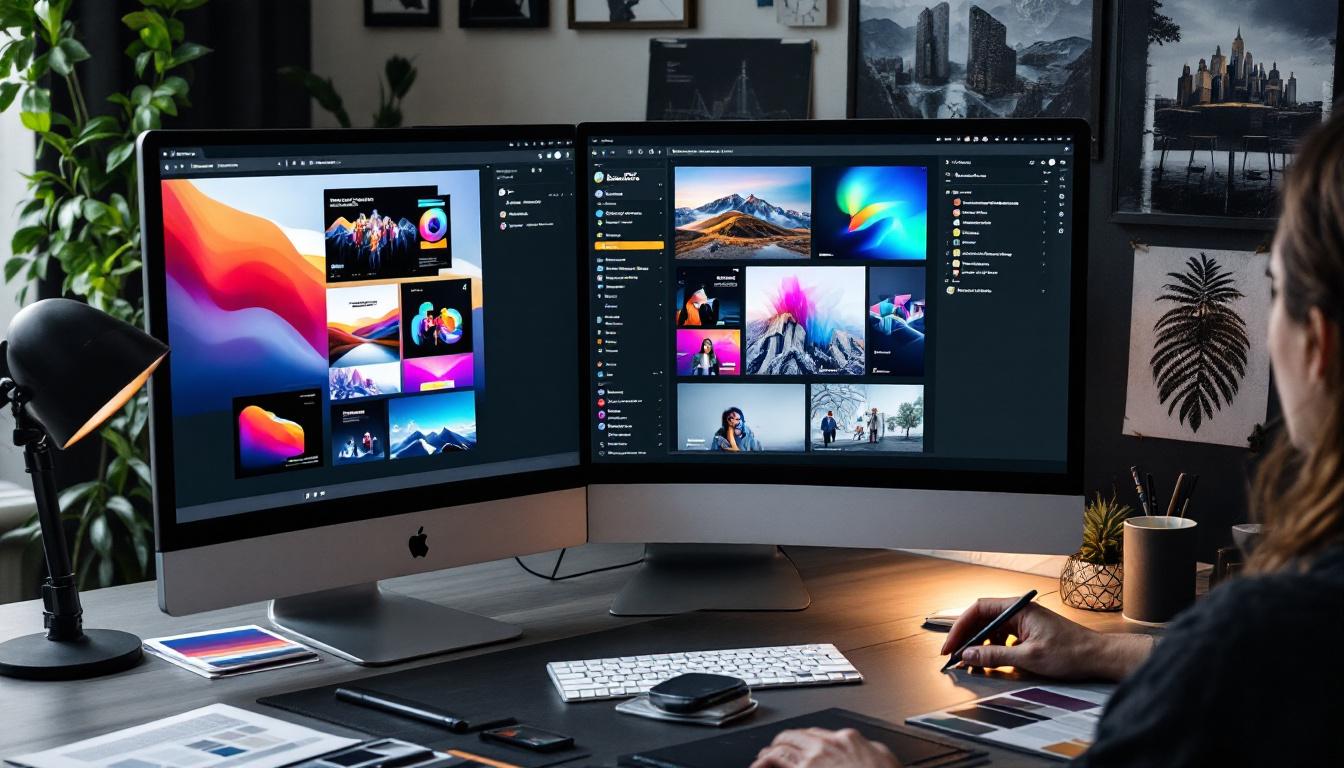
For MSP websites, consider using visuals that reflect technology, security, and professionalism. Avoid generic stock photos where possible; instead, opt for custom graphics or photos of your team and office to add authenticity.
Integrating your website with Customer Relationship Management (CRM) systems and marketing automation tools can streamline lead capture and nurture processes. This integration allows you to personalise user experiences, track visitor behaviour, and automate follow-ups.
For example, forms on your website can feed directly into your CRM, enabling your sales team to respond promptly to inquiries. Marketing tools can help segment your audience and deliver targeted content, increasing the likelihood of conversion.
Making your MSP website accessible to all users, including those with disabilities, is both a legal requirement and a best practice. Following the Web Content Accessibility Guidelines (WCAG) ensures your content is perceivable, operable, understandable, and robust.
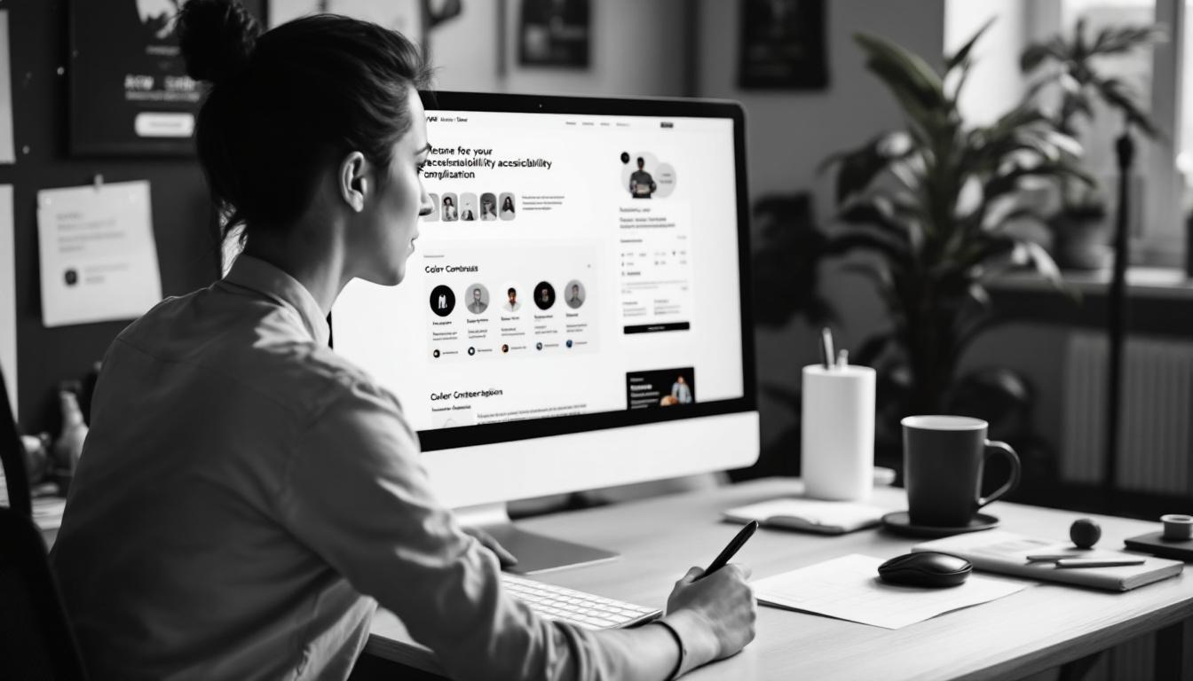
Simple steps include providing alternative text for images, using sufficient colour contrast, and ensuring your site can be navigated using a keyboard. Accessibility not only broadens your audience but also improves overall usability for everyone.
Launching your website is just the beginning. Regularly analysing user behaviour through tools like heat maps and session recordings can reveal how visitors interact with your site and where they encounter obstacles.
Implementing A/B testing allows you to experiment with different headlines, CTAs, or layouts to see what resonates best with your audience. This data-driven approach leads to incremental improvements in engagement and conversion rates over time.
For MSPs serving specific geographic areas, local SEO is vital. Optimising your website for location-based searches helps you appear in local search results, driving more relevant traffic.
Create unique content for each location you serve, incorporate location-specific keywords naturally, and ensure your Name, Address, and Phone (NAP) details are consistent across your website and online directories. This consistency boosts your visibility on platforms like Google Maps and local business listings.
Designing a custom website for your MSP is a strategic investment that can significantly impact your business growth. By focusing on mobile-first design, fast load times, clear communication of services, and trust-building elements like testimonials, you create a site that appeals to both search engines and potential clients.
Incorporating intuitive navigation, strong CTAs, high-quality visuals, and seamless integration with CRM and marketing tools further enhances user experience and operational efficiency. Don’t overlook accessibility and local SEO, as these factors broaden your reach and ensure compliance.
Finally, adopting a data-driven approach to continually refine and improve your website ensures it remains effective in meeting your business goals. With careful planning and execution, your MSP website can become a powerful asset, attracting, engaging, and converting visitors into loyal clients.
Ready to elevate your MSP's online presence with a custom website that drives results? At Kickass Online, we specialize in bespoke web development, leveraging platforms like WordPress, Umbraco, Shopify, Webflow, and custom solutions with Angular, MERN, or Laravel. Our expertise extends to website maintenance, SEO, PPC, and implementing AI and automations to grow your business. Don't miss the opportunity to transform your digital strategy. Book a discovery call with us today and let's create a website that stands out in the competitive MSP market.
Creating a website as a graphic designer is more than just showcasing your work online — it’s about crafting a digital portfolio that reflects your unique style, professionalism, and creativity. WordPress, with its flexibility and wide range of themes and plugins, offers an excellent platform tailored to the needs of graphic designers. This guide will walk you through the essential steps and considerations to design a WordPress website that not only looks stunning but also performs seamlessly and attracts potential clients.
When designing a website specifically for graphic designers, certain features become indispensable. These elements ensure your work is presented in the best light while offering visitors an enjoyable browsing experience.
Graphic designers need themes that offer multiple layout options to showcase portfolios creatively. Whether it’s grid layouts, sliders, or masonry galleries, the ability to present visual work professionally is crucial. Themes compatible with popular page builders such as Elementor or WPBakery provide drag-and-drop interfaces, allowing you to adjust typography, colours, and layouts without touching a line of code. This flexibility enables you to maintain your unique brand identity and update your site easily as your portfolio evolves. Additionally, incorporating custom fonts and colour palettes can further enhance the visual appeal of your site, ensuring it reflects your artistic style and resonates with your target audience.
With more users accessing websites on mobile devices, responsiveness is non-negotiable. A responsive theme ensures your site looks impeccable across smartphones, tablets, and desktop screens. Additionally, fast loading times are vital — slow websites frustrate visitors and harm your search engine rankings. Selecting a lightweight, optimised theme will enhance user experience and improve your SEO performance. Moreover, employing techniques such as image compression and lazy loading can significantly boost your site's speed, ensuring that your stunning visuals do not come at the cost of performance. This is particularly important for graphic designers, as the visual impact of their work should never be compromised by technical shortcomings.
To attract clients organically, your website should be built on clean code with built-in SEO features. This helps search engines understand your content better and rank your site higher. Furthermore, compatibility with essential plugins, such as WooCommerce for selling products or WPForms for contact forms, expands your website’s functionality without compromising performance. In addition to these, integrating social media sharing plugins can amplify your reach, allowing visitors to easily share your work across platforms like Instagram, Pinterest, and Facebook. This not only increases your visibility but also creates opportunities for engagement and interaction with potential clients, ultimately driving more traffic to your site and enhancing your professional network.
Picking the right theme is one of the most important decisions when building your website. The theme sets the tone and structure for your portfolio and influences how visitors interact with your content.

Sydney offers over 28 professionally designed starter sites, making it easy to find a layout that suits your style. Its seamless integration with Elementor provides extensive customisation options, allowing you to tailor every aspect of your site. Sydney’s balance between design flexibility and simplicity makes it an excellent choice for both beginners and experienced designers. Additionally, the theme is compatible with WooCommerce, enabling you to effortlessly set up an online store should you wish to sell your designs or digital products. The responsive design ensures that your portfolio looks stunning on any device, from desktops to smartphones, which is crucial in today’s mobile-centric world.
Neve is a mobile-first theme known for its fast loading speeds and clean code. It features drag-and-drop header and footer builders, giving you control over your site’s structure without complexity. Its compatibility with multiple page builders makes it adaptable to various design preferences, perfect for graphic designers prioritising speed and performance. Furthermore, Neve is designed with SEO in mind, helping your site rank better in search engine results. This is particularly beneficial for designers looking to attract new clients through organic traffic. The theme also supports AMP (Accelerated Mobile Pages), ensuring that your website not only loads quickly but also provides a seamless experience for mobile users.
Uncode stands out with its creative demos and powerful tools like WPBakery page builder, Slider Revolution, and the Isotope masonry grid plugin. With over 70 unique demos, it caters to diverse design needs, enabling you to build a visually striking portfolio. Its mobile-friendly design ensures your site looks great on all devices. Uncode also offers a robust media library that allows for easy management of images and videos, which is essential for graphic designers who often rely on visual content to showcase their work. The theme's advanced grid system enables you to create stunning layouts that highlight your projects effectively, ensuring that each piece of work is presented in the best possible light.
Webify offers beautiful galleries and enticing portfolio layouts, making it suitable for designers at any stage. Its customisable headers and footers add to the flexibility. Pile, on the other hand, is ideal for showcasing personal projects with features like parallax scrolling and an intuitive setup process, helping you create an immersive experience for visitors. Additionally, Pile includes a variety of hover effects and animations that can bring your portfolio to life, engaging your audience and encouraging them to explore your work further. Both themes are designed with a focus on user experience, ensuring that potential clients can easily navigate through your projects and contact you without hassle, which is vital in converting visitors into clients.
Beyond selecting the right theme, following best practices ensures your website is not only visually appealing but also functional and user-friendly.
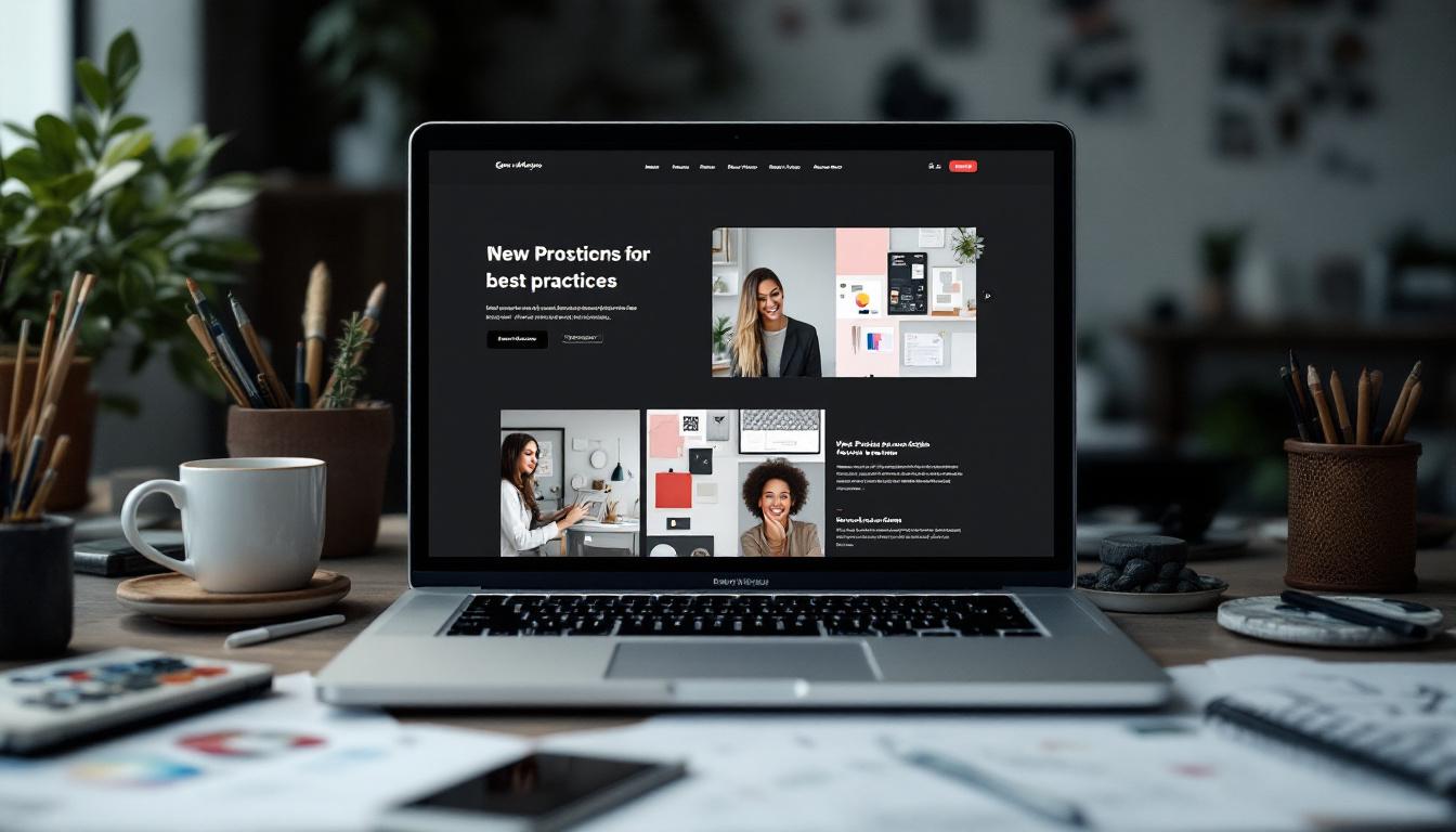
Your portfolio is the heart of your website. Use high-quality images and organise your projects into clear categories or themes. This helps visitors navigate your work easily and understand your range of skills. Consider adding case studies or project descriptions to give context and demonstrate your creative process. Additionally, incorporating client testimonials alongside your projects can provide social proof of your expertise and reliability, further enticing potential clients to engage with your services.
Consistency in colour schemes, typography, and logos reinforces your brand identity. Choose a palette that reflects your style and use it throughout your site. Consistent branding builds trust and makes your website memorable, which is essential for attracting repeat visitors and clients. Furthermore, think about how your branding extends beyond the website; ensure that your social media profiles and any printed materials echo the same visual identity, creating a cohesive presence across all platforms.
With mobile traffic steadily increasing, ensuring your website is fully responsive is crucial. Test your site on various devices to confirm that images scale correctly, menus are easy to navigate, and text remains readable. A seamless mobile experience can significantly boost engagement and client inquiries. It’s also worth considering the loading speed of your site on mobile devices, as slow-loading pages can deter potential clients. Tools like Google PageSpeed Insights can help you identify areas for improvement to ensure a swift browsing experience.
Visitors should find it easy to explore your website. Use intuitive menus and organise content logically. Clear calls-to-action (CTAs), such as ‘Contact Me’ or ‘View Portfolio’, guide users towards desired actions, increasing the chances of client engagement. Additionally, consider placing CTAs strategically throughout your site, such as at the end of blog posts or after showcasing a project, to encourage users to take the next step without overwhelming them.
Make it simple for potential clients to reach you by including easy-to-use contact forms. Plugins like WPForms offer customizable forms that can be embedded anywhere on your site. Including multiple contact options, such as email and social media links, also enhances accessibility. To further streamline communication, consider adding a chatbot feature that can answer common queries in real-time, providing immediate assistance to visitors and potentially increasing the likelihood of conversion.
Regularly updating your portfolio and blog sections demonstrates ongoing activity and growth. Sharing recent projects, industry insights, or design tips can engage visitors and improve your site’s SEO. Fresh content signals to search engines that your website is active and relevant. Moreover, consider creating a newsletter signup option, allowing visitors to subscribe for updates. This not only keeps your audience informed but also helps build a community around your brand, fostering loyalty and encouraging repeat visits.
Designing a WordPress website tailored for graphic designers involves balancing aesthetics with functionality. By choosing a flexible, responsive, and SEO-friendly theme, and following best practices in portfolio presentation and user experience, you create a compelling online presence that attracts and impresses clients.
Investing time in customisation and regular updates keeps your site dynamic and reflective of your evolving skills. Ultimately, your website should serve as a digital extension of your creativity — a space where your work shines and your professional story unfolds seamlessly.
Ready to elevate your graphic design portfolio with a website that stands out? At Kickass Online, we specialize in bespoke web development across platforms like WordPress, ensuring your creative work is showcased with the excellence it deserves. Our expertise extends to Umbraco, Shopify, Webflow, and custom solutions like Angular, MERN, or Laravel. Beyond development, we offer comprehensive services including website maintenance, SEO, PPC, and AI-driven automations to grow your business. Book a discovery call with us today and let's create a digital space that truly reflects your design prowess.
Creating a WordPress website for a branding company is more than just putting together a digital presence—it’s about crafting a platform that truly reflects the company’s identity and communicates its unique value to potential clients. A well-designed website not only showcases your expertise but also builds trust and encourages engagement. This guide explores essential steps and best practices to design an effective WordPress site tailored specifically for branding agencies.
Before diving into the technical or creative aspects of website design, it’s crucial to have a clear understanding of your brand’s identity. This foundation shapes every design decision and ensures consistency across your digital and offline presence.
Start by defining your brand’s core values, personality, and visual elements. What does your branding company stand for? Is your tone professional and authoritative, or more creative and playful? These answers will guide your choice of colours, typography, and imagery. For example, a company that emphasises innovation might lean towards modern fonts and bold colours, while a more traditional agency might opt for classic typefaces and muted palettes.
Incorporating your logo prominently on the website reinforces brand recognition. Additionally, maintaining consistent use of your brand colours and fonts across all pages helps visitors immediately associate the site with your company. This consistency builds credibility and strengthens your overall brand presence.
Furthermore, it’s essential to consider how your brand identity translates across various platforms. Social media, email marketing, and even print materials should all echo the same visual and tonal elements established on your website. This cohesive approach not only enhances brand recognition but also fosters a sense of trust among your audience. When customers encounter a unified brand identity, they are more likely to engage and remain loyal, as they feel a connection to a brand that is consistent in its messaging and presentation.
Another vital aspect of establishing a strong brand identity is storytelling. Every brand has a unique story that can resonate with its audience, whether it’s the inspiration behind its founding, the challenges overcome, or the vision for the future. By weaving this narrative into your website’s content, you can create an emotional connection with visitors. This connection can be further enhanced through visuals, such as images and videos that reflect your brand’s journey and values, making your brand not just a name, but a relatable entity that customers can engage with on a personal level.
Knowing who your website visitors are and what they expect is vital for designing a site that resonates. Branding companies often serve a diverse range of clients—from startups to established enterprises—so understanding your target audience’s demographics, preferences, and behaviours allows you to tailor content and design accordingly.
Tools like Google Analytics provide valuable insights into visitor behaviour, such as which pages are most popular and how users navigate your site. Additionally, gathering direct feedback through surveys or contact forms can reveal what clients are looking for and which aspects of your services appeal most.
By aligning your website’s tone, visuals, and content with your audience’s expectations, you create a more engaging and relevant experience that encourages visitors to explore further and ultimately get in touch.
Selecting a WordPress theme that complements your brand identity is a critical step. The theme sets the overall look and feel of your website and influences user experience. Prioritise themes that are responsive and mobile-friendly, as a significant portion of web traffic now comes from smartphones and tablets.
Look for themes that offer flexibility in customisation, allowing you to adjust colours, fonts, and layouts to match your branding. Many premium themes come with built-in page builders, making it easier to design pages without needing extensive coding knowledge.
Once you’ve chosen a theme, customise it carefully to reflect your brand’s visual style. This includes adjusting colour schemes to your brand palette, selecting typography that aligns with your brand personality, and organising the layout to highlight key content areas such as services, portfolio, and client testimonials.
A clean, intuitive layout is essential for keeping visitors on your site and guiding them towards taking action. Simplicity and minimalism often work best, as they reduce distractions and make it easier for users to find information.
Use ample white space to create a sense of openness and clarity. Navigation menus should be straightforward and consistent across all pages, allowing users to move seamlessly through your site. Consider the placement of call-to-action buttons—such as “Get a Quote” or “Contact Us”—making them prominent and easy to find.
Organising content with clear headings, subheadings, and concise paragraphs helps visitors quickly scan and absorb information. Including visuals like images, graphics, and videos can also enhance engagement, illustrating your brand story and showcasing your work effectively.
With mobile internet usage surpassing desktop in many regions, ensuring your WordPress website is fully mobile-responsive is non-negotiable. A mobile-friendly site adapts its layout and functionality to different screen sizes, providing a smooth experience regardless of the device.
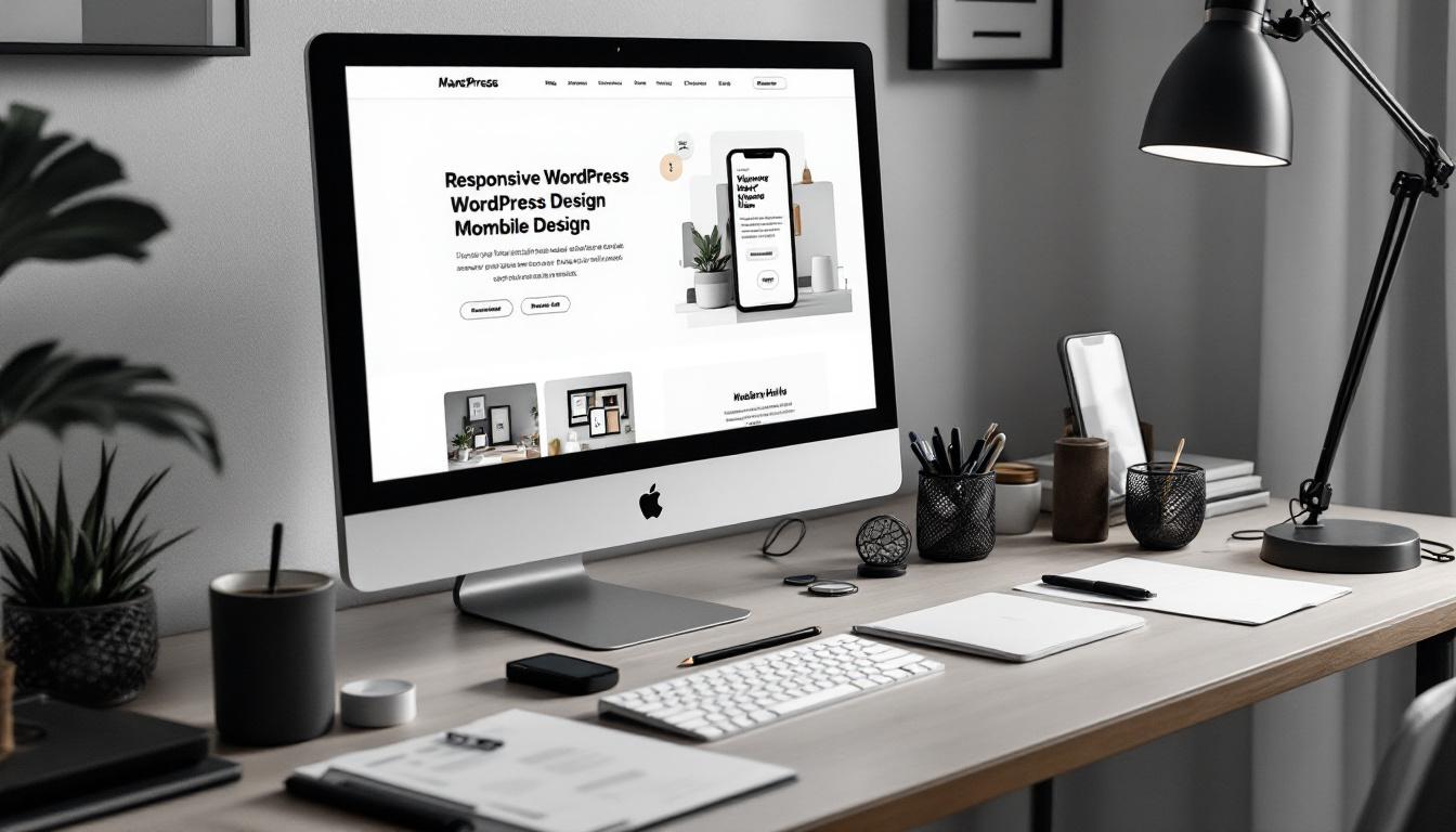
Choose a theme designed with mobile responsiveness in mind and test your site on various devices to identify any usability issues. Tools like Google’s Mobile-Friendly Test can help evaluate performance and highlight areas for improvement.
Optimise images and other media to load quickly on mobile networks, and ensure buttons and navigation elements are large enough to be easily tapped. A seamless mobile experience not only improves user satisfaction but also positively impacts search engine rankings.
Storytelling is a powerful tool for branding companies, as it helps forge emotional connections with visitors. Sharing your company’s journey, mission, and values in a compelling way humanises your brand and makes it memorable.
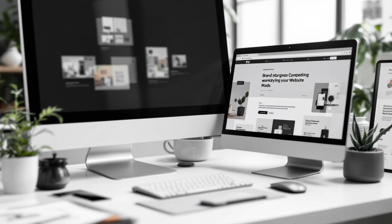
Use your website to tell stories about how your branding solutions have helped clients succeed. Case studies, testimonials, and behind-the-scenes insights provide authenticity and demonstrate your expertise. This narrative approach differentiates your agency from competitors and builds trust.
Embedding storytelling into various sections—such as the About page, service descriptions, and blog posts—creates a cohesive brand experience that resonates deeply with your audience and encourages loyalty.
Navigation is more than just a functional tool; it’s an opportunity to reinforce your brand identity. Incorporate your brand colours and fonts into menu designs and use consistent styling for buttons and links. This cohesion helps visitors feel familiar and comfortable as they explore your site.
Visual elements like icons, graphics, and images should align with your brand’s style and tone. Avoid mixing styles that clash or confuse the visitor. Regularly preview your site during the design process to ensure all elements work harmoniously together.
Content is at the heart of any successful website. For a branding company, it’s essential that your copy reflects your expertise and speaks directly to your target clients’ needs and aspirations.
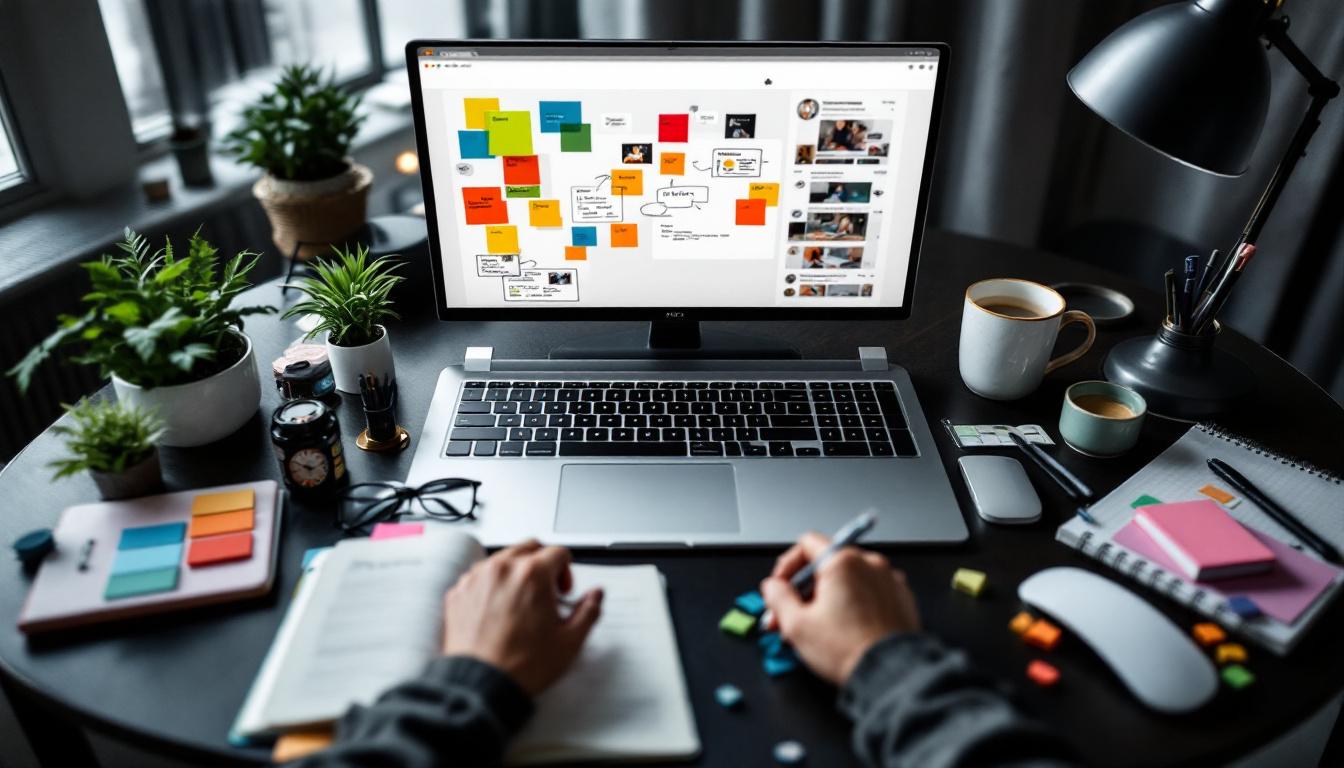
Focus on clear, concise language that highlights the benefits of your services. Use storytelling techniques to engage readers and make your brand values come alive. Incorporate relevant keywords naturally to improve search engine visibility without sacrificing readability.
Visual content such as high-quality images, videos, and infographics can complement your text and make your website more appealing and shareable. Showcasing your portfolio with detailed case studies allows potential clients to see the tangible results of your work.
A website is never truly finished. To remain effective and relevant, it requires ongoing attention and updates. Monitor your site’s performance using analytics tools to understand visitor behaviour and identify areas for improvement.
Gather feedback from clients and users to ensure the site meets their needs and expectations. Regularly update content to reflect new services, completed projects, and industry trends. Keeping your website fresh not only improves user experience but also signals to search engines that your site is active and authoritative.
Examining established branding agencies’ websites can offer valuable inspiration and insights. Agencies like Portent, Human Made, and Modern Tribe have crafted WordPress sites that effectively showcase their brand identities while providing user-friendly experiences.
These sites often combine strong visual branding, clear messaging, and intuitive navigation, creating engaging platforms that attract and convert visitors. Analysing their design choices, content strategies, and technical implementations can help inform your own website development.
However, while it’s useful to draw inspiration, it’s important to maintain your unique brand voice and tailor your website to your specific audience and goals.
Designing a WordPress website for a branding company involves a thoughtful blend of strategy, creativity, and technical know-how. By establishing a clear brand identity, understanding your audience, selecting the right theme, and crafting engaging content within a user-friendly layout, you can create a site that truly represents your agency’s strengths.
Optimising for mobile devices and integrating storytelling further enhance the user experience, while consistent branding throughout the site builds recognition and trust. Finally, committing to regular reviews and updates ensures your website remains a dynamic and effective tool for attracting and retaining clients.
With these best practices in mind, your WordPress website can become a powerful asset that not only showcases your branding expertise but also drives business growth.
Ready to elevate your brand's online presence with a stunning WordPress website? Kickass Online specializes in bespoke web development and digital marketing solutions that cater to your unique needs. Our experienced team is proficient with platforms like WordPress, Umbraco, Shopify, Webflow, and custom development using Angular, MERN, or Laravel. Beyond development, we offer comprehensive services including website maintenance, SEO, PPC, and AI-driven automations to grow your business. Don't wait to transform your digital strategy—book a discovery call with us today and take the first step towards a captivating and effective online brand experience.
Creating a professional and effective website for a solicitor is essential in today’s digital age. A well-designed website not only showcases the firm’s expertise but also builds trust with potential clients and makes it easy for them to get in touch. Using Umbraco as the content management system (CMS) offers flexibility and scalability, making it an excellent choice for law firms aiming to establish a strong online presence. This article explores how to design a Umbraco website tailored specifically for solicitors, covering key design principles, essential features, compliance considerations, and optimisation strategies.
At the heart of any successful solicitor website lies a user-centric design. This means the website should be intuitive, easy to navigate, and accessible to all visitors, regardless of their device or abilities.
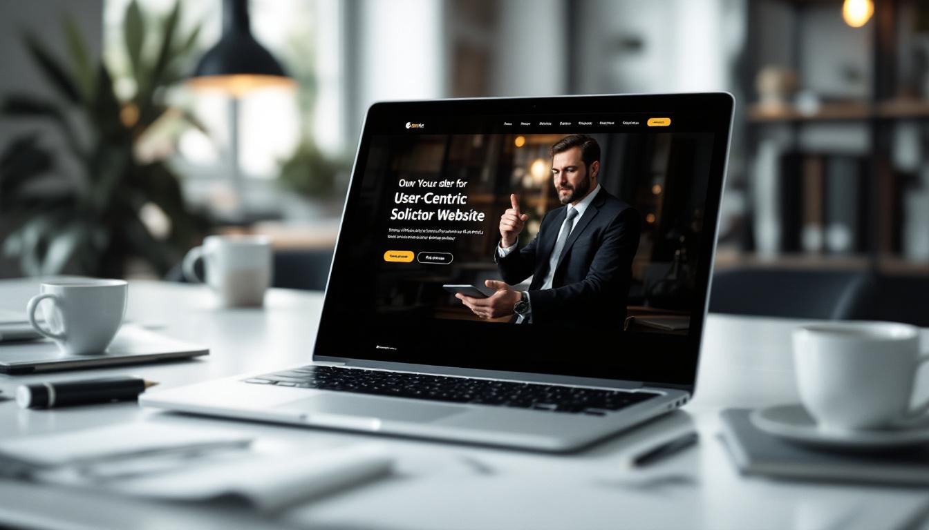
Clients seeking legal advice often find themselves in stressful situations, so the website needs to provide clear pathways to information without overwhelming them. A straightforward navigation structure helps users quickly locate services, team profiles, or contact details, reducing frustration and encouraging engagement.
Navigation menus should be concise and logically organised. Grouping services by legal specialisations or client needs helps visitors find relevant information without confusion. For example, separate sections for family law, property law, and criminal defence can guide users efficiently.
Given the increasing use of mobile devices, responsive design is non-negotiable. A solicitor’s website must display correctly on smartphones and tablets, adapting layouts and font sizes to ensure readability and usability. Responsive design not only improves user experience but also positively impacts search engine rankings, as Google prioritises mobile-friendly sites.
Moreover, incorporating features such as a search bar can significantly enhance user experience. This allows visitors to quickly type in keywords or phrases related to their legal queries, bypassing the need to navigate through multiple pages. Additionally, integrating a live chat function can provide immediate assistance, offering users the chance to ask questions or clarify doubts in real-time. This level of interaction not only fosters trust but also demonstrates the firm's commitment to client service.
Furthermore, accessibility should be a key consideration in the design process. This includes ensuring that the website is compliant with the Web Content Accessibility Guidelines (WCAG), which aim to make web content more accessible to people with disabilities. Features such as alt text for images, keyboard navigability, and adjustable text sizes can make a significant difference in how users interact with the site. By prioritising accessibility, solicitors not only widen their potential client base but also uphold their ethical responsibility to serve all members of the community effectively.
Beyond design, the website’s content and features play a crucial role in converting visitors into clients. Solicitors need to clearly communicate their expertise, build credibility, and provide easy ways for clients to reach out.
Potential clients want to understand exactly what legal services are offered and whether the firm specialises in their area of need. Providing comprehensive yet clear descriptions of services helps to set expectations and demonstrates the firm’s expertise. For instance, outlining the process involved in divorce proceedings or property conveyancing can reassure visitors and reduce initial uncertainty. Moreover, including FAQs related to each service can further assist clients in navigating their queries, ensuring they feel informed and empowered to make decisions regarding their legal matters.
Introducing the solicitors behind the firm with detailed profiles is an effective way to build trust. Profiles should highlight qualifications, years of experience, areas of specialisation, and any notable achievements. Including photographs adds a personal touch, making the firm feel approachable and transparent. Additionally, solicitors could share personal anecdotes or insights about their passion for law, which can resonate with potential clients on a more human level, fostering a connection that goes beyond mere professional credentials.
Contact details must be prominently displayed on every page, ideally in the header or footer, to ensure visitors can easily find them. This includes phone numbers, email addresses, and office locations with maps if possible. Additionally, a simple, user-friendly contact form encourages enquiries without the need for visitors to leave the website. To enhance accessibility, consider incorporating a live chat feature, allowing potential clients to engage with a representative in real-time, which can significantly improve the likelihood of converting inquiries into consultations.
Positive reviews and testimonials are powerful social proof. Displaying client feedback highlights the firm’s reputation and the quality of service offered. Where possible, include full names or initials and the nature of the case to add authenticity, while respecting client confidentiality. Furthermore, video testimonials can be particularly impactful, as they provide a dynamic way for clients to share their experiences, allowing potential clients to see and hear the satisfaction of others, thereby enhancing the firm’s credibility and relatability.
Solicitors handle sensitive information, so their websites must prioritise data protection and accessibility to meet legal and ethical standards.

Implementing robust security measures is vital to protect client data collected through contact forms or newsletters. This includes using SSL certificates to encrypt data, secure hosting environments, and regular software updates. Compliance with the General Data Protection Regulation (GDPR) is mandatory in the UK and EU, requiring clear privacy policies and consent mechanisms for data collection. Solicitors should also conduct regular audits of their data handling processes to identify any potential vulnerabilities. This proactive approach not only safeguards client information but also fosters trust, which is paramount in the legal profession. Moreover, training staff on data protection principles ensures that everyone within the firm understands their responsibilities regarding client confidentiality and data security.
Accessibility is not just a legal requirement but also an ethical one. The website should meet standards such as the Web Content Accessibility Guidelines (WCAG), ensuring it is usable by people with disabilities. This involves providing alternative text for images, ensuring sufficient colour contrast, enabling keyboard navigation, and using clear, simple language. Additionally, solicitors should consider the diverse needs of their clients, which may include those with visual impairments, hearing difficulties, or cognitive challenges. Incorporating features such as audio descriptions, transcripts for video content, and easy-to-navigate layouts can significantly enhance the user experience for all visitors. By prioritising accessibility, solicitors not only comply with legal standards but also demonstrate their commitment to inclusivity, ultimately broadening their reach and fostering a more equitable environment for everyone seeking legal assistance.
Performance optimisation and search engine optimisation (SEO) are key to attracting and retaining visitors on a solicitor’s website.
Slow websites deter visitors and can negatively affect search rankings. Optimising images for web use, minimising code bloat, and leveraging caching techniques help ensure pages load quickly. Umbraco’s flexible architecture supports these optimisations, contributing to a smooth user experience.
Implementing SEO strategies helps the firm appear prominently in search results when potential clients look for legal services. This includes using relevant keywords naturally within page titles, headings, and content, creating descriptive meta tags, and structuring URLs clearly. Additionally, regularly updating content such as blog posts or news articles keeps the site fresh and engaging for both users and search engines.
Umbraco is a powerful CMS that offers several advantages tailored to the needs of law firms.
Umbraco’s flexible templating system allows developers to create bespoke page layouts that reflect the firm’s brand identity. This ensures consistency in colours, fonts, and imagery, reinforcing professionalism and trustworthiness.
For solicitors serving diverse communities, offering content in multiple languages can broaden reach and improve client engagement. Umbraco supports multilingual websites, enabling easy management of translations within the same platform.
Integrating the website with customer relationship management (CRM) tools, email marketing platforms, or analytics services can streamline operations and enhance marketing efforts. For example, connecting enquiry forms directly to a CRM ensures prompt follow-up, improving client service.
As a law firm grows or changes, its website should be able to evolve without requiring a complete redesign.
Building the website with scalability in mind means it can accommodate new services, additional team members, or expanded content without compromising performance or user experience. Umbraco’s modular structure supports this adaptability, allowing new features to be added smoothly.
One of Umbraco’s strengths is its user-friendly content management interface. Solicitors or their staff can update text, images, and other content without needing technical expertise. This empowers the firm to keep the website current and relevant, which is important for both clients and search engines.
Developing a solicitor website on Umbraco requires expertise to ensure all the above elements are implemented effectively. Partnering with an experienced Umbraco agency can make a significant difference in the final product.
Agencies specialising in Umbraco understand the platform’s capabilities and legal industry requirements. They can guide the project from initial strategy through to deployment, ensuring the website is secure, compliant, and optimised for user experience and search engines.
Designing a Umbraco website for a solicitor involves more than just aesthetics. It requires a thoughtful approach that balances user-friendly design, comprehensive content, legal compliance, and technical optimisation. By focusing on intuitive navigation, detailed service and team information, robust security, and leveraging Umbraco’s flexible features, law firms can create websites that effectively represent their expertise and connect with clients.
Choosing the right development partner and planning for future growth ensures the website remains a valuable asset as the firm evolves. In a competitive legal market, a well-designed Umbraco website can be a key factor in attracting and retaining clients.
Ready to elevate your solicitor firm's online presence with a bespoke Umbraco website? At Kickass Online, we specialize in crafting custom web solutions that resonate with your brand and engage your clients. Our expertise spans across WordPress, Umbraco, Shopify, Webflow, and custom development using Angular, MERN, or Laravel. We don't just build websites; we ensure they thrive through meticulous maintenance, SEO, PPC, and cutting-edge AI and automations. Book a discovery call with us today and let's discuss how we can help grow your business.
Creating a Shopify website for a branding company is a unique challenge that requires balancing aesthetic appeal with functional design. The site must not only reflect the company’s identity but also engage visitors effectively, turning them into loyal clients. This guide explores key strategies and best practices to help design a Shopify store that stands out, drives conversions, and embodies the essence of a branding business.
Branding companies specialise in crafting identities, so their own website must serve as a prime example of this expertise. Consistency across all design elements—from colours and typography to imagery and tone—reinforces brand recognition and builds trust with visitors.
Using a cohesive colour palette that reflects your company’s values and style is essential. For instance, a branding agency focused on modern, minimalist design might opt for monochromatic schemes with bold accent colours, while a creative agency could use vibrant, playful hues. Typography should complement the brand’s personality, whether that’s sleek and professional or friendly and approachable.
Visual elements such as logos, icons, and images should also align with the brand story. High-quality, custom graphics and professional photography can elevate the site’s appearance, signalling attention to detail and quality—traits clients will expect from a branding company.
Moreover, the consistency of messaging across various platforms is equally crucial. Every piece of content, whether it be a blog post, social media update, or email newsletter, should echo the same voice and tone. This not only helps in creating a unified brand experience but also aids in establishing a distinct personality that resonates with the target audience. For example, if a branding agency positions itself as an industry leader, the language used should reflect authority and expertise, thereby reinforcing its reputation.
Additionally, the user experience (UX) plays a significant role in brand consistency. A well-structured website that is easy to navigate not only keeps visitors engaged but also reflects the professionalism of the agency. Elements such as consistent button styles, uniform spacing, and predictable layouts contribute to a seamless experience. When users can easily find information and interact with the site without confusion, it fosters a sense of reliability and encourages them to trust the brand further.
With over half of online interactions now occurring on mobile devices, a mobile-responsive design is no longer optional—it’s a necessity. A Shopify website that adapts smoothly to smartphones and tablets ensures visitors have a positive experience regardless of their device.
Mobile optimisation reduces bounce rates by making navigation intuitive and content easy to consume on smaller screens. This includes optimising images for faster loading, simplifying menus, and ensuring clickable elements are appropriately sized. A mobile-friendly site also improves search engine rankings, helping your branding company attract more organic traffic.
Moreover, the significance of mobile optimisation extends beyond mere aesthetics; it encompasses the entire user journey. For instance, integrating features such as voice search and location-based services can enhance user engagement, making it easier for potential customers to find your products or services. As consumers increasingly rely on their smartphones for shopping, having a site that not only looks good but also functions seamlessly can lead to higher conversion rates. Additionally, incorporating touch-friendly elements, such as swipe gestures and larger buttons, can further enhance usability, ensuring that users can navigate your site effortlessly.
Furthermore, it’s essential to consider the diverse range of mobile devices and operating systems in use today. Testing your website across various platforms—such as iOS and Android—can help identify any inconsistencies in performance or design. This level of diligence not only ensures a consistent experience for all users but also demonstrates a commitment to quality that can set your brand apart in a competitive marketplace. By prioritising mobile optimisation, you are not just catering to a trend; you are investing in a future where mobile commerce continues to flourish, and customer expectations evolve.
Selecting an appropriate Shopify theme is a foundational step in the design process. The theme sets the tone for the website and influences user experience. For branding companies, themes that offer flexibility and customisation are ideal, allowing the site to be tailored to specific brand guidelines.
The Shrine and Booster themes, for example, are popular choices for brand builders. Shrine provides modular, scalable designs with dynamic product information blocks and customisable cart backgrounds, enabling a polished and professional look. Booster focuses on conversion optimisation, combining sleek design with features that encourage user engagement.
When choosing a theme, consider not only aesthetics but also functionality—look for themes that support interactive elements, fast loading times, and easy navigation.
Additionally, it is essential to assess the compatibility of the theme with various apps and plugins that can enhance your store's capabilities. For instance, integrating social media feeds can create a more engaging experience, allowing customers to see real-time updates and user-generated content. Furthermore, themes that are responsive across different devices are crucial, as an increasing number of shoppers are using smartphones and tablets to browse and purchase online. A responsive design ensures that your site maintains its visual integrity and functionality, regardless of the device being used, thereby enhancing user satisfaction and potentially increasing conversion rates.
Moreover, considering the long-term implications of your theme choice is vital. Opting for a theme that is regularly updated and well-supported by its developers can save you from future headaches related to compatibility issues and security vulnerabilities. A theme with a robust community or customer support can provide invaluable resources and assistance, helping you to troubleshoot any issues that may arise as your brand grows and evolves. Ultimately, investing time in selecting the right Shopify theme can significantly impact your brand's online presence and overall success.
Visual content is a powerful tool for storytelling and engagement. For a branding company, showcasing your work through high-resolution images and videos can demonstrate your capabilities and style effectively.
Incorporate lifestyle photography that shows your branding projects in real-world contexts, helping potential clients visualise the impact of your services. Videos, such as client testimonials or behind-the-scenes looks at your creative process, can add authenticity and deepen emotional connections.
Investing in professional photography and videography not only enhances the site’s appeal but also signals professionalism and attention to detail—qualities that clients seek in a branding partner.
Visitors should be able to find what they’re looking for quickly and effortlessly. A well-structured navigation system reduces frustration and keeps users engaged longer.
Use clear menu labels and organise content logically. For example, separate your portfolio, services, about page, and contact information into distinct sections. Incorporate predictive search features and filters if you have a large portfolio or multiple service offerings.
Regularly testing different navigation layouts through A/B testing can provide insights into what works best for your audience, helping to refine the user experience over time.
Trust is a critical factor when clients choose a branding company. Displaying social proof such as customer reviews, testimonials, and user-generated content can significantly boost credibility.
Studies show that 88% of consumers trust online reviews as much as personal recommendations. Featuring authentic testimonials and case studies on your Shopify site reassures visitors of your expertise and reliability.
Embedding social media feeds or showcasing client logos can also enhance transparency and demonstrate a proven track record. These elements not only build trust but encourage visitors to engage more deeply with your brand.
Fast-loading websites are essential for retaining visitors and improving search engine rankings. Optimise images by compressing them without losing quality, minimise the use of unnecessary apps or plugins, and leverage caching to speed up load times.
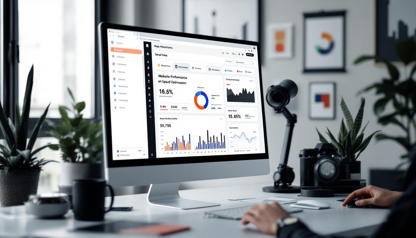
Shopify offers built-in performance reports that help identify bottlenecks. Regularly monitoring these metrics ensures your site remains responsive and efficient, providing a smooth user experience that keeps potential clients engaged.
Interactive elements can transform a static website into an engaging experience. Features like quizzes to help clients identify their branding needs, clickable product or service lists, and dynamic videos add depth and interactivity.
Augmented reality (AR) is an emerging trend that allows clients to visualise branding elements in their environment before committing. While more common in retail, AR can be adapted creatively for branding companies to showcase logos, packaging, or signage in real-world settings.
These dynamic features not only capture attention but also provide practical value, making the decision-making process easier and more enjoyable for clients.
Personalisation powered by artificial intelligence can significantly enhance user experience by tailoring content and recommendations to individual visitors. AI tools analyse browsing behaviour and preferences, suggesting relevant services or portfolio examples.
This personalised approach makes visitors feel understood and valued, increasing the likelihood of engagement and conversion. For a branding company, showcasing tailored case studies or customised service packages can demonstrate attentiveness and professionalism.
More consumers today prioritise sustainability and ethical business practices. Incorporating these values into your Shopify website can resonate with environmentally conscious clients and differentiate your branding company.
Use design elements such as icons indicating recyclable packaging or badges highlighting ethical sourcing. Include a dedicated section that explains your commitment to sustainability, detailing any eco-friendly initiatives or partnerships.
Communicating these values transparently not only appeals to a growing market segment but also reinforces your company’s integrity and social responsibility.
Designing a Shopify website for a branding company demands a thoughtful blend of aesthetics, functionality, and user engagement. By prioritising brand consistency, mobile optimisation, and high-quality visuals, you create a strong first impression that reflects your expertise.
Complementing this with clear navigation, social proof, and interactive features ensures visitors have a seamless and engaging experience. Optimising site speed and incorporating AI personalisation further enhance usability and conversion potential.
Finally, embracing sustainability and ethical practices can set your branding company apart in a competitive market. Implementing these strategies will help build a Shopify website that not only showcases your brand effectively but also fosters trust and drives business growth.
Ready to elevate your brand's online presence with a stunning Shopify website? At Kickass Online, we blend creativity with technical expertise to deliver bespoke web development solutions that resonate with your audience. Whether you're looking for a Shopify site that stands out, SEO strategies that drive traffic, or AI-driven automations that streamline your operations, we've got you covered. Don't just take our word for it—book a discovery call with us today and let's create something kickass together!
Creating a website for a Software as a Service (SaaS) business involves more than just showcasing your product. It requires a platform that can grow with your business, deliver content seamlessly across devices, and provide a secure, engaging experience for users. Umbraco, a flexible and scalable content management system (CMS), is an excellent choice for building such a website. This article explores the key strategies and best practices for designing an Umbraco website tailored specifically to SaaS platforms.
Umbraco’s architecture is designed to handle complex content structures and multiple sites, making it ideal for SaaS companies that anticipate growth and evolving content needs. Unlike traditional CMS platforms, Umbraco offers a high degree of flexibility, allowing developers to customise the backend while maintaining ease of use for content editors.
One of the standout features of Umbraco is its scalability. As your SaaS business expands, you can add new features, integrate additional services, and manage increasing amounts of content without compromising performance. This adaptability ensures your website remains a reliable asset as your customer base grows. Furthermore, Umbraco’s cloud hosting options provide a robust infrastructure that can automatically scale resources according to traffic demands, ensuring that your platform remains responsive even during peak usage times. This level of reliability is crucial for maintaining user satisfaction and trust in your brand.
Modern SaaS platforms often need to deliver content across multiple channels—websites, mobile apps, and even IoT devices. Umbraco supports a headless CMS model, where the content management backend is decoupled from the frontend presentation layer. This separation allows developers to use any technology stack for the frontend, providing greater freedom to create customised user experiences.
A practical example of this approach can be seen in retail brands like Skoringen, which leveraged Umbraco’s headless capabilities to enhance their omnichannel presence. This strategy led to a 19% increase in conversion rates and a 49% rise in drive-to-store visits, demonstrating the potential of headless CMS for improving engagement. Additionally, the ability to serve content dynamically means that businesses can tailor their messaging based on user behaviour and preferences, creating a more personalised experience that resonates with customers. This level of customisation not only boosts engagement but also fosters brand loyalty, as users feel more connected to a service that understands and caters to their individual needs.
Security is paramount for SaaS websites, which often handle sensitive user data and payment information. Umbraco has made significant strides in this area, incorporating modern security features such as multi-factor authentication and end-to-end encryption. The recent upgrade to Tiptap as the default rich text editor in Umbraco version 16 also reflects the platform’s commitment to safeguarding content from vulnerabilities. This enhancement not only fortifies the security of the content management process but also empowers content creators with a more intuitive editing experience, ensuring that they can focus on delivering high-quality content without the distraction of potential security concerns.
Ensuring compliance with data protection regulations like the GDPR is another critical consideration. Umbraco’s flexible architecture allows for the implementation of necessary privacy controls and consent management tools, helping SaaS providers maintain trust with their users. Furthermore, the platform's built-in features facilitate easy data access requests and the ability to delete user information upon request, which are essential components of GDPR compliance. This proactive approach not only helps in adhering to legal requirements but also fosters a culture of transparency and accountability, which can significantly enhance user loyalty and satisfaction.
Deploying your SaaS website on Umbraco Cloud offers additional security benefits. This managed hosting environment provides automatic updates, security patches, and high availability, reducing the operational burden on your team. With these features, you can focus on developing your core business functionalities while relying on a secure and reliable infrastructure. Additionally, Umbraco Cloud's robust backup and recovery options ensure that your data is not only secure but also easily recoverable in the event of an incident, providing peace of mind for both developers and users alike.
Moreover, the scalability of Umbraco Cloud allows businesses to grow without the fear of outgrowing their hosting solution. As your user base expands, the platform can seamlessly accommodate increased traffic and data loads, ensuring consistent performance and reliability. This scalability is particularly advantageous for SaaS providers looking to innovate and introduce new features, as it allows for rapid deployment without compromising on security or user experience. By leveraging Umbraco Cloud, businesses can confidently navigate the complexities of digital transformation while maintaining a strong focus on security and compliance.
Performance is a key factor in retaining users and encouraging conversions. Umbraco includes advanced caching mechanisms and optimised content delivery systems that contribute to faster load times and smoother interactions. These improvements are especially important for SaaS platforms, where users expect quick access to tools and information. The underlying architecture of Umbraco is designed to handle high traffic volumes efficiently, ensuring that even during peak times, users experience minimal delays. This reliability is crucial for businesses that depend on their online presence to drive sales and maintain customer satisfaction.

For example, after migrating their website to Umbraco, Shawbrook Bank saw a 70% increase in mobile traffic and a 41% boost in total organic traffic. This demonstrates how a well-optimised Umbraco site can significantly enhance user engagement and visibility. Furthermore, the analytics tools integrated within Umbraco allow businesses to monitor user behaviour closely, enabling them to make data-driven decisions that further refine their performance strategies. By continuously analysing user interactions, companies can identify bottlenecks and optimise their content to better meet the needs of their audience.
With a growing number of users accessing SaaS platforms via mobile devices, responsive design is no longer optional. Your Umbraco website should adapt seamlessly to different screen sizes and orientations, providing an optimal experience whether users are on a smartphone, tablet, or desktop. The use of fluid grids and flexible images within Umbraco ensures that your content looks appealing and functions well across all devices. This adaptability not only enhances user satisfaction but also positively impacts search engine rankings, as Google prioritises mobile-friendly sites in its search results.
Equally important is accessibility. Ensuring your site meets recognised standards means that users with disabilities can navigate and interact with your content effectively. This not only broadens your audience but also demonstrates a commitment to inclusivity. Implementing features such as keyboard navigation, screen reader compatibility, and alternative text for images can significantly improve the experience for users with varying needs. Moreover, by engaging with accessibility experts during the design process, businesses can ensure compliance with regulations such as the Equality Act 2010 in the UK, fostering a more equitable online environment for all users.
SaaS platforms often rely on a variety of third-party tools such as payment gateways, customer relationship management (CRM) systems, and analytics platforms. Umbraco’s flexible API and plugin architecture make it straightforward to integrate these services, enhancing your website’s functionality and user experience. This seamless integration allows businesses to streamline their operations, reducing the need for manual data entry and improving overall efficiency. Moreover, the ability to connect with popular tools like Stripe for payments or HubSpot for CRM ensures that businesses can leverage the best features from each platform without compromising on performance.
For instance, Rubbermaid Commercial Products successfully integrated multiple third-party applications into their Umbraco-powered eCommerce site, resulting in a robust and impactful online presence. By utilising these integrations, they not only improved their operational workflow but also enhanced customer satisfaction through smoother transactions and personalised communication. This case exemplifies how embracing third-party services can elevate a brand’s digital strategy and foster a more cohesive online experience for users.
Artificial intelligence is transforming how websites deliver content. Umbraco supports AI-driven content personalisation, allowing SaaS providers to tailor experiences based on user behaviour and preferences. This can lead to higher engagement rates and improved conversion by presenting users with relevant information and offers. For example, by analysing user interactions, AI can suggest products or content that align with individual interests, effectively creating a unique journey for each visitor. This level of personalisation not only enhances user satisfaction but also encourages repeat visits and loyalty to the brand.
Incorporating AI tools within your Umbraco site aligns with broader trends in the CMS landscape, where personalisation is becoming a key differentiator in competitive markets. As consumers increasingly expect tailored experiences, leveraging AI allows businesses to stay ahead of the curve. Additionally, the insights gained from AI analytics can inform marketing strategies and product development, enabling companies to make data-driven decisions that resonate with their target audience. By harnessing the power of AI, businesses can create dynamic, engaging websites that adapt to the needs of their users, ultimately driving growth and success in an ever-evolving digital landscape.
Launching your Umbraco website is just the beginning. To ensure ongoing success, it’s essential to monitor user behaviour and gather data on how visitors interact with your site. Analytics tools can reveal bottlenecks, popular features, and areas needing improvement.
Regularly reviewing these insights enables you to make informed decisions about design tweaks, content updates, and new feature development. This iterative process helps your SaaS website evolve in line with user expectations and business goals, maintaining its relevance and effectiveness over time.
Designing a website for a SaaS business using Umbraco requires a thoughtful approach that balances flexibility, security, performance, and user experience. By leveraging Umbraco’s scalable architecture, embracing a headless CMS model, prioritising security, and integrating advanced features like AI-driven personalisation, SaaS providers can build websites that not only meet technical demands but also engage and convert users effectively.
Additionally, deploying on Umbraco Cloud simplifies maintenance and enhances reliability, while responsive and accessible design ensures your platform reaches the widest possible audience. Finally, ongoing analytics and iteration keep your website aligned with evolving user needs and market trends.
With these strategies in place, an Umbraco website can become a powerful tool for driving growth and success in the competitive SaaS landscape.
Ready to elevate your SaaS platform with a high-performing Umbraco website? At Kickass Online, we specialize in bespoke web development, offering expertise in platforms like Umbraco, WordPress, Shopify, Webflow, and custom solutions using Angular, MERN, or Laravel. Our services extend to website maintenance, SEO, PPC, and leveraging AI and automation to scale your business. Don't miss the opportunity to transform your online presence. Book a discovery call with us today and let's create a website that stands out in the competitive SaaS landscape.
Creating a WordPress website tailored for a technology-focused audience in 2025 demands a thoughtful approach that balances cutting-edge design, seamless performance, and user experience. Whether you’re building a site for a tech startup, a blog about the latest gadgets, or a software company, understanding the key elements that resonate with tech-savvy visitors is essential. This guide explores how to design a WordPress website that not only looks modern but also performs exceptionally well in today’s fast-paced digital landscape.
Technology audiences expect websites that reflect innovation and sophistication. To meet these expectations, it’s important to incorporate contemporary design trends and leverage tools that streamline the development process.

One of the most significant advancements in web design is the integration of AI-powered tools. These tools can assist with content creation, image generation, and even suggest optimal layouts based on your content. By using AI-driven design assistants, you can save time and ensure your website’s structure maximises user engagement and readability. Furthermore, these tools often come equipped with analytics capabilities, allowing you to monitor user interactions and make data-driven decisions to enhance your site further. This level of insight can be invaluable in tailoring your content to meet the specific needs and preferences of your audience.
Additionally, minimalist design remains a popular choice for tech websites. A clean, uncluttered layout not only improves readability but also enhances loading speed, which is crucial for retaining visitors. Prioritising whitespace, simple typography, and intuitive navigation helps create a professional and approachable appearance. Moreover, the use of subtle animations and transitions can add a layer of sophistication without overwhelming the user. These elements can guide the visitor's journey through the site, drawing attention to key features or calls to action while maintaining an overall sense of calm and focus.
Another emerging trend is the use of dark mode, which has gained traction among users who prefer a more visually comfortable experience, especially in low-light environments. Dark mode not only reduces eye strain but can also enhance the visual impact of images and graphics, making them pop against a darker background. As more users become accustomed to this feature across various platforms, integrating dark mode into your web design can set your site apart and cater to a broader audience. By considering these modern trends and tools, you can create a website that not only meets but exceeds the expectations of today’s tech-savvy users.
With over 60% of web traffic coming from mobile devices, a mobile-friendly website is no longer optional—it’s essential. Google’s mobile-first indexing means that your site’s mobile version is the primary factor in search rankings. Therefore, choosing a WordPress theme that adapts seamlessly to different screen sizes is critical. This adaptability ensures that users can navigate your site effortlessly, regardless of the device they are using, whether it be a smartphone, tablet, or even a smaller laptop. A responsive design not only enhances user satisfaction but also encourages longer visits, as users are more likely to engage with content that is easily accessible and visually appealing on their chosen device.
Speed is another vital factor. Modern users expect pages to load within two seconds, and nearly 40% will abandon a site that takes longer than three seconds to load. Selecting a lightweight theme that is optimised for performance can make a significant difference. Themes like Astra Pro and Neve are well-regarded for their fast load times and mobile-first design, ensuring your site remains responsive and quick across all devices. Furthermore, integrating tools such as Google PageSpeed Insights can provide valuable insights into your site’s performance, highlighting areas for improvement and helping you maintain optimal loading speeds.
Beyond theme selection, implementing performance best practices is crucial. This includes optimising images, leveraging browser caching, and minimising the use of heavy plugins. Using a content delivery network (CDN) can also improve load times by serving your website’s content from servers closer to your visitors. A well-configured CDN can distribute your content globally, ensuring that users experience minimal latency, regardless of their geographical location. Additionally, consider implementing lazy loading for images and videos, which allows these elements to load only when they enter the viewport, further enhancing speed and performance.
Performance optimisation not only improves user experience but also positively impacts SEO, helping your site rank higher in search results. Search engines favour websites that provide fast and efficient experiences for users, which can lead to increased visibility and traffic. Regularly monitoring your site’s performance through analytics tools can help you identify trends and make informed decisions about future enhancements, ensuring that your website remains competitive in an ever-evolving digital landscape. Furthermore, staying updated with the latest web technologies and practices can give you an edge, allowing you to implement innovative solutions that keep your site at the forefront of user experience and search engine optimisation.
Search engine optimisation (SEO) is fundamental for any website aiming to attract organic traffic. For tech websites, where competition can be fierce, having an SEO-friendly WordPress theme is a strategic advantage.
Look for themes that offer clean, well-structured code and compatibility with popular SEO plugins such as Yoast SEO or Rank Math. Features like schema markup, which helps search engines understand your content better, and mobile-first indexing support are essential. Themes like Blocksy and Kadence are known for their SEO optimisation and fast, clean code.
Beyond theme capabilities, ensure your content follows SEO best practices: use descriptive headings, optimise meta descriptions, and include relevant keywords naturally. Fast loading times and mobile responsiveness also contribute to better SEO performance, making these factors inseparable from your overall SEO strategy.
Tech audiences appreciate websites that feel tailored and intuitive. Choosing a WordPress theme with robust customisation options allows you to reflect your brand identity accurately and provide a seamless user experience.
The ability to modify layouts, fonts, colours, and widgets without coding knowledge is invaluable. Themes that integrate with popular page builders like Elementor or Divi enable drag-and-drop editing, making it easier to experiment with design and functionality. Divi, for example, offers a powerful visual builder that balances aesthetics with performance.
Dark mode has become increasingly popular, especially among tech-savvy users who spend long hours in front of screens. A theme with built-in dark mode support not only enhances user comfort by reducing eye strain but also adds a modern, sleek look to your website. Blocksy is one such theme that offers dynamic dark mode options, appealing directly to this audience’s preferences.
Security is a critical consideration for any tech website, particularly if you handle sensitive data or run e-commerce operations. Opt for themes that receive regular updates and are built with security best practices in mind. An insecure website risks financial loss and damages your credibility with users.
Additionally, sustainability is gaining traction in web design. Lightweight themes that reduce server requests contribute to a greener digital footprint. By choosing eco-friendly design practices and optimised themes, you not only improve performance but also support environmental responsibility.
Block-based themes are transforming the WordPress landscape by enabling full-site editing through a drag-and-drop interface. This approach simplifies the design process and offers unparalleled flexibility, allowing you to customise every aspect of your site without touching a line of code.
The Divi theme is a prime example, offering a comprehensive visual builder that caters to both beginners and experienced designers. This flexibility is particularly beneficial for tech websites, where unique layouts and dynamic content are often required to showcase products, services, or innovations effectively.
Choosing the right theme is foundational to your website’s success. Here are some top WordPress themes that align well with the needs of technology-focused sites:
Astra Pro is renowned for its lightweight structure and customisation capabilities. It integrates smoothly with major page builders and offers a range of starter templates tailored to various niches, including technology. Its focus on speed and performance makes it an excellent choice for tech websites aiming to deliver fast, responsive experiences.
Kadence strikes a balance between design flexibility and functionality. With its drag-and-drop header and footer builder, global design controls, and WooCommerce support, it’s ideal for tech businesses that want a polished, professional look without sacrificing performance.
Neve is a mobile-first theme optimised for AMP (Accelerated Mobile Pages), ensuring lightning-fast load times on mobile devices. Its compatibility with all major page builders and e-commerce platforms makes it versatile for a variety of tech-related projects.
Built specifically for Gutenberg block editing, Blocksy offers dark mode options, dynamic content features, and extensive customisation. Its clean, fast code is SEO-friendly and developer-friendly, making it a great choice for tech websites focused on innovation and user experience.
Divi is known for its powerful visual builder and design flexibility. It allows users to create stunning layouts with ease, without compromising on performance. For tech companies that want a visually impressive yet efficient website, Divi provides a perfect blend of aesthetics and functionality.
Designing a WordPress website for a tech audience in 2025 involves more than just picking a trendy theme. It requires a strategic focus on performance, mobile optimisation, SEO, security, and user experience. Embracing modern design tools, such as AI-powered assistants and block-based editors, can streamline your workflow and enhance creativity.
By selecting a theme that supports customisation, dark mode, and sustainable design practices, you create a website that not only meets the expectations of tech-savvy users but also stands the test of time in a rapidly evolving digital environment. Whether you choose Astra Pro, Kadence, Neve, Blocksy, or Divi, prioritising speed, responsiveness, and SEO will ensure your site remains competitive and engaging.
Ultimately, a well-designed WordPress website tailored for technology will serve as a powerful platform to showcase innovation, build trust, and connect with your audience effectively.
Ready to elevate your tech website with a design that captivates and performs? Kickass Online specializes in crafting bespoke web solutions that resonate with tech-savvy audiences. Our expertise spans WordPress, Umbraco, Shopify, Webflow, and custom development using Angular, MERN, or Laravel. We don't just build websites; we ensure they thrive through meticulous maintenance, SEO, PPC, and cutting-edge AI and automations. Book a discovery call with us today and let's create a digital presence that truly kicks ass!
Launching a startup is an exciting journey, and one of the most crucial steps to establish your brand is creating a custom website. Your website often serves as the first point of contact between your business and potential customers, so it needs to be both engaging and functional. Designing a website tailored to your startup’s needs can significantly impact your online presence, user engagement, and ultimately, your success.
This guide explores essential strategies to help you design a custom website that not only looks professional but also delivers a seamless experience for your visitors.
The foundation of any effective website is a great user experience. If visitors find your site confusing or slow, they’re likely to leave without exploring your offerings. To keep users engaged, focus on simplifying navigation, ensuring mobile optimisation, and speeding up load times.

Clear and intuitive navigation is key to helping visitors find what they need quickly. A straightforward menu structure, with well-labelled categories and logical flow, reduces frustration and encourages users to explore more pages. Avoid cluttering your navigation bar with too many options; instead, prioritise the most important sections such as “About Us,” “Products or Services,” “Pricing,” and “Contact.”
Incorporating a search function can also assist users in locating specific information without hassle. Remember, the easier it is to navigate your website, the more likely visitors are to stay longer and convert. Additionally, breadcrumbs can be a useful feature, allowing users to track their path back to previous pages, which enhances their sense of control and understanding of the site’s structure. This is particularly beneficial for larger websites with extensive content, as it helps users feel less overwhelmed and more engaged.
With over 92% of internet users browsing on mobile devices, designing a mobile-friendly website is no longer optional — it’s a necessity. Responsive design ensures your site adapts seamlessly to different screen sizes, from smartphones to tablets and desktops.
A mobile-optimised website improves usability by making buttons easy to tap, text legible without zooming, and images appropriately scaled. It also positively impacts your search engine rankings, as Google prioritises mobile-friendly sites in its results. Furthermore, considering the touch interface of mobile devices, it’s essential to ensure that interactive elements are spaced adequately to prevent accidental clicks, which can lead to user frustration. Engaging users through mobile-specific features, such as location-based services or push notifications, can also enhance their experience and encourage repeat visits.
Speed is a critical factor in user retention. Studies show that if a page takes longer than three seconds to load, visitors are more likely to abandon it. Slow websites not only frustrate users but also harm your SEO performance.
To enhance loading times, optimise images, leverage browser caching, and minimise the use of heavy scripts. Tools like Google PageSpeed Insights can help you identify and fix speed issues efficiently. Additionally, consider using a Content Delivery Network (CDN) to distribute your content globally, which can significantly reduce loading times for users regardless of their geographical location. Regularly monitoring your site’s performance and making adjustments as needed can ensure that your users enjoy a consistently fast and smooth experience, ultimately leading to higher engagement and conversion rates.
Once visitors land on your site, guiding them towards desired actions is vital. Whether it’s signing up for a newsletter, requesting a demo, or making a purchase, clear and compelling calls-to-action (CTAs) help convert visitors into customers.
Place CTAs strategically throughout your website, especially on high-traffic pages like the homepage, product pages, and blog posts. Use contrasting colours to make buttons stand out and concise, action-oriented text such as “Get Started,” “Subscribe Now,” or “Contact Us Today.”
Ensure that each CTA leads to a relevant and easy-to-complete next step, reducing friction in the user journey. Testing different CTA placements and wording can also help identify what resonates best with your audience.
Moreover, consider the psychological triggers that can enhance the effectiveness of your CTAs. For instance, incorporating urgency by using phrases like “Limited Time Offer” or “Join Now Before It’s Too Late” can create a sense of immediacy that encourages users to act promptly. Additionally, employing social proof, such as displaying the number of current subscribers or testimonials from satisfied customers, can bolster trust and persuade hesitant visitors to take the plunge.
It’s also important to remember the mobile experience when designing your CTAs. With an increasing number of users accessing websites via their smartphones, ensure that your buttons are easily clickable and that the surrounding content is optimised for smaller screens. A seamless mobile experience not only improves user satisfaction but also significantly increases the likelihood of conversion, as users are more inclined to engage with a site that functions well on their devices.
Building a beautiful website is only part of the equation; you also need to ensure your target audience can find it. Search engine optimisation (SEO) helps improve your website’s visibility on platforms like Google, driving organic traffic and potential leads.
Start by researching keywords that your target customers are likely to use when searching for products or services like yours. Tools such as Google Keyword Planner or SEMrush can assist in identifying these terms.
Incorporate keywords thoughtfully into your page titles, headings, meta descriptions, and throughout your content. Avoid keyword stuffing, which can harm readability and SEO rankings. Instead, focus on creating content that answers your audience’s questions and provides value.
Regularly updating your website with informative blog posts, case studies, or news keeps your site relevant and encourages repeat visits. Quality content not only attracts visitors but also signals to search engines that your site is active and trustworthy.
Consider creating a content calendar to plan consistent updates that align with your startup’s goals and audience interests.
Developing a custom website from scratch can be time-consuming and expensive, especially for startups with limited resources. Fortunately, no-code platforms offer a practical solution to build professional websites quickly without extensive coding knowledge.
Platforms like Webflow, Framer, and Wix provide drag-and-drop interfaces and pre-designed templates tailored for startups. These tools allow you to prototype your website rapidly, test different designs, and launch faster than traditional development methods.
Moreover, no-code tools simplify ongoing maintenance, enabling you to update content, add new features, or tweak designs without relying on developers. This flexibility is crucial for startups aiming to stay agile and responsive to market feedback.
Your website should reflect your startup’s identity clearly and consistently to build recognition and trust. Cohesive branding helps visitors connect with your business and reinforces your message.
Choose a colour palette, typography, and imagery that align with your brand personality. Consistency in these elements across all pages creates a professional look and strengthens brand recall.
For example, if your startup’s brand is modern and innovative, opt for clean fonts, bold colours, and contemporary graphics. If it’s more traditional and trustworthy, select classic typefaces and a subdued colour scheme.
Beyond visuals, the tone and style of your written content should also mirror your brand’s character. Whether it’s friendly and casual or formal and authoritative, consistency in voice helps establish a connection with your audience.
Trust is a vital factor in converting visitors into customers. Showcasing social proof on your website reassures potential clients that your startup delivers value and has satisfied customers.

Featuring customer testimonials with real names and photos adds authenticity. Case studies that detail how your product or service solved specific problems demonstrate tangible benefits and expertise.
Including media mentions, awards, or partnerships further enhances credibility and positions your startup as a reliable player in your industry.
As your startup grows, your website needs to evolve alongside it. Planning for scalability from the outset ensures your site can handle increased traffic, content, and features without major overhauls.
Select a CMS that allows easy content updates and supports expansion. Popular options like WordPress, Webflow, or Shopify (for e-commerce) offer scalability and a wide range of plugins or integrations to enhance functionality.
Consider your startup’s long-term goals and choose a platform that can accommodate new products, services, or marketing strategies as you grow.
Organise your website structure so that new pages or sections can be added without disrupting existing content. A modular approach simplifies updates and improves user navigation as your site expands.
Designing a custom website for your startup is a strategic investment that can significantly influence your brand’s success. By focusing on user experience, clear calls-to-action, SEO, efficient development tools, consistent branding, social proof, and scalability, you create a website that not only attracts visitors but also converts them into loyal customers.

Remember, your website is a living asset that should evolve with your business. Regularly review and refine your design and content to ensure it continues to meet your audience’s needs and supports your startup’s growth.
Ready to bring your startup's vision to life with a custom website that captivates and converts? At Kickass Online, we specialize in crafting bespoke web solutions that resonate with your brand and audience. Our expertise spans WordPress, Umbraco, Shopify, Webflow, and custom development with Angular, MERN, or Laravel. Beyond development, we empower your online presence with website maintenance, SEO, PPC, and cutting-edge AI and automations. Book a discovery call with us today and let's kickstart your journey to digital excellence.
Creating a Shopify website tailored specifically for an accounting firm involves more than just setting up an online presence. It requires a thoughtful blend of professional design, user-friendly navigation, and practical features that reflect the trustworthiness and expertise of your firm. Whether you’re a seasoned accountant or a small practice looking to expand digitally, this guide will walk you through the essential steps to build a Shopify site that resonates with your clients and drives engagement.
Accounting services are built on trust, accuracy, and professionalism. Unlike typical e-commerce stores that focus on product sales, an accounting website’s primary goal is to communicate credibility and encourage potential clients to reach out for consultations or services. Therefore, the design and functionality must prioritise clarity, security, and ease of contact.
Clients visiting your site are often seeking reassurance that their financial matters will be handled competently. This means your website should highlight your qualifications, client testimonials, and the range of services offered, all while maintaining a clean and professional look. Additionally, features such as secure payment gateways and easy appointment booking can significantly enhance user experience.
Moreover, the content on your accounting website should be tailored to address the specific concerns of your target audience. For instance, small business owners may be particularly interested in tax planning and compliance, while individuals might seek assistance with personal budgeting or retirement planning. By providing informative articles, FAQs, and resources that cater to these diverse needs, you can position your firm as a knowledgeable and approachable authority in the field. This not only helps in building trust but also encourages visitors to spend more time on your site, increasing the likelihood of them reaching out for your services.
In addition to content, the visual elements of your website play a crucial role in conveying professionalism. A well-thought-out colour scheme, consistent branding, and high-quality images can create a welcoming atmosphere that reflects the values of your firm. Furthermore, ensuring that your website is mobile-responsive is essential, as many clients may access your services via smartphones or tablets. A seamless mobile experience can significantly improve engagement and accessibility, allowing potential clients to connect with you effortlessly, regardless of the device they are using.
With more people browsing and interacting with websites on mobile devices than ever before, a mobile-first approach is essential. Responsive design ensures your Shopify site looks and functions perfectly on smartphones, tablets, and desktops alike. This adaptability not only improves user experience but also positively impacts your search engine rankings.
For accountants, this means potential clients can easily navigate your services, read about your expertise, and book consultations on the go. Ensuring fast loading times and intuitive layouts on smaller screens can make the difference between gaining a new client or losing their interest. In today's fast-paced world, where time is of the essence, a seamless mobile experience can significantly enhance client satisfaction and retention. Furthermore, as more individuals rely on their smartphones for everyday tasks, from banking to scheduling appointments, having a mobile-optimised site can position your firm as a modern, accessible choice in a competitive market.
Additionally, consider incorporating touch-friendly elements such as larger buttons and easily tappable links to enhance usability on mobile devices. Since many users will be accessing your site with their fingers rather than a mouse, ensuring that these interactive elements are appropriately sized and spaced can prevent frustration and encourage engagement. Moreover, integrating features like click-to-call buttons can streamline the process for potential clients, allowing them to reach out to you directly without the hassle of searching for your contact information. As the digital landscape continues to evolve, embracing these mobile-first strategies will not only keep your site relevant but also foster a more connected and responsive relationship with your clientele.
Visitors should be able to find what they need quickly without feeling overwhelmed. A straightforward navigation menu with clear categories—such as Services, About Us, Resources, and Contact—helps users explore your site effortlessly.
One effective strategy is to include a prominent call-to-action (CTA) like “Book a Free Strategy Call” on your homepage and throughout the site. This encourages visitors to take the next step and engage with your firm directly.
Keep menus uncluttered and avoid jargon. Use familiar terms that clients will recognise easily. For example, instead of “Financial Solutions,” opt for “Accounting Services” or “Tax Preparation.” Additionally, consider incorporating a sticky header so that navigation options remain accessible as users scroll.
Visual elements play a crucial role in establishing your firm’s identity and professionalism. Using high-resolution images, such as photos of your team, office, or relevant financial graphics, can make your site more inviting and trustworthy.
Consistent branding—through colours, fonts, and logos—reinforces your firm’s personality and helps visitors remember you. Choose a colour palette that conveys stability and trust, such as blues, greys, and whites, which are commonly associated with finance and professionalism.
A cohesive visual identity signals attention to detail, a trait clients value highly in accountants. Avoid clutter and overly flashy elements that may distract from your core message. Instead, aim for a clean, modern look that highlights your expertise.
Potential clients often look for reassurance through the experiences of others. Featuring client testimonials, case studies, or reviews on your Shopify site can significantly boost credibility.
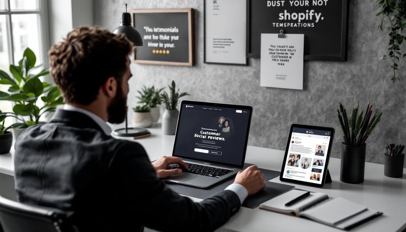
Choose testimonials that highlight specific benefits, such as improved tax savings or personalised service. Where possible, include client names and photos (with permission) to add authenticity.
Place testimonials strategically on your homepage, service pages, and near CTAs to reinforce trust at key decision points. Consider also adding logos of any professional associations or certifications your firm holds to further establish authority.
CTAs guide visitors towards actions that benefit both them and your firm. Whether it’s booking a consultation, signing up for a newsletter, or contacting you for more information, CTAs should be clear, concise, and inviting.
Use action-oriented phrases like “Book a Chat,” “Get Your Free Consultation,” or “Contact Us Today.” Position these CTAs prominently on your homepage, service pages, and in the website header or footer for easy access.
If your accounting firm offers online payment options for services such as tax filing or bookkeeping, security is paramount. Shopify provides secure payment gateways that comply with industry standards, including SSL certificates that encrypt sensitive data.
Displaying security badges and reassuring clients about data protection can build confidence in your online services. Always keep your website updated with the latest security protocols to safeguard client information.
To attract organic traffic, your Shopify website must be search-engine friendly. This involves using relevant keywords that potential clients might use when searching for accounting services, optimising meta titles and descriptions, and structuring your site logically.
For example, include keywords such as “accounting services,” “tax preparation,” or “small business accountant” naturally within your content. Additionally, ensure your site loads quickly and is mobile-friendly, as these factors influence search rankings.
) to organise content.Designing your Shopify website to be accessible ensures all users, including those with disabilities, can navigate and use your site effectively. This not only broadens your reach but also demonstrates your firm’s commitment to inclusivity.

Accessibility features include adjustable font sizes, high-contrast colour modes, keyboard navigation, and alt text for images. These elements improve usability for everyone, including those with visual impairments or motor difficulties.
Website performance directly affects user satisfaction and engagement. Slow-loading pages or broken elements can frustrate visitors and drive them away.
Optimise image sizes without sacrificing quality, minimise the use of heavy scripts, and leverage browser caching to speed up your site. Shopify’s platform offers tools and apps that help maintain optimal performance, ensuring your visitors have a seamless experience.
A website is never truly finished. To keep your accounting firm’s Shopify site relevant and secure, regular updates are essential. This includes refreshing content, adding new services, updating testimonials, and ensuring all software and plugins are current.

Routine maintenance also involves monitoring site analytics to understand visitor behaviour and making improvements based on those insights. Staying proactive helps you maintain a professional image and adapt to changing client needs.
Designing a Shopify website for an accountant requires a careful balance of professionalism, usability, and security. By focusing on responsive design, clear navigation, strong branding, social proof, and effective calls-to-action, your site can attract and convert potential clients effectively.
Incorporating secure payment options, optimising for search engines, ensuring accessibility, and maintaining high performance further enhance the user experience and build trust. Finally, regular updates keep your site fresh and aligned with industry standards, helping your accounting firm thrive in the digital landscape.
With these strategies in place, your Shopify website will not only showcase your expertise but also serve as a powerful tool to grow your client base and strengthen your firm’s reputation.
Ready to elevate your accounting firm's digital presence with a Shopify website that embodies professionalism and functionality? At Kickass Online, we specialize in crafting bespoke web solutions that cater to the unique needs of professionals like you. With our expertise in platforms such as Shopify, WordPress, and more, we ensure your website not only looks great but also ranks well and operates smoothly. Let us help you harness the power of SEO, PPC, and AI-driven automations to grow your business. Book a discovery call with us today and take the first step towards a standout online presence.
Creating a WordPress website for an IT company in 2025 involves more than just picking a theme and adding content. It requires a thoughtful approach that balances modern design trends, robust functionality, and a seamless user experience. Whether you’re building a site from scratch or revamping an existing one, understanding the key elements that resonate with your audience and reflect your company’s expertise is essential.
The theme you select sets the tone for your entire website. In 2025, the best WordPress themes for IT companies are those that combine sleek, minimalist design with powerful features. Look for themes that offer AI-powered customisation options, allowing you to tailor the look and feel without extensive coding knowledge.
Dark mode compatibility is increasingly popular, providing a modern aesthetic while reducing eye strain for users who browse at night. Additionally, accessibility features are no longer optional—they ensure your site is usable by everyone, including people with disabilities, and they also improve your SEO rankings.
Integration with emerging technologies such as chatbots or virtual assistants can set your IT company apart by offering visitors instant support or guidance. When selecting a theme, prioritise those that are regularly updated and supported by their developers to keep pace with evolving web standards.
Moreover, the importance of responsive design cannot be overstated. With an ever-increasing number of users accessing websites via mobile devices, your chosen theme must adapt seamlessly across various screen sizes. This not only enhances user experience but also plays a crucial role in search engine optimisation, as search engines favour mobile-friendly sites. Look for themes that boast a fluid grid layout and flexible images to ensure your content looks stunning, regardless of the device being used.
Another critical aspect to consider is the theme's loading speed. A visually appealing website is of little use if it takes ages to load. Themes that are optimised for speed can significantly reduce bounce rates and keep visitors engaged. Investigate themes that offer lightweight frameworks and minimal reliance on heavy scripts, as these factors contribute to a faster browsing experience. Additionally, consider the potential for customisation in terms of colour schemes and typography, as these elements can significantly impact your brand identity and user engagement.
Website speed is critical, especially in the IT sector where visitors expect efficiency and professionalism. A slow-loading site can frustrate users and increase bounce rates, negatively impacting your search engine rankings. Opt for themes that are optimised for speed, avoiding unnecessary bloat or overly complex design elements that slow down loading times.
Beyond the theme, your hosting environment plays a significant role in performance. Choose a reliable hosting provider that offers fast servers and scalable resources to handle traffic spikes. Regularly test your website’s speed using tools like Google PageSpeed Insights or GTmetrix, and make adjustments such as compressing images or leveraging browser caching to maintain optimal performance.
Moreover, the choice of content delivery network (CDN) can greatly enhance your website's speed, particularly for users located far from your server. A CDN distributes your content across multiple servers worldwide, ensuring that users can access your site from the nearest location, thus reducing latency. This is particularly beneficial for businesses that cater to a global audience, as it ensures a consistent and swift experience regardless of geographical barriers.
In addition to technical optimisations, consider the user experience when it comes to speed. Implementing lazy loading for images and videos can significantly improve initial load times, as these elements will only be loaded as they come into the user's viewport. Furthermore, simplifying your website's navigation can lead to quicker access to essential information, keeping visitors engaged and encouraging them to explore more of your offerings. Ultimately, a seamless and speedy browsing experience not only retains visitors but also fosters a sense of trust and credibility in your brand.
With over half of web traffic coming from mobile devices, your IT company’s website must look and function flawlessly on smartphones and tablets. Responsive design ensures your site automatically adapts to different screen sizes, providing a smooth browsing experience regardless of device.
When selecting a WordPress theme, verify that it is fully responsive. Test your website on various devices and browsers to identify any layout issues or usability problems. A mobile-friendly site not only improves user satisfaction but also favours your SEO, as search engines prioritise mobile-optimised websites in their rankings.
Moreover, the importance of mobile responsiveness extends beyond mere aesthetics; it significantly impacts user engagement and conversion rates. A website that loads quickly and displays content neatly on a mobile device encourages visitors to stay longer and explore more. This is particularly crucial for IT companies, where potential clients may be seeking immediate solutions or information. If your site is cumbersome to navigate on a smartphone, users are likely to abandon it in favour of a competitor’s site that offers a more user-friendly experience.
In addition, consider the growing trend of voice search, which is predominantly used on mobile devices. As more users rely on voice-activated technology to search for services, ensuring your content is optimised for mobile not only enhances accessibility but also aligns with this shift in user behaviour. Implementing structured data and ensuring your site loads quickly can further improve your visibility in voice search results, making it easier for prospective clients to find your IT services when they need them most.
Security is paramount for IT companies, which often handle sensitive client data and proprietary information. Implementing strong security measures builds trust and safeguards your business from cyber threats.
Start by choosing themes and plugins that adhere to the latest security standards and are regularly updated to patch vulnerabilities. Installing an SSL certificate is essential to encrypt data transmitted between your website and visitors, signalling to users that your site is secure.
Additionally, consider implementing security plugins that offer features such as firewalls, malware scanning, and login protection. Regularly back up your website to prevent data loss in case of an attack or technical failure.
Your website should clearly communicate what your IT company offers and why clients should choose you. Incorporate functionalities that highlight your expertise and encourage interaction.
Use dedicated pages or sections to detail your services, explaining the benefits and technologies involved. Including case studies or project highlights can demonstrate your capability and build credibility.
Displaying feedback from satisfied clients fosters trust and reassures potential customers about your reliability and quality of work. Authentic testimonials can significantly influence decision-making.
Make it easy for visitors to get in touch by providing clear, user-friendly contact forms. Ensure forms are simple to complete, mobile-friendly, and include necessary fields to capture relevant information.
Maintaining a blog allows you to share industry insights, company updates, and thought leadership. Regularly updated content keeps your website dynamic, engages visitors, and supports SEO efforts by targeting relevant keywords.
Search engine optimisation (SEO) is vital for attracting organic traffic to your IT company’s website. Choose a theme that is SEO-friendly, with clean code and fast loading times. Use relevant keywords naturally throughout your content, including headings, paragraphs, and metadata.
Ensure all images have descriptive alt text and that your website’s structure supports easy crawling by search engines. Tools like Yoast SEO can help manage on-page optimisation and provide actionable recommendations.
A well-organised navigation menu helps visitors find the information they need quickly, reducing frustration and encouraging longer site visits. Structure your menu logically, grouping related pages and using clear labels.

Consider including a search function for larger websites, enabling users to locate content directly. Consistent navigation across all pages ensures a smooth user experience and supports your site’s overall usability.
Keeping your website content fresh reflects your company’s ongoing developments and commitment to the IT industry. Regular updates can include new service offerings, recent projects, or industry news.
Frequent content refreshes not only engage returning visitors but also signal to search engines that your site is active, which can positively influence your rankings. A content calendar can help plan and maintain consistent updates.
Your website should embody your company’s brand identity through consistent use of colours, fonts, and logos. This visual coherence reinforces professionalism and makes your site instantly recognisable.
Ensure that branding elements are applied thoughtfully, balancing aesthetic appeal with readability and user experience. Avoid overcomplicating designs; simplicity often conveys clarity and trustworthiness.
Before going live, thoroughly test your website’s functionality, usability, and performance. Check all links, forms, and interactive elements to ensure they work as intended.

Gather feedback from colleagues, stakeholders, and potential users to identify areas for improvement. This input can reveal issues you might have overlooked and help tailor the website to better meet user expectations.
Continuous testing and iteration even after launch are important to maintain a high-quality website that evolves with your business needs.
Designing a WordPress website for an IT company in 2025 demands a strategic blend of modern design, robust functionality, and user-centric features. By selecting a suitable theme, prioritising speed and security, ensuring mobile responsiveness, and integrating essential elements like service showcases and client testimonials, you can create a compelling online presence.

Optimising for SEO, maintaining clear navigation, regularly updating content, and embedding consistent branding further enhance your site’s effectiveness. Finally, thorough testing and incorporating feedback ensure your website not only looks professional but also performs seamlessly.
With these considerations in mind, your WordPress website will effectively represent your IT company, engage visitors, and support your business objectives well into the future.
Ready to elevate your IT company's online presence with a state-of-the-art WordPress website? At Kickass Online, we specialize in bespoke web development across platforms like WordPress, Umbraco, Shopify, Webflow, and even custom solutions using Angular, MERN, or Laravel. Our expertise extends to website maintenance, SEO, PPC, and leveraging AI and automation to scale your business. Don't miss the opportunity to transform your digital strategy. Book a discovery call with us today and let's create a website that not only looks kickass but also drives your business forward.
Creating an effective Shopify website for a Managed Service Provider (MSP) in 2025 requires more than just a sleek design. It involves blending industry-specific needs with the latest e-commerce trends to deliver a seamless, secure, and engaging experience for your clients. Whether you’re launching a new site or revamping an existing one, this guide will walk you through the essential steps and best practices to ensure your MSP’s online presence stands out.
In today’s digital landscape, mobile commerce is no longer optional—it’s essential. By 2025, mobile purchases are expected to make up 42% of all e-commerce transactions in the UK and US. This means your Shopify website must be designed with mobile users in mind from the outset.
A mobile-first approach ensures that your site looks and functions flawlessly on smartphones and tablets, which are often the first point of contact for potential clients. Responsive layouts, easy navigation, and fast loading times on mobile devices improve user experience and reduce bounce rates. For MSPs, where trust and professionalism are key, a smooth mobile experience can make a significant difference in client acquisition and retention.
Moreover, the prevalence of mobile devices means that users are increasingly expecting a seamless transition between their devices. This expectation extends beyond just the aesthetics of the site; it encompasses the entire user journey. For instance, a customer may start browsing on their phone during their commute and later return to their desktop to complete a purchase. Therefore, ensuring that the experience is consistent across platforms is paramount. Integrating features such as saved carts or user accounts can facilitate this continuity, allowing users to pick up right where they left off, regardless of the device they are using.
Additionally, as mobile technology continues to evolve, it is crucial to stay abreast of emerging trends and features that can enhance mobile user engagement. For example, incorporating voice search capabilities can cater to the growing number of users who prefer speaking over typing. Similarly, utilising mobile-specific functionalities, such as geolocation services, can provide tailored experiences that resonate with users on a personal level. By embracing these innovations, businesses can not only meet but exceed the expectations of their mobile audience, fostering loyalty and encouraging repeat visits.
Personalisation is no longer a luxury—it’s an expectation. MSPs can benefit greatly by tailoring the shopping experience to individual visitors. Shopify’s evolving tools now allow for dynamic content that adapts based on user behaviour, preferences, and previous interactions.
For example, returning visitors might see customised service recommendations or loyalty rewards based on their past engagements. This not only improves user satisfaction but also encourages repeat business and builds long-term client relationships. By leveraging data analytics, MSPs can gain insights into customer journeys, allowing them to refine their offerings and create a more engaging user experience that resonates with each visitor.
Consider integrating personalised loyalty programmes that reward clients for continued use of your services. Use behavioural data to highlight relevant case studies, service packages, or support options that align with the visitor’s industry or company size. This level of attention shows potential clients that your MSP understands their unique needs. Moreover, incorporating features such as personalised email campaigns can further enhance engagement; by sending tailored messages that reflect the recipient's interests, you can foster a deeper connection and encourage them to explore more of what your services have to offer.
Additionally, utilising chatbots equipped with AI can provide immediate, personalised assistance, answering queries based on the user's history and preferences. This not only streamlines the customer service process but also creates a more interactive experience, making visitors feel valued and understood. By ensuring that every touchpoint is personalised, you can significantly enhance the overall user experience, leading to higher conversion rates and greater customer loyalty.
Artificial intelligence is transforming how Shopify merchants manage their stores. For MSPs, AI tools can simplify content creation, customer support, and site customisation—freeing up valuable time to focus on strategic growth.
Shopify’s AI capabilities now include generating product descriptions, FAQs, and even custom theme blocks from simple prompts. This can be particularly useful for MSPs who offer complex or technical services that need clear, concise explanations tailored to different audiences. By harnessing AI, merchants can ensure that their messaging resonates with potential customers, enhancing engagement and driving conversions.
Moreover, the integration of AI can lead to significant improvements in customer experience. For instance, AI chatbots can handle routine inquiries, providing instant responses to customers at any hour of the day. This not only boosts customer satisfaction but also allows human support teams to focus on more complex issues that require a personal touch. As a result, businesses can operate more smoothly, with fewer bottlenecks in their customer service processes.
Additionally, AI tools can analyse customer behaviour and preferences, allowing merchants to tailor their offerings more effectively. By understanding which products are most popular or which services are frequently requested, MSPs can make informed decisions about inventory and marketing strategies. This data-driven approach not only enhances operational efficiency but also helps in crafting targeted campaigns that resonate with specific customer segments, ultimately leading to increased sales and customer loyalty.
Accessibility is both a legal requirement and a moral imperative. Approximately 1.3 billion people worldwide have some form of disability, and your MSP website should be welcoming and usable for all visitors.
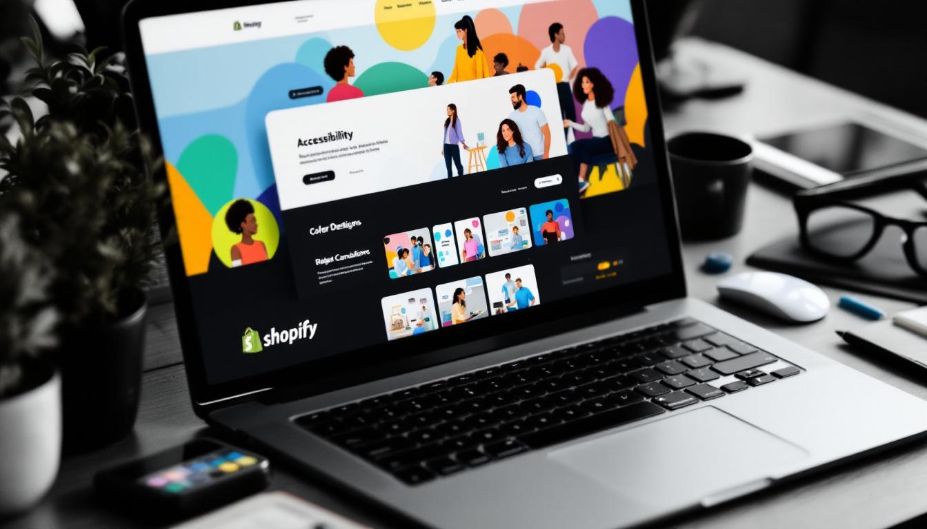
Adhering to the Web Content Accessibility Guidelines (WCAG) 2.1 at Level AA ensures your site is perceivable, operable, understandable, and robust. This means providing features such as keyboard navigation, alt text for images, and sufficient colour contrast.
Beyond compliance, accessible websites improve SEO and foster trust among clients who value inclusivity. For MSPs, demonstrating commitment to accessibility can also reflect the quality and reliability of your services.
Content is the backbone of your Shopify site. For MSPs, clear, concise, and informative content not only educates visitors but also builds credibility and improves search engine rankings.
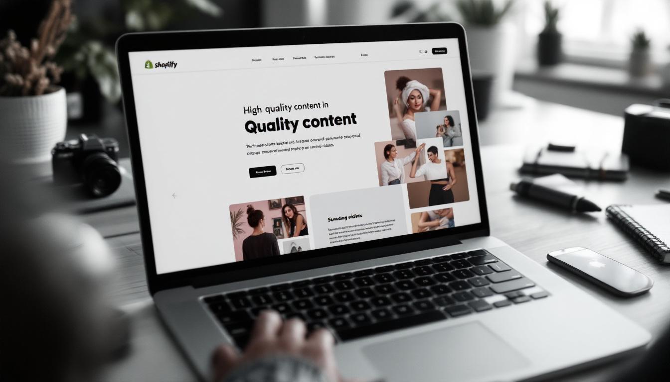
Detailed service descriptions should explain what you offer and how it benefits clients, avoiding jargon where possible. Supplement these with blog posts that address common IT challenges, industry trends, and case studies showcasing your expertise.
Engaging multimedia such as explainer videos, infographics, and client testimonials can further enhance your site’s appeal and help potential clients understand the value of your services.
Speed matters. A fast-loading website keeps visitors engaged and reduces bounce rates. For MSPs, where clients expect professionalism and efficiency, performance optimisation is crucial.
Several practical steps can improve your Shopify site’s speed:
These measures not only improve user experience but also positively impact your search engine rankings, helping more potential clients find your MSP online.
Security is paramount in e-commerce, especially for MSPs handling sensitive client information. A secure website builds trust and protects both your business and your customers.
Ensure your Shopify store uses SSL certificates to encrypt data during transactions. Enable two-factor authentication for all admin accounts to add an extra layer of protection. Regularly update your themes, apps, and plugins to patch vulnerabilities and prevent cyber threats.
Communicate your security measures clearly on your site to reassure visitors that their data is safe with you—this can be a deciding factor for businesses choosing an MSP.
MSPs often rely on multiple systems such as ERP, CRM, and marketing platforms. Integrating these with your Shopify store streamlines operations and enhances client management.
Shopify supports a wide range of third-party integrations, allowing you to synchronise data, automate workflows, and gain better insights into your business performance. Regular maintenance of these integrations ensures smooth operation, avoiding disruptions that could affect client experience.
Designing a Shopify website for an MSP in 2025 involves a thoughtful blend of mobile-first design, personalisation, AI tools, accessibility, quality content, performance optimisation, security, and seamless integrations. By focusing on these areas, your MSP can create a website that not only meets modern e-commerce standards but also delivers a trustworthy, engaging, and inclusive experience for all visitors.
Investing time and resources into these strategies will help your MSP stand out in a competitive market, attract and retain clients, and ultimately drive business growth through a professional and effective online presence.
Ready to elevate your MSP's online presence with a cutting-edge Shopify website? Kickass Online specializes in bespoke web development across platforms like Shopify, ensuring your site is optimized for performance, security, and user engagement. Our expertise extends to WordPress, Umbraco, Webflow, and custom development using Angular, MERN, or Laravel. Beyond development, we offer comprehensive digital marketing services, including website maintenance, SEO, PPC, and AI-driven automations to scale your business. Book a discovery call with us today and let's create a digital experience that sets your MSP apart.
Creating a website for a branding company demands a careful balance between visual appeal, functionality, and scalability. Umbraco, a flexible and open-source content management system (CMS), offers a powerful platform to build such websites that truly reflect a company's identity while providing a seamless user experience. This guide explores how to design an Umbraco website tailored specifically for branding companies, focusing on key aspects such as customisation, responsiveness, performance, and integration with essential business tools.
One of Umbraco’s greatest strengths lies in its open-source nature, which allows developers to customise the CMS extensively. For a branding company, this means the website can be crafted to perfectly align with the unique identity and workflow of the business rather than being limited by rigid templates or predefined structures.
Developers can modify source code to create bespoke layouts, interactive elements, and tailored functionalities. This freedom ensures that the website is not just a digital brochure but a dynamic tool that supports the company’s branding strategy. Whether it’s custom content types, unique navigation flows, or specialised media galleries, Umbraco’s flexibility accommodates these needs with ease.
Branding companies thrive on distinctiveness and creativity. A generic website template rarely conveys the personality and ethos of a brand effectively. Customisation allows the website to become an extension of the company’s visual identity, using bespoke fonts, colour schemes, and interactive features that resonate with clients and prospects alike.
Moreover, the ability to integrate various third-party tools and APIs further enhances the customisation potential of Umbraco. For instance, a branding agency might want to incorporate social media feeds, analytics tools, or even e-commerce functionalities seamlessly into their site. This integration not only enriches the user experience but also provides valuable insights into customer behaviour, enabling the agency to refine its strategies. As a result, the website evolves into a multifaceted platform that not only showcases the brand but also engages users in meaningful ways, fostering a deeper connection with the audience.
In addition to aesthetic and functional customisations, Umbraco also supports a robust content management system that empowers branding companies to manage their digital assets efficiently. With features such as version control, multi-language support, and user permissions, teams can collaborate effectively while maintaining a consistent brand voice across various channels. This level of control is crucial for branding companies that often juggle multiple projects and clients, ensuring that each website remains true to its intended message and design ethos.
In an era where mobile devices dominate internet usage, responsive design is no longer optional—it is essential. Umbraco supports responsive design out of the box, enabling websites to adapt seamlessly to different screen sizes, from desktops to smartphones and tablets.

For a branding company, consistency in visual identity across all devices is crucial. Responsive design ensures that logos, colour palettes, and imagery maintain their impact regardless of how users access the site. This consistency builds trust and reinforces brand recognition.
When designing responsively, consider the hierarchy of content and how it shifts on smaller screens. Navigation menus should be easy to access and use on mobile devices, often through collapsible menus or “hamburger” icons. Images and videos must be optimised to load quickly without compromising quality, and text should remain legible without excessive zooming or scrolling.
In addition to these considerations, it is vital to implement flexible grid layouts that allow content to flow naturally across various screen sizes. Using CSS media queries can help tailor the presentation of content to suit different devices, ensuring an optimal viewing experience. Furthermore, incorporating touch-friendly elements, such as larger buttons and interactive features, enhances usability on mobile devices, making it easier for users to engage with the site.
Another important aspect of responsive design is the performance of the website. As mobile users often rely on varying internet speeds, it is essential to minimise load times by compressing images and leveraging browser caching. Tools like Google PageSpeed Insights can provide valuable feedback on how to improve site performance. By prioritising speed and accessibility, brands can create a more satisfying experience for their users, ultimately leading to higher engagement and conversion rates.
Website performance directly influences user experience and search engine rankings. A slow-loading site frustrates visitors and can lead to higher bounce rates. Umbraco offers several ways to enhance performance, such as image optimisation, CSS and JavaScript minification, and caching strategies. By leveraging these features, developers can significantly reduce the time it takes for a webpage to load, ensuring that users remain engaged and are more likely to explore further. Furthermore, employing Content Delivery Networks (CDNs) can distribute content across various geographical locations, allowing for faster access times for users regardless of their location.

Implementing lazy loading for images and videos is another effective technique. This approach loads media only as it comes into the user’s viewport, reducing initial page load times and conserving bandwidth. Additionally, it is important to consider the use of asynchronous loading for scripts, which allows the browser to continue rendering the page while scripts are being downloaded. This not only improves perceived performance but also enhances the overall user experience, making the site feel more responsive and fluid.
Security is paramount, especially when handling client data or integrating with business tools. Umbraco regularly updates its platform to address vulnerabilities, and developers should ensure these updates are applied promptly. Additionally, using HTTPS, securing forms against spam and abuse, and implementing strong authentication methods protect both the company and its customers. It is also advisable to conduct regular security audits and vulnerability assessments, which can help identify potential weaknesses before they can be exploited. By adopting a proactive approach to security, businesses can safeguard their digital assets and maintain the trust of their clients.
Moreover, employing firewalls and intrusion detection systems can further bolster a website’s security posture. These tools monitor traffic for suspicious activity and can block malicious requests before they reach the server. Educating staff about security best practices, such as recognising phishing attempts and using secure passwords, is equally crucial. A well-informed team can act as the first line of defence against cyber threats, ensuring that the website remains a safe environment for users and clients alike.
A branding company’s website is not just a showcase; it is a hub for managing leads, clients, and marketing efforts. Umbraco’s capability to integrate with various CRM (Customer Relationship Management), ERP (Enterprise Resource Planning), and marketing automation tools streamlines these processes.
Integrations with platforms such as HubSpot, Salesforce, or Google Analytics enable the company to track visitor behaviour, manage campaigns, and nurture leads efficiently. This seamless data flow ensures that marketing strategies are informed by real-time insights and that customer interactions are personalised.
By connecting the website with email marketing tools or chatbots, branding companies can engage visitors proactively. Personalisation features can tailor content based on user behaviour or demographics, making the website more relevant and increasing conversion opportunities.
Search engine optimisation (SEO) is vital for attracting organic traffic and increasing visibility. Umbraco provides built-in tools to customise meta tags, URLs, and redirects, all of which contribute to a solid SEO foundation.

Moreover, integrating with marketing platforms allows for detailed tracking and analysis of user behaviour. Understanding how visitors interact with content helps refine marketing campaigns and improve conversion rates.
Ensure that each page has unique and descriptive meta titles and descriptions. Use clean, keyword-friendly URLs and implement 301 redirects to manage changes in site structure without losing search ranking. Regularly update content to keep it fresh and relevant, which search engines favour.
Headless CMS architecture decouples content management from the presentation layer, allowing content to be delivered across multiple channels such as websites, mobile apps, and IoT devices. Umbraco’s headless capabilities offer branding companies the flexibility to future-proof their digital presence.
This approach means that as new technologies and platforms emerge, the company can adopt them without overhauling the entire CMS. Content can be managed centrally and distributed wherever it’s needed, maintaining consistency and saving time.
One of Umbraco’s standout features is its vibrant and supportive community. With thousands of developers and businesses actively contributing, the community is a valuable resource for troubleshooting, inspiration, and staying updated on best practices.
Regular updates to the platform often stem from community feedback, ensuring that Umbraco evolves in ways that meet real-world needs. For branding companies, tapping into this network can accelerate development and enhance the website’s capabilities.
Designing an Umbraco website for a branding company involves more than just aesthetics; it requires a strategic approach that leverages the CMS’s flexibility, responsiveness, and integration capabilities. By focusing on customisation, mobile-friendly design, performance optimisation, and seamless integration with business tools, branding companies can create websites that not only look impressive but also drive business growth.
Moreover, utilising Umbraco’s headless CMS features and engaging with its active community ensures that the website remains adaptable and supported well into the future. With these considerations in mind, branding companies can build a digital presence that truly reflects their identity and meets the evolving needs of their clients.
Ready to elevate your branding company's online presence with a custom-designed Umbraco website? At Kickass Online, we specialize in bespoke web development across platforms like Umbraco, ensuring your brand stands out in the digital landscape. Our expertise extends to WordPress, Shopify, Webflow, and custom development with Angular, MERN, or Laravel. Beyond development, we offer comprehensive website maintenance, SEO, PPC, and AI-driven automations to propel your business growth. Book a discovery call with us today and let's create a website that truly encapsulates your brand's essence.