Responsive Design Tutorial for Effective Mobile Websites

Many Milton Keynes businesses struggle to keep up as customers move between mobiles, tablets and desktops. A one size fits all website no longer works when your audience expects smooth browsing everywhere. By focusing on responsive web design principles and tailored digital marketing strategies, your business can reach more people in Milton Keynes and beyond with a website that looks sharp and works flawlessly on every device.
Table of Contents
- Step 1: Assess Project Requirements And Select Responsive Frameworks
- Step 2: Set Up Essential Html And Css For Flexible Layouts
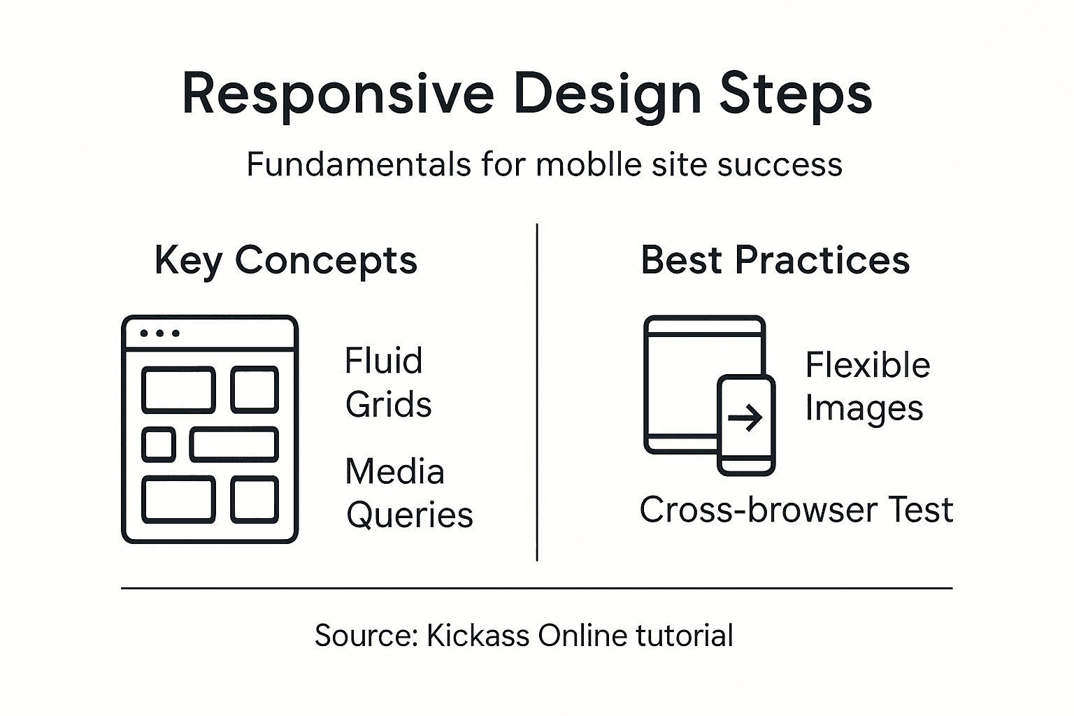
- Step 3: Implement Fluid Grids And Scalable Images
- Step 4: Apply Media Queries To Tailor For All Devices
- Step 5: Test And Validate Design Across Multiple Browsers
Quick Summary
| Important Insight | Clarification |
|---|---|
| 1. Assess project requirements thoroughly | Understand the specific needs for device compatibility, performance, and audience preferences before selecting a responsive framework. |
| 2. Use a mobile-first approach | Start your HTML structure focusing on smaller screens, progressively enhancing for larger devices to ensure optimal performance. |
| 3. Implement fluid grids for layouts | Shift from fixed widths to percentage-based layouts to ensure adaptability across varying screen sizes effectively. |
| 4. Test across multiple browsers and devices | Execute comprehensive testing to validate your website’s functionality and appearance across different platforms and browsers. |
| 5. Prototype frameworks before full development | Always create a small test project to validate your chosen framework’s performance and compatibility prior to full-scale implementation. |
Step 1: Assess project requirements and select responsive frameworks
Selecting the right responsive framework requires a strategic approach tailored to your specific web development needs. You will analyse your project’s technical requirements, device compatibility goals, and performance expectations before making a framework selection.
Start by comprehensively mapping out your project’s specific demands. This involves understanding your target audience’s device usage, screen resolution ranges, and performance expectations. Responsive web design principles suggest examining factors like mobile traffic percentages, typical screen sizes, and loading speed requirements. Consider creating a detailed matrix of device types your website must support most effectively.
Next, evaluate popular responsive frameworks against your specific requirements. Look beyond marketing materials and assess practical capabilities. Popular options like Bootstrap, Foundation, and Tailwind CSS offer different strengths. Some prioritise lightweight performance, while others provide extensive pre built components. Carefully compare framework features such as grid systems, responsive breakpoints, browser compatibility, and customisation flexibility. Your goal is finding a framework that matches your project’s unique technical landscape and design vision.
Here’s a comparison of three popular responsive frameworks to help guide your selection:
| Framework | Grid System Flexibility | Customisation Ease | Notable Advantage |
|---|---|---|---|
| Bootstrap | Highly configurable | Extensive variables | Large pre built component set |
| Foundation | Advanced and flexible | Modular Sass structure | Excellent accessibility tools |
| Tailwind CSS | Fully utility based layouts | Rapid design iteration | Small CSS bundle size |
Top Tip: Always prototype your chosen framework with a small test project before committing to full website development to validate its real world performance and compatibility.
Step 2: Set up essential HTML and CSS for flexible layouts
Designing responsive websites requires establishing a robust HTML and CSS foundation that adapts seamlessly across different devices and screen sizes. You will learn how to structure your markup and style sheets to create layouts that flex and adjust dynamically.
Responsive design principles recommend using a mobile first approach when structuring your HTML. Begin by creating a semantic HTML structure that separates content from presentation. Use semantic tags like header, main, section, and footer to provide meaningful document structure. Implement a flexible container system using percentage based widths or CSS grid layouts that automatically adjust to different screen sizes.
For CSS, focus on creating fluid and adaptive styling. Utilise relative units like percentages, em, rem, and viewport width (vw) instead of fixed pixel measurements. Implement media queries to define specific layout changes at different breakpoints. This allows your design to smoothly transition between mobile, tablet, and desktop views. Prioritise flexible box (flexbox) and grid layouts that inherently support responsive design, enabling content to reflow and reorganise intuitively across various device dimensions.

Top Tip: Test your responsive layouts using browser developer tools that simulate different device screen sizes to ensure consistent performance across multiple platforms.
Step 3: Implement fluid grids and scalable images
Creating responsive websites demands intelligent design strategies that allow content to adapt gracefully across different screen sizes. You will learn how to construct flexible grid systems and make visual elements resize intelligently without losing quality or visual integrity.
Fluid grid techniques provide the foundation for responsive layouts by using relative measurements instead of fixed pixel values. Begin by converting your existing fixed width layouts to percentage based configurations. This means transforming static pixel measurements into proportional width calculations. For example, instead of defining a column as 800 pixels wide, define it as a percentage of the total container width like 62.5%. This approach ensures that your layout will automatically adjust and redistribute content across different device screens.
To make images scalable, implement CSS techniques that allow visual content to resize proportionally. Use max width 100% and height auto properties to ensure images never exceed their container width while maintaining their original aspect ratio. For more advanced responsive image handling, leverage the picture element or srcset attributes in HTML5, which allow browsers to select the most appropriate image resolution based on the device characteristics. This strategy reduces unnecessary data loading and improves performance across mobile and desktop platforms.
This summary outlines essential responsive CSS concepts and their typical use cases:
| Concept | Description | Common Use Case |
|---|---|---|
| Fluid Grids | Layouts using percentage widths | Main page structure |
| Media Queries | Adapts design at set breakpoints | Adjust for tablet screens |
| Scalable Images | Images resize with container | Hero and gallery images |
| Relative Units | Sizing with em, rem, vw, % | Font and spacing scaling |
Top Tip: Always test your fluid grid and image scaling on multiple devices to verify consistent visual presentation and performance.
Step 4: Apply media queries to tailor for all devices
Responsive web design requires precise techniques to adapt your website seamlessly across different screen sizes and device types. You will learn how to use media queries to create intelligent layouts that respond dynamically to varying viewport dimensions.
Media query fundamentals involve defining specific CSS rules that activate at predetermined screen width breakpoints. Start by implementing a mobile first approach, where your base CSS styles target smaller screens, then progressively enhance the layout for larger displays. Typical breakpoints include 600 pixels for tablets and 900 pixels for desktop screens. Write your media query rules using max width or min width attributes to control how styles change across different device sizes.
Structure your media queries strategically to handle layout transformations smoothly. Use CSS properties like display flex, grid, and relative units to create flexible containers that reorganise content intelligently. Consider not just width, but also orientation and resolution. Advanced media queries can target specific device characteristics such as touch capabilities, screen aspect ratios, and pixel densities. This granular approach ensures your website looks professional and functions optimally across smartphones, tablets, laptops, and desktop computers.
Top Tip: Regularly test your media queries using browser developer tools that simulate various device screen sizes and resolutions.
Step 5: Test and validate design across multiple browsers
Ensuring your responsive website performs consistently across different browsers and devices is crucial for delivering a seamless user experience. You will learn comprehensive testing strategies to validate your design’s functionality and appearance across various platforms.
Cross browser testing techniques involve using a systematic approach to evaluate your website’s performance. Begin with manual testing by accessing your site on different browsers like Chrome, Firefox, Safari, and Edge. Use virtual machine environments or cloud testing platforms that simulate various device configurations. Pay special attention to how your responsive layouts adapt, checking that text remains readable, images scale correctly, and interactive elements function smoothly across different screen sizes.
Adopt a structured testing methodology that covers multiple dimensions of browser compatibility. Use automated testing tools that can quickly validate your design across numerous browser versions and operating systems. Consider browser specific rendering differences, particularly for older browser versions. Test not just visual presentation, but also functional elements like forms, navigation menus, and interactive components. Prioritise testing on mobile browsers, as they often present the most challenging compatibility scenarios, ensuring your responsive design remains robust and user friendly across smartphones, tablets, and desktop browsers.
Top Tip: Invest in cloud based testing platforms that provide instant access to multiple browser and device configurations for comprehensive validation.
Elevate Your Mobile Website with Expert Responsive Design
Building a responsive website that truly adapts to every device is no small feat. This article addressed major challenges and goals such as selecting the right framework, implementing fluid grids, scalable images and using media queries effectively. If you are aiming for a professional site that performs seamlessly across mobiles, tablets and desktops you need more than just basic knowledge. You deserve a customised solution that embraces these core principles and turns them into a high-performing, user-friendly website.
Kickass Online specialises in creating responsive websites tailored specifically for small and medium-sized businesses striving for mobile optimisation and improved online presence. Our team understands the critical role of responsive layouts, scalable visuals and adaptive media queries that your project demands. Browse our extensive collection of Websites | Kickass Online to see how we have helped other clients thrive.

Ready to transform your mobile website into a powerhouse that captivates your customers everywhere? Take the next step by exploring our practical Tutorials | Kickass Online or connect directly with our experts at Kickass Online for a personalised consultation. Seize the moment and make your responsive design goals a reality today.
Frequently Asked Questions
What are responsive frameworks, and why are they important for mobile websites?
Responsive frameworks are collections of CSS and JavaScript tools that help create websites that adapt to different screen sizes. They are essential because they ensure that your website provides a seamless user experience, whether viewed on a smartphone, tablet, or desktop. Start by evaluating your project requirements to select the best framework for your needs.
How do I set up essential HTML and CSS for responsive layouts?
To set up essential HTML and CSS for responsive layouts, begin with a semantic HTML structure that uses tags like header, main, section, and footer. Then, implement a flexible container system using percentage-based widths and CSS grid layouts to enable your design to adjust dynamically across various devices. Focus on using relative units such as em and rem for styling.
What techniques should I use to create fluid grids and scalable images?
To create fluid grids, convert fixed-width layouts to percentage-based configurations, ensuring that elements rearrange based on the screen size. Make images scalable by applying CSS properties like max-width: 100% and height: auto to maintain aspect ratios. Test these configurations regularly on different devices for optimal results.
How can I implement media queries for different device sizes?
To implement media queries, start by defining specific CSS rules that activate at set breakpoints, typically at widths like 600 pixels for tablets and 900 pixels for desktops. Use a mobile-first approach where your base styles are designed for smaller screens, progressively enhancing for larger displays. Structure your media queries for a smooth layout transition across devices.
What testing strategies should I follow to ensure cross-browser compatibility?
To ensure cross-browser compatibility, perform manual testing on various browsers like Chrome, Firefox, Safari, and Edge. Use a structured testing methodology that covers both visual and functional aspects of your site, focusing on how responsive layouts adapt. Regularly check for compatibility issues, especially on mobile browsers, to enhance user experience.
Recommended


Book A Discovery Call
Stay Connected

